

Your living room walls do a lot more heavy lifting than people admit. They set the mood, change how furniture looks, and quietly decide whether your space feels cozy, expensive, relaxing, or like a waiting room at a dentist’s office. And honestly? Picking the right living room wall color in 2026 feels harder now because trends move fast. One week, everyone loves sterile white walls, and the next, people suddenly want moody mushroom-brown everywhere. Interior design has trust issues.
I’ve tested way too many paint swatches on walls over the years, and I can confidently say this: the right wall color can completely transform a living room without buying new furniture. That’s why these trending living room wall colors for 2026 matter so much. So if your space feels dull, outdated, or just “meh,” these dreamy color ideas might fix it faster than another expensive decor haul.
Warm Cream
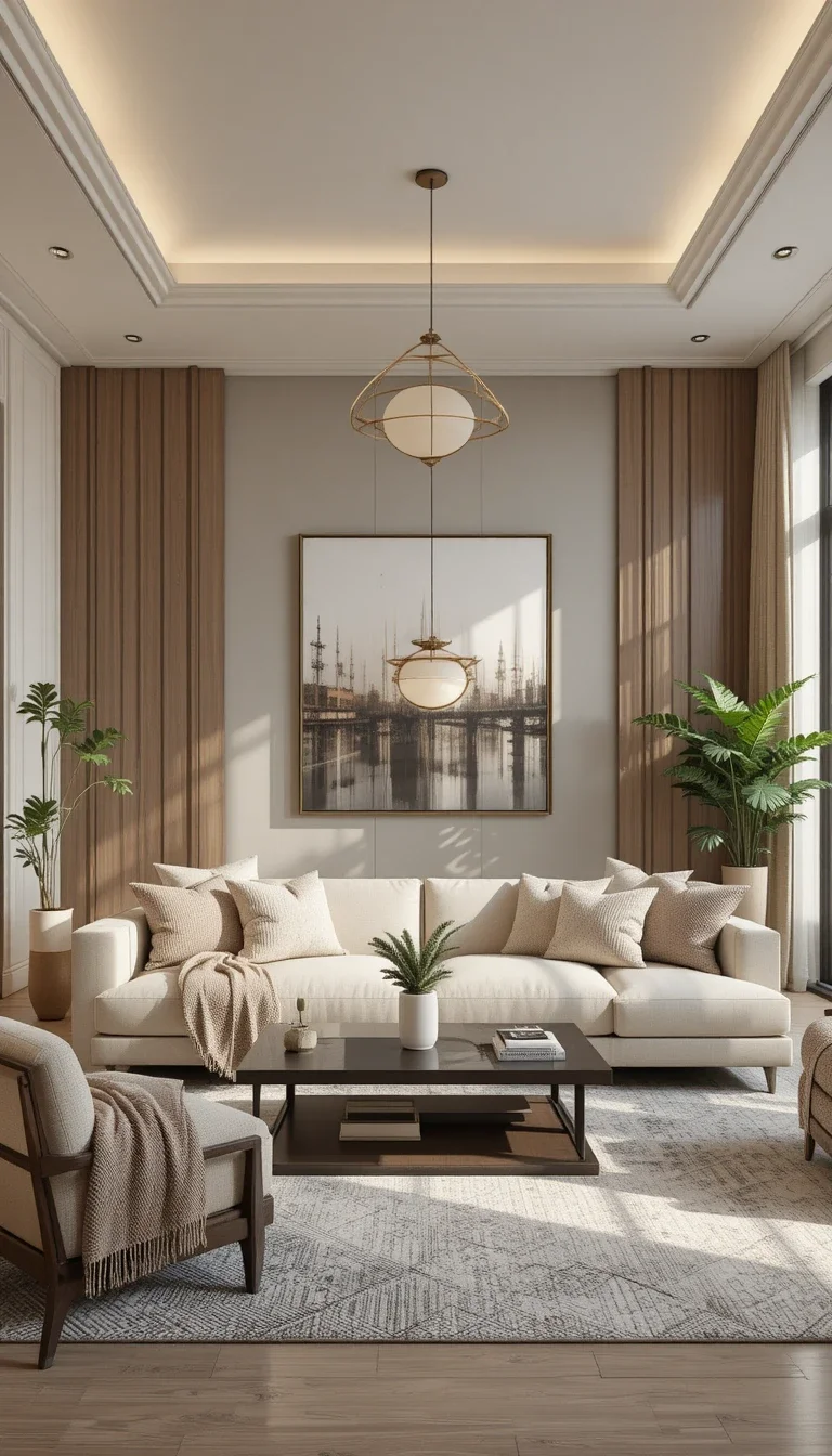
Warm cream walls continue dominating living room trends in 2026, and honestly, I get it. They feel soft, clean, and cozy without looking cold. Unlike stark white, warm cream adds comfort instantly. Your furniture also looks richer against it.
Why do people love it
- Works with almost every decor style
- Makes small living rooms feel bigger
- Looks expensive in natural light
- Pairs beautifully with wood tones
FYI, warm cream beats plain white almost every time if you want your home to feel welcoming instead of painfully sterile.
Sage Green
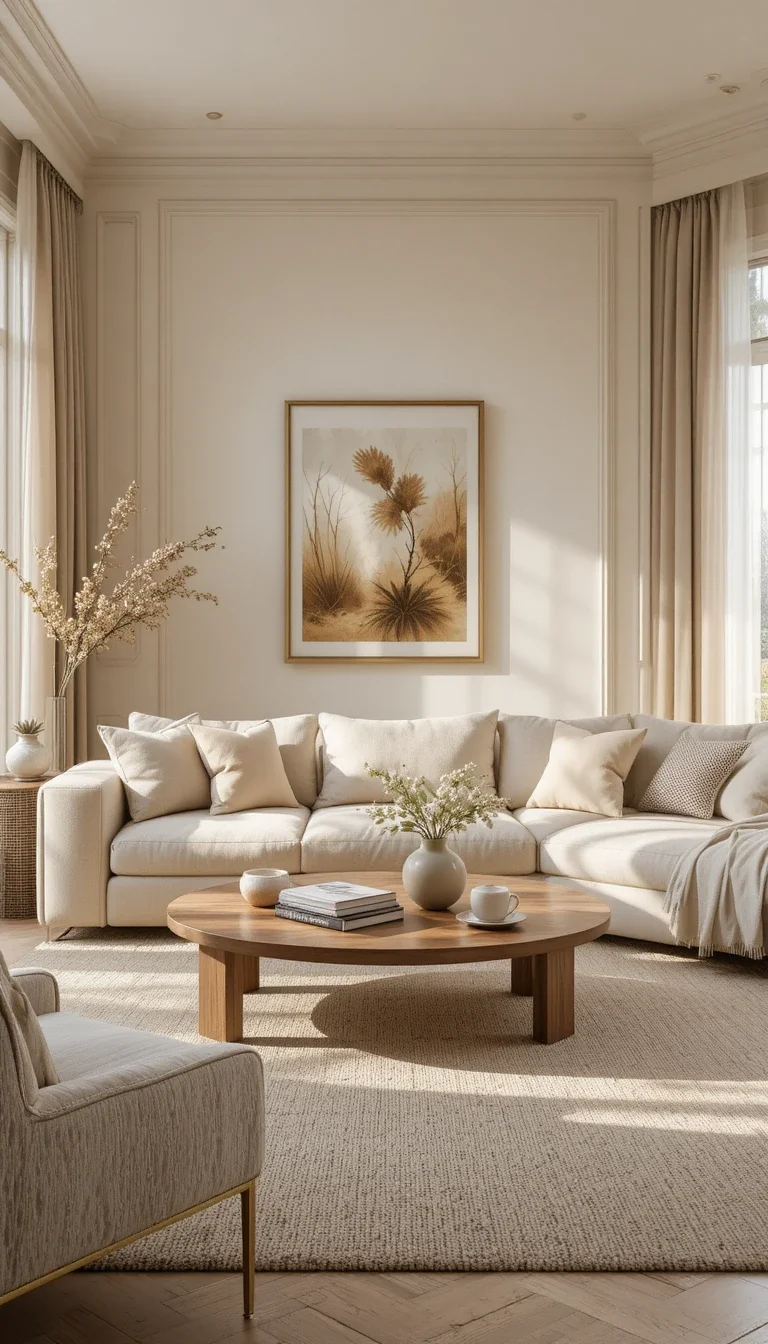
Sage green still refuses to leave the trend cycle, and nobody seems mad about it. This muted green creates a calm atmosphere without feeling boring. It works especially well in living rooms with plants, linen fabrics, and natural textures.
Best pairings for sage green
- Beige sofas
- Oak furniture
- Brass lighting
- White curtains
Ever notice how some colors instantly lower stress levels? Sage green does exactly that.
Moody Charcoal Gray
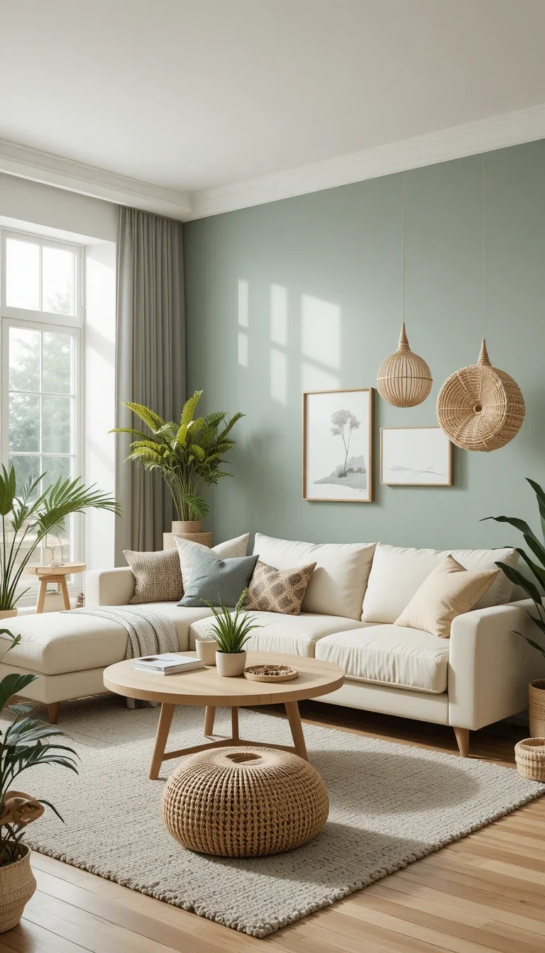
Charcoal gray adds drama in the best way possible. It creates depth and makes artwork pop like crazy. People often fear dark walls, but dark colors actually make large living rooms feel more intimate and luxurious.
Tips before using charcoal gray
- Add layered lighting
- Use light-colored furniture
- Include mirrors for balance.
- Avoid overcrowding the room.
A charcoal living room can look stunning. A poorly lit charcoal living room can look like a basement parking garage. Lighting matters.
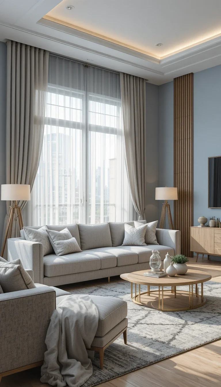
Dusty Blue
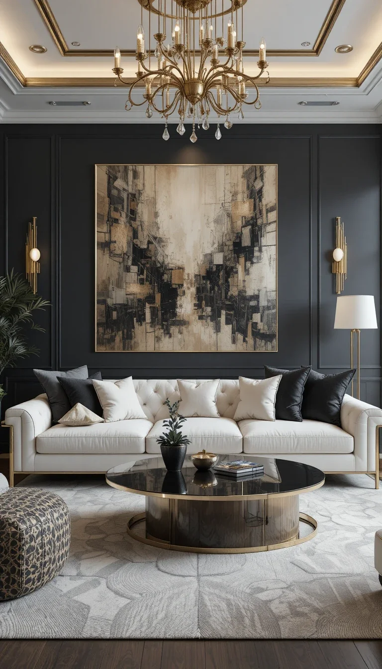
Dusty blue feels peaceful without becoming childish or beach-themed. That balance matters more than people think. I especially love dusty blue in homes with lots of sunlight because the color shifts beautifully throughout the day.
Why dusty blue works so well
- Creates a relaxed mood
- Complements neutral furniture
- Feels timeless
- Fits both modern and classic homes
IMO, this color quietly became one of the safest “non-neutral” choices for homeowners.
Terracotta Clay
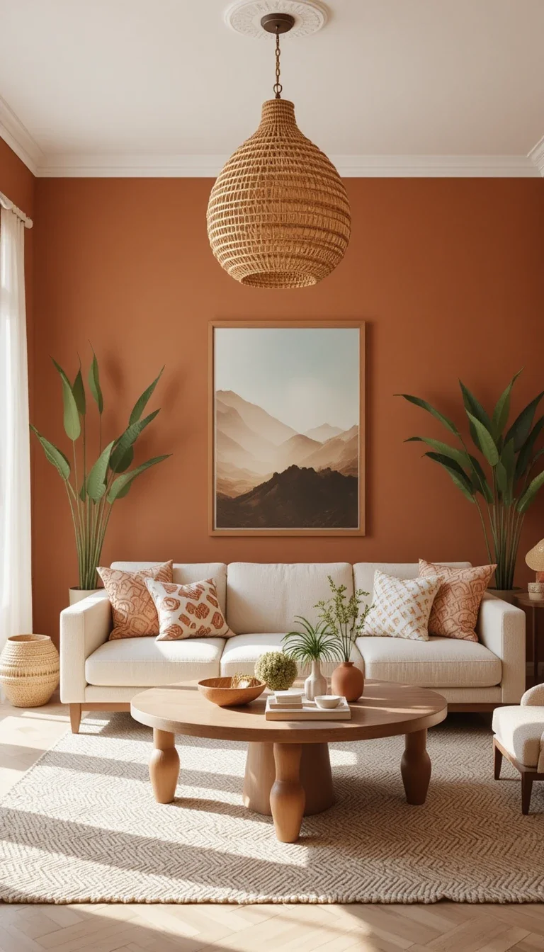
Terracotta walls bring warmth, personality, and a slightly Mediterranean vibe that feels incredibly cozy. This color exploded recently because people want homes that feel grounded and lived-in, not showroom-perfect.
Terracotta looks amazing with:
- Cream furniture
- Textured rugs
- Woven decor
- Black accents
And yes, Instagram probably helped make terracotta famous. Shocking, I know.
Mushroom Taupe
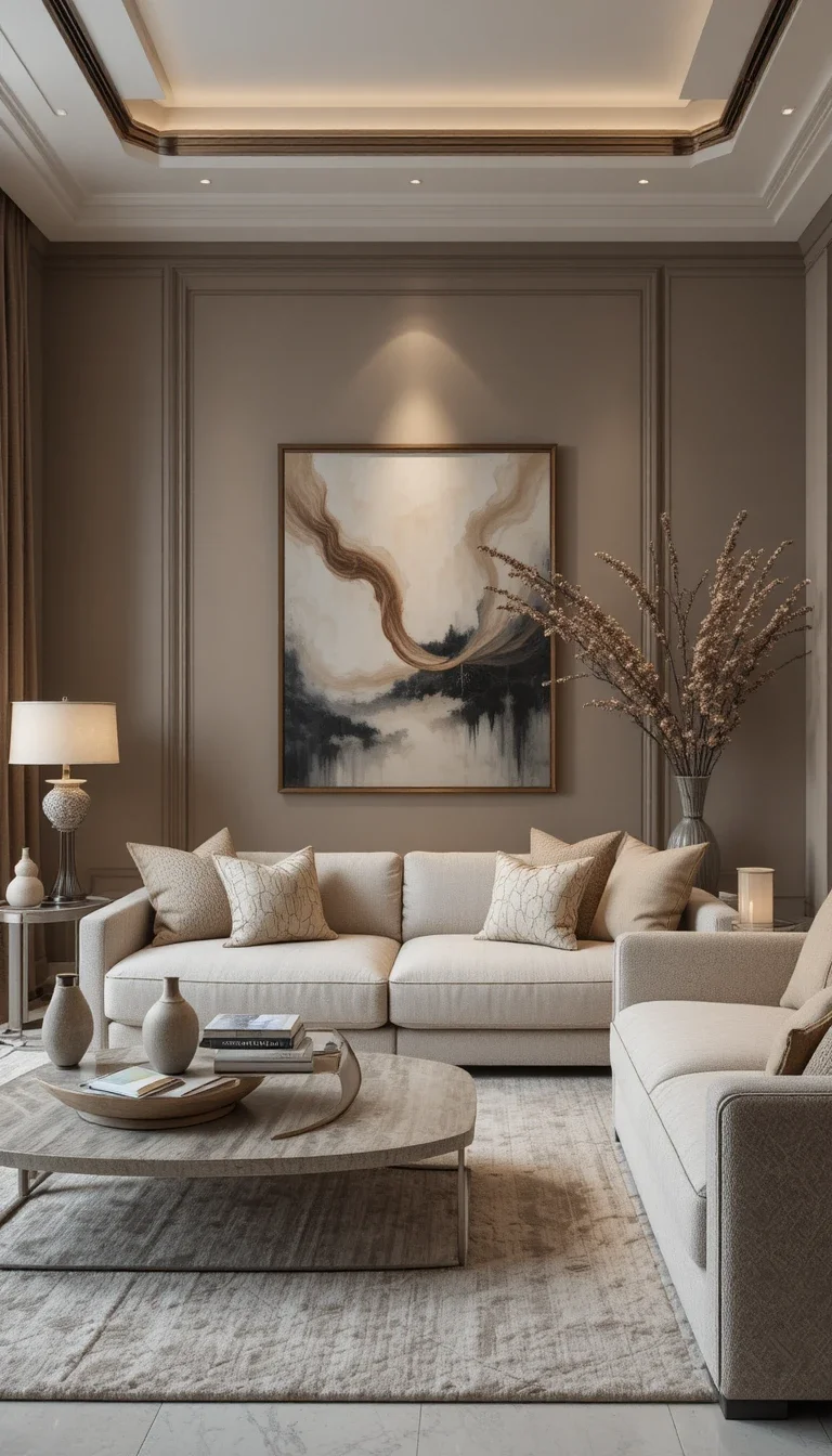
Mushroom taupe sits somewhere between gray, beige, and soft brown. Sounds confusing. Looks incredible. This color works beautifully because it changes slightly depending on lighting conditions.
Why mushroom taupe feels luxurious
- Softens harsh spaces
- Creates warmth without yellow tones
- Pairs well with modern furniture
- Adds subtle sophistication
This might become the defining neutral of 2026.
Soft Lavender Gray
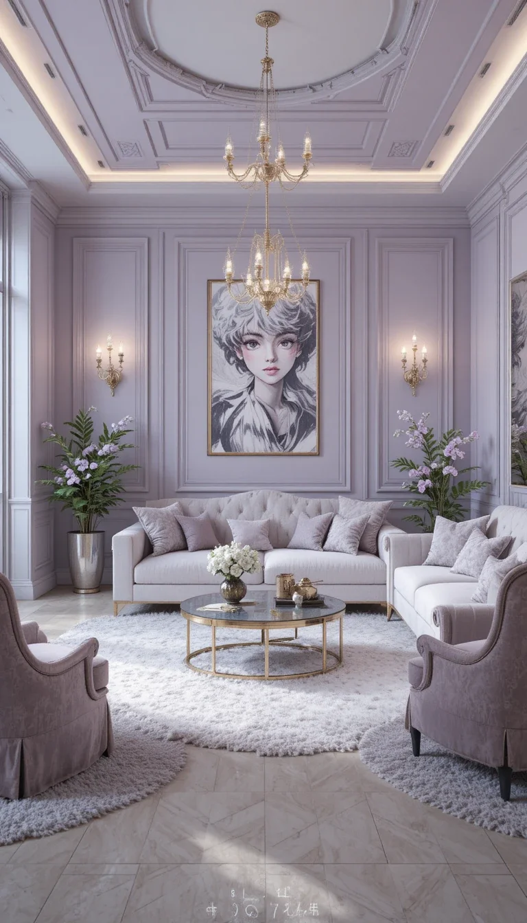
Soft lavender gray sounds risky until you actually see it on walls. The purple undertones stay subtle, which gives the room a dreamy, elegant atmosphere without screaming “teen bedroom.”
Best for:
- Glam living rooms
- Contemporary spaces
- Minimalist interiors
- Rooms with silver accents
Ever walked into a room that instantly felt peaceful and stylish? Colors like this usually do the work behind the scenes.
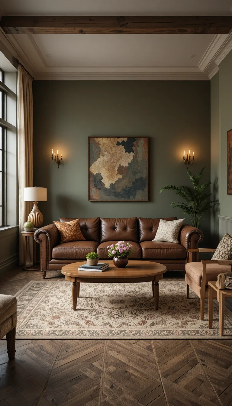
Olive Green
Olive green delivers depth and richness without feeling overwhelming. Unlike brighter greens, olive tones feel mature and grounded. They also hide imperfections surprisingly well.
Olive green pairs beautifully with:
- Leather sofas
- Walnut wood
- Vintage decor
- Cream textiles
Honestly, olive green walls make almost any living room feel more intentional.
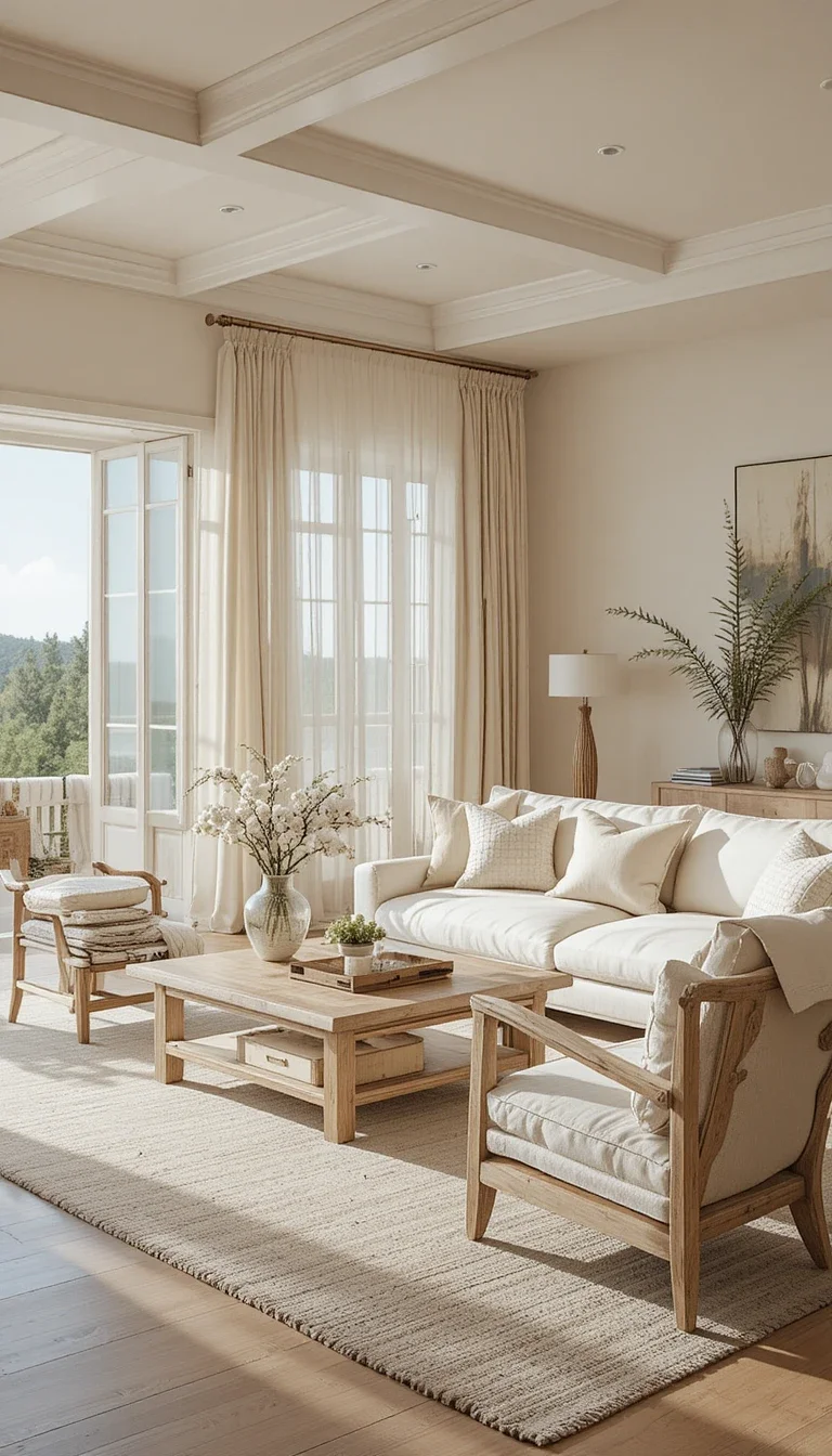
Sand Beige
Sand beige creates that effortless “expensive vacation home” look people keep chasing online. This color feels warm, airy, and relaxed all at once.
Why homeowners love sand beige
- Brightens dark spaces
- Looks soft in artificial lighting
- Makes decor layering easier
- Never feels too trendy.
Some colors demand attention. Sand beige quietly improves everything around it.
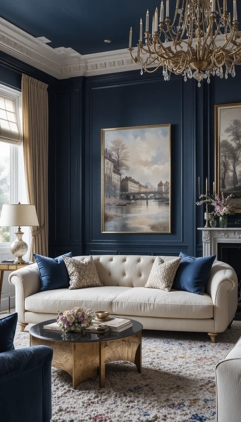
Deep Navy Blue
Navy blue walls create instant sophistication. They also make metallic decor and artwork stand out beautifully. I once painted a small accent wall in navy and immediately regretted not doing the entire room.
Navy blue works best with:
- Gold accents
- White trim
- Velvet furniture
- Warm wood tones
Just avoid pairing navy with cold gray furniture unless you enjoy emotionally depressing rooms.
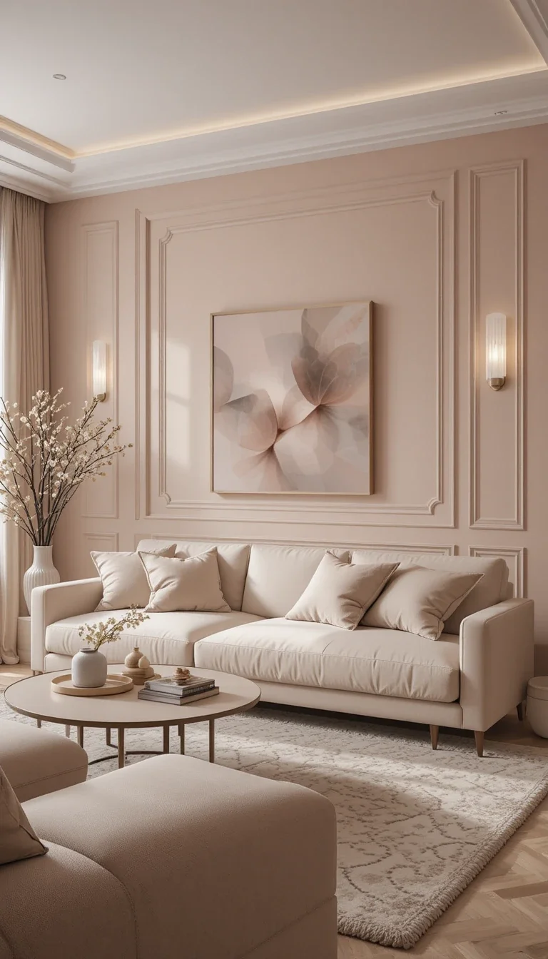
Blush Beige
Blush beige combines soft pink and warm beige tones in a surprisingly grown-up way. The result feels warm, flattering, and slightly romantic without looking overly feminine.
Perfect for creating:
- Cozy living rooms
- Soft modern interiors
- Scandinavian-inspired spaces
- Relaxed minimalist designs
This color also makes skin tones look great in photos. Random bonus, but useful.
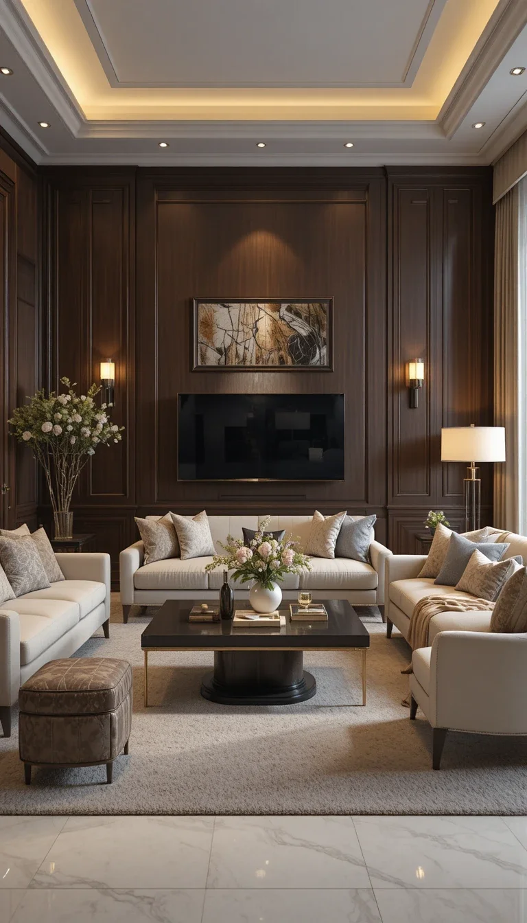
Rich Chocolate Brown
Brown walls are officially back, and now they actually look stylish. Rich chocolate brown creates warmth and depth while making living rooms feel grounded and cozy.
How to keep brown walls modern
- Add cream furniture
- Use layered textures
- Include warm lighting
- Keep decor minimal
Ever notice luxury hotels use darker, earthier colors constantly? There’s a reason.
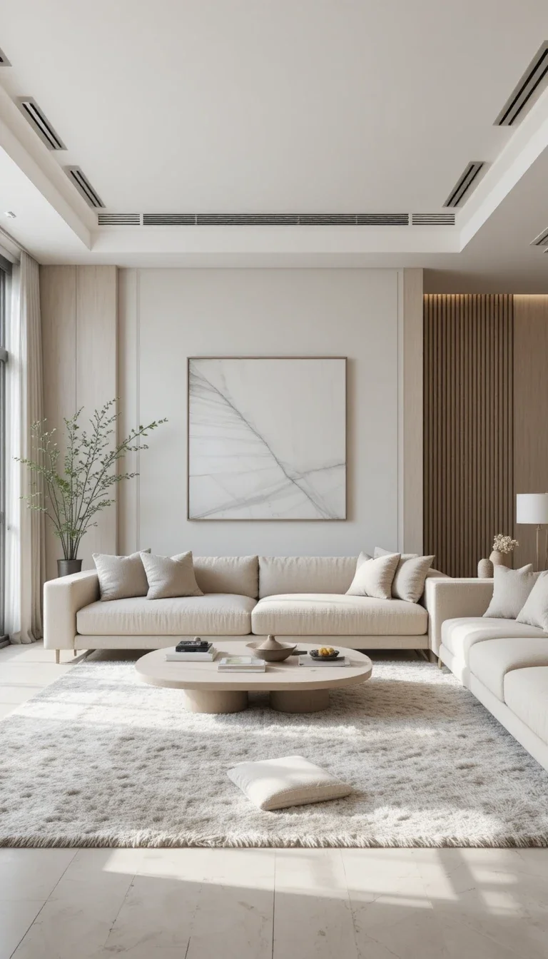
Pale Greige
Greige remains wildly popular because it solves the eternal beige-versus-gray debate. Pale greige feels balanced, flexible, and incredibly easy to decorate around.
Why Greige Survives Every Trend Cycle
- Works with cool and warm decor
- Feels clean without sterility
- Supports layered textures
- Adapts to changing styles
Honestly, if you fear color commitment, greige probably saves your sanity.
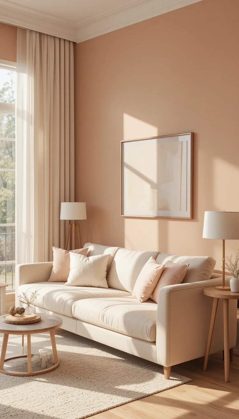
Muted Peach
Muted peach adds warmth and softness without overpowering the room. Unlike bright peach tones from older trends, modern muted peach feels sophisticated and airy.
Best decor matches
- Linen curtains
- Light wood furniture
- Cream sofas
- Matte black accents
This color shines especially well in apartments with limited natural light.
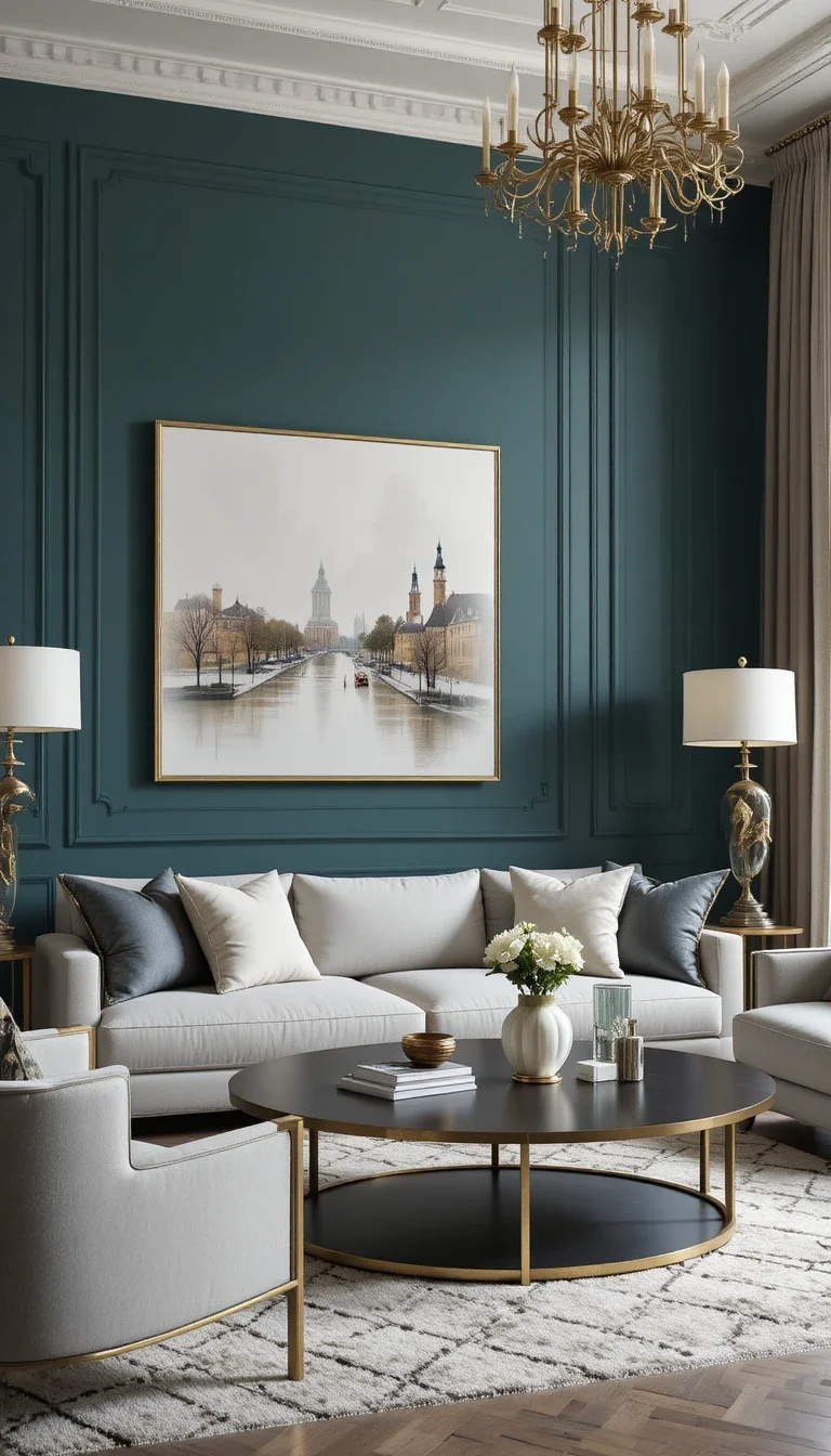
Smoky Teal
Smoky teal adds personality to living rooms while still feeling elegant. It blends blue and green tones beautifully, which creates depth without becoming too bold.
Smoky teal creates:
- A cozy atmosphere
- Visual richness
- Modern sophistication
- Strong contrast with neutral decor
Ever wanted color without chaos? Smoky teal handles that perfectly.
Warm White
Warm white continues leading modern living room trends because it feels clean without looking clinical. And yes, undertones matter more than people realize. Some whites secretly look blue under certain lighting. Absolute betrayal.
What makes warm white better
- Feels softer than pure white
- Enhances natural light
- Supports layered textures
- Matches almost everything
Always test warm-white samples before painting the entire room. Lighting changes everything.
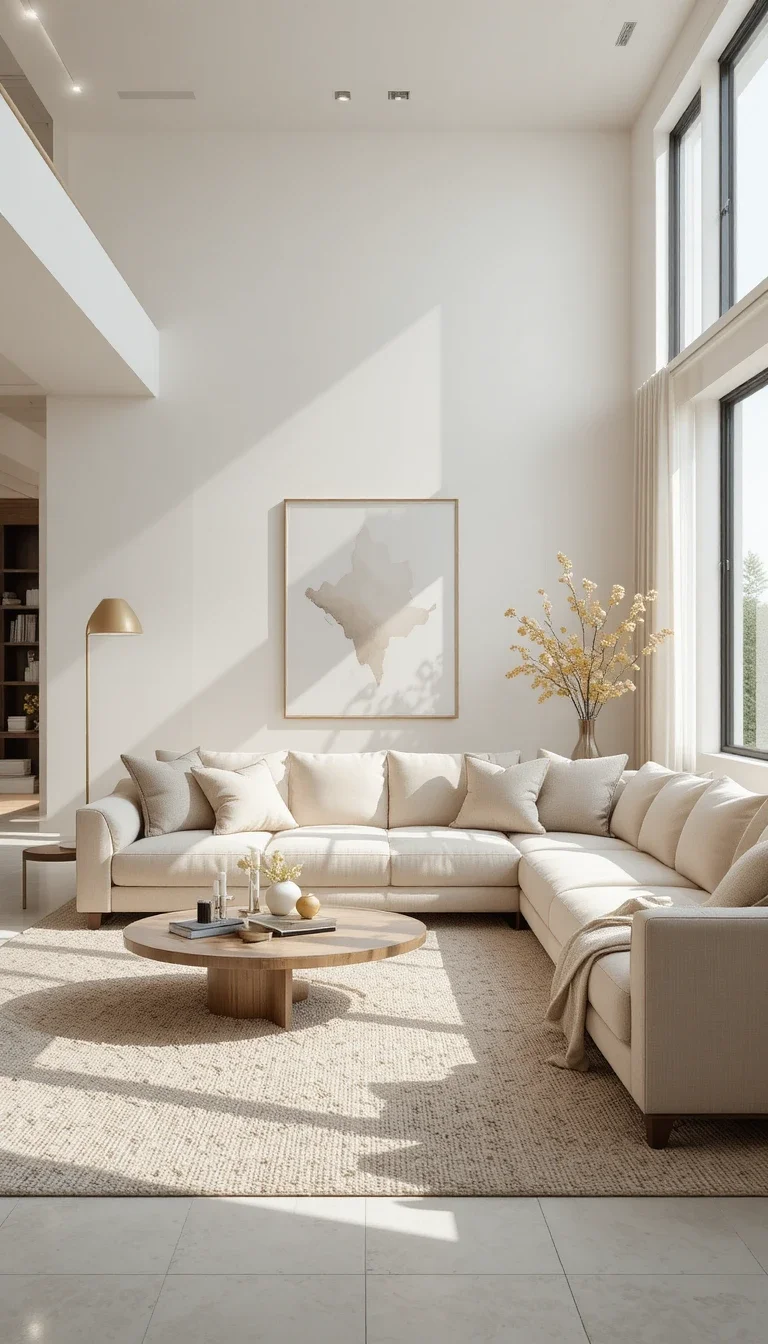
Burnt Orange
Burnt orange walls create bold, cozy energy that feels surprisingly stylish in 2026. This shade works best for people who want personality instead of safe neutrals.
Burnt orange pairs well with:
- Dark woods
- Black decor
- Cream fabrics
- Vintage-inspired furniture
Not every home needs beige walls pretending to have personality.
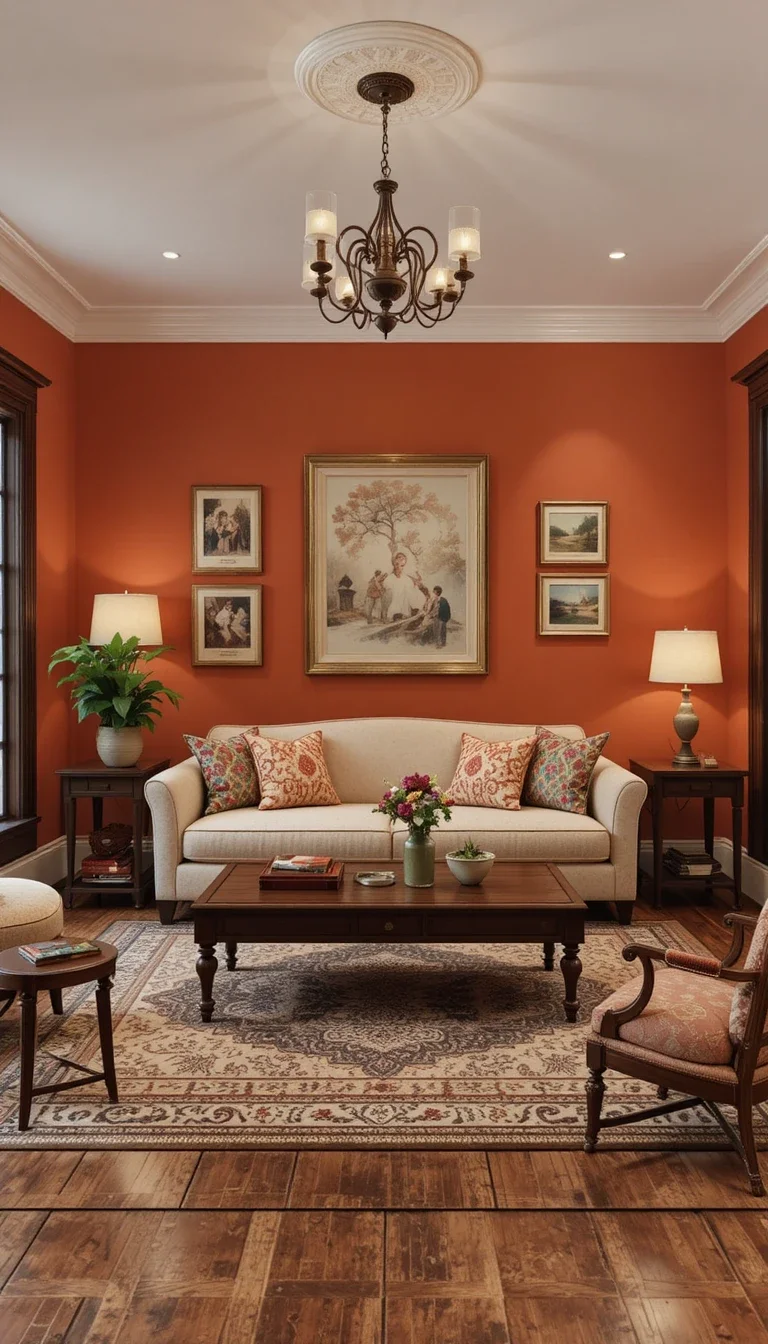
Ice Blue Gray
Ice blue gray feels crisp, modern, and calming without becoming cold. This color works especially well in minimalist living rooms with clean lines.
Why homeowners choose it
- Makes rooms feel airy
- Reflects natural light beautifully
- Adds subtle color
- Supports modern decor
I’d avoid this shade in rooms with poor lighting, though. Otherwise, the room can feel emotionally unavailable.
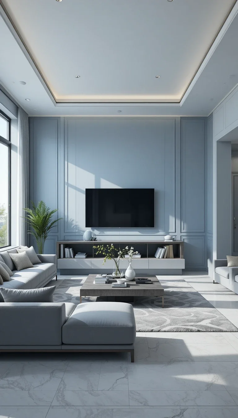
Forest Green
Forest green delivers bold luxury energy immediately. This deep green works beautifully in larger living rooms or spaces with tall ceilings.
Forest green looks incredible with:
- Brass accents
- Dark wood
- Cream textiles
- Statement lighting
If you want your living room to feel dramatic and expensive, forest green deserves serious attention.
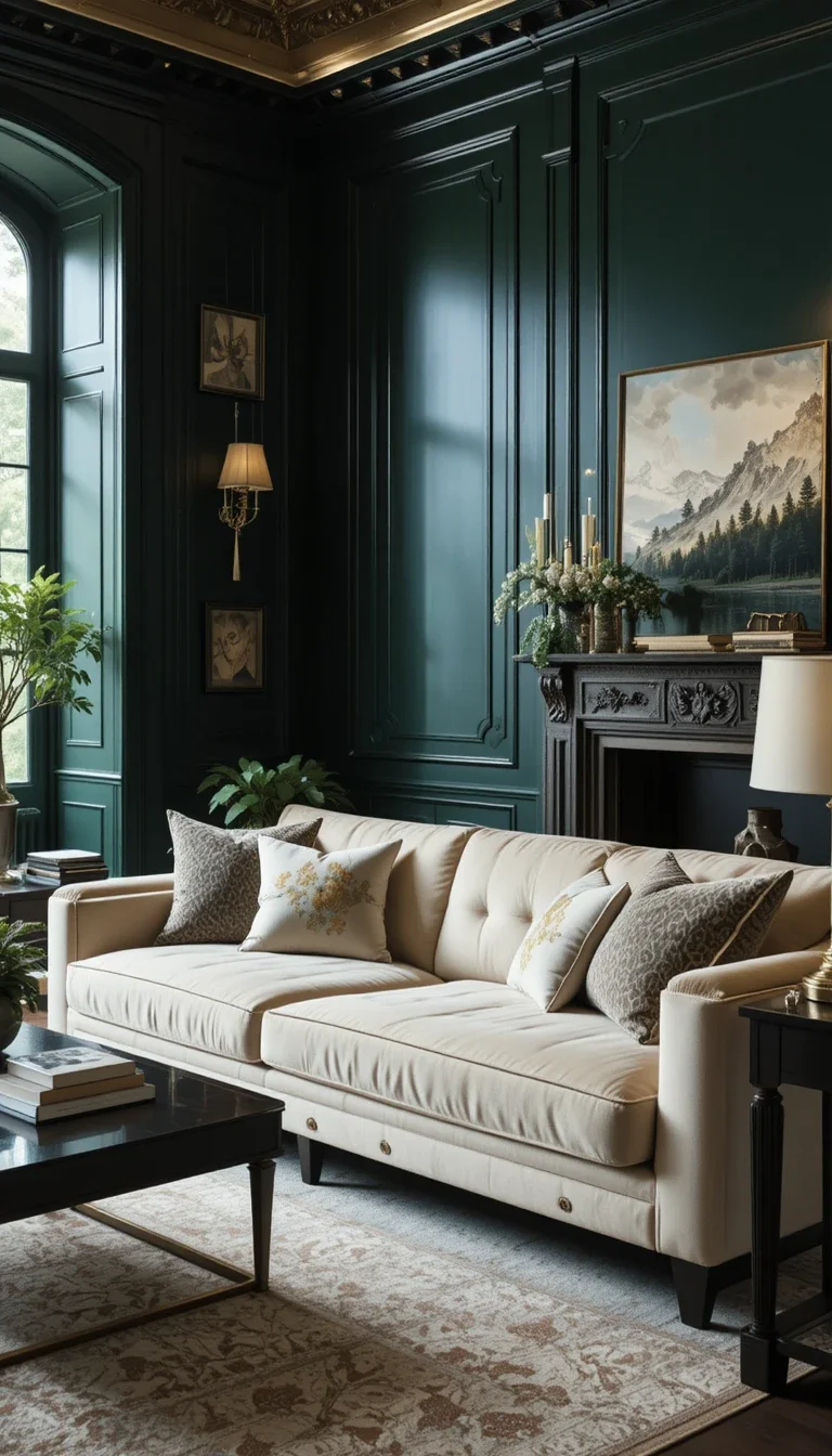
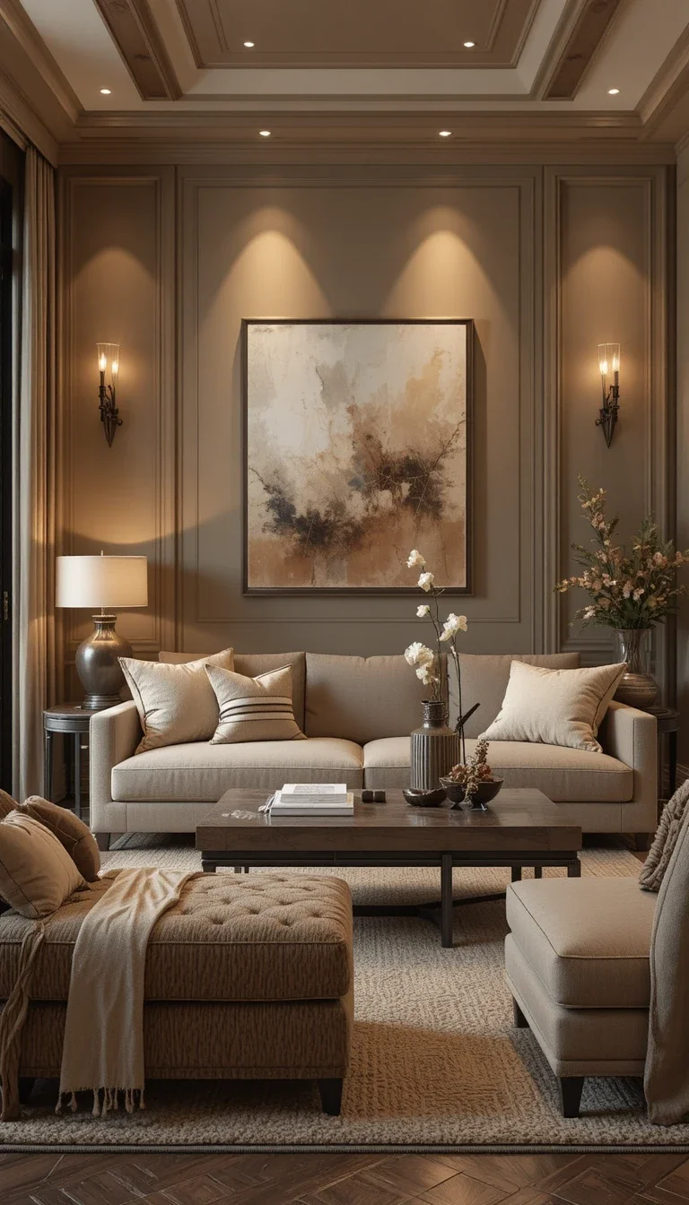
Soft Cappuccino
Soft cappuccino blends warm brown and creamy beige tones into one extremely cozy color. This shade feels inviting, timeless, and easy to style.
Why soft cappuccino works
- Creates warmth instantly
- Feels elegant without effort
- Complements modern furniture
- Works year-round
Honestly, this color feels like a giant warm blanket for your walls.
How to Choose the Right Living Room Wall Color
Choosing trendy wall colors means nothing if the shade fights your lighting and furniture. Here’s what actually matters: Check Your Lighting First
Natural light changes everything.
- North-facing rooms feel cooler.
- South-facing rooms feel warmer.
- Dark rooms need softer shades.
- Bright rooms can handle bold colors.
Test paint samples properly.
Never trust tiny paint chips alone. Paint large samples directly on your wall and check them:
- Morning
- Afternoon
- Evening
Yes, it sounds annoying. It also prevents expensive regret. Match the Mood You Want
Ask yourself one simple question:
How do you want the room to feel?
- Calm → Sage green, dusty blue
- Cozy → Cappuccino, terracotta
- Luxurious → Forest green, charcoal
- Bright → Warm white, cream
People often copy trends without considering the mood. That mistake usually shows immediately.
Don’t Ignore Your Furniture
Your wall color should support your furniture, not fight it like two reality TV contestants.
Quick matching guide
- Brown furniture → Sage, cream, olive
- Gray furniture → Navy, greige, dusty blue
- Beige furniture → Terracotta, forest green
- Black furniture → Warm white, cappuccino
This step saves a lot of decorating frustration later.
Final Thoughts
Living room wall color trends for 2026 feel warmer, moodier, and far more personal than older trends. People finally moved away from cold, lifeless interiors that looked pretty online but felt awkward in real life. And honestly, that shift makes sense.
Your living room should feel comfortable when you actually live in it. Not just when someone takes a perfectly edited photo for social media.
