

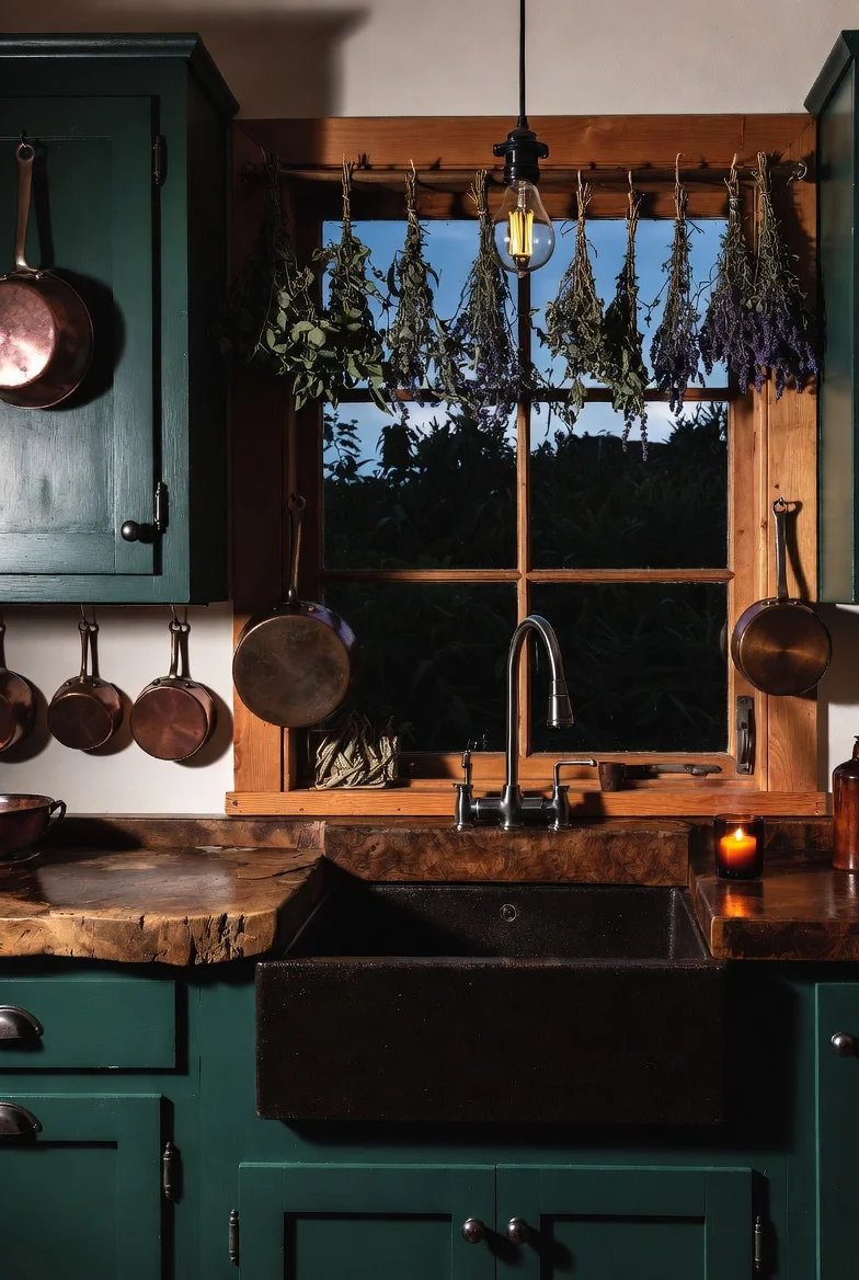
Somewhere between a fairy tale cottage and a candlelit apothecary sits the year’s fastest-growing kitchen aesthetic. Searches for dark cottagecore kitchen ideas have exploded on Pinterest this year, and the pull is easy to understand: after a decade of white-on-white kitchens, a room that feels like dusk came inside and stayed sounds like sanctuary.
Before the ideas, the definition that keeps everything on track: dark cottagecore is cottage first, dark second. Deep forest greens and warm charcoals, yes, but wrapped around worn wood, copper with age on it, dried herbs overhead, and the soft clutter of a kitchen that actually bakes. Remove the cottage half and you’ve built a gothic kitchen; remove the dark half and it’s your grandmother’s. The magic lives in the overlap.
Sixteen ideas follow, including two the other guides skip: the honest truth about lighting a kitchen you still have to cook in, and the exact order to build the look, starting at about twenty euros.
Pass the Storybook Test First
Every choice in this article can be checked against one question: would this object exist in a storybook grandmother’s kitchen, on a moody evening? Copper pot, yes. Dried lavender, yes. Chrome bar stools and LED strip in ice white, no.
The test matters because “dark kitchen” alone drifts industrial fast. Matte black everything with no worn wood or botanicals is a bachelor loft, not a cottage. Run the test on every purchase and the style protects itself.
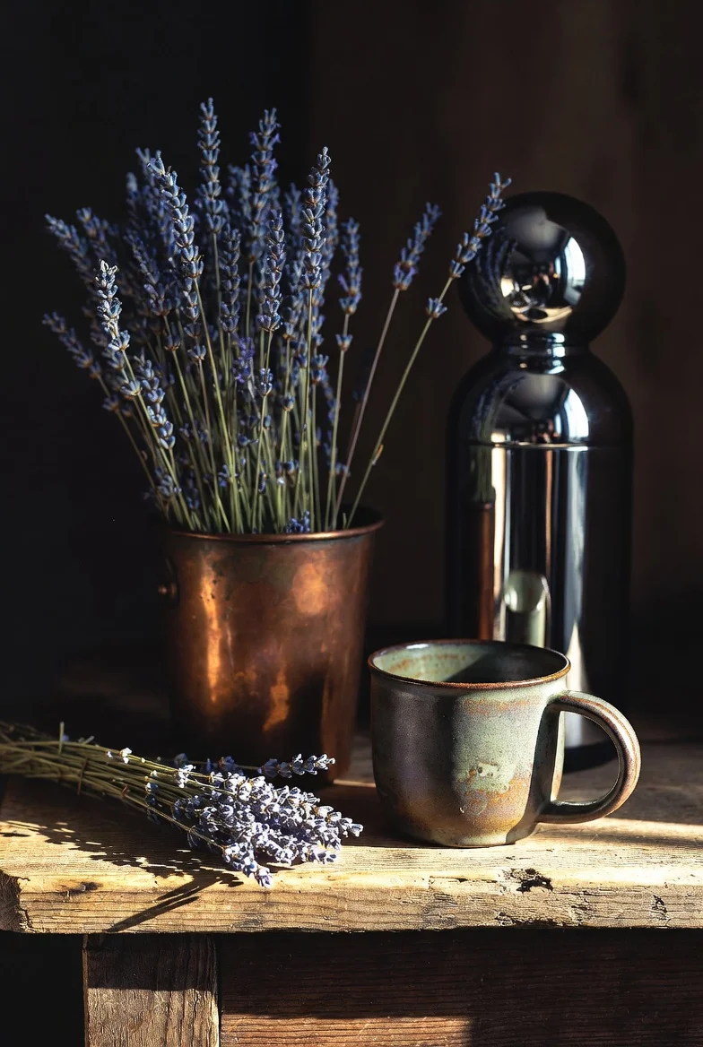
Paint the Cabinets Forest Green
The signature move. Deep forest or hunter green cabinetry sets the moody tone while staying unmistakably natural, and it pairs with everything else in this article: brass, copper, cream, worn oak.
The undertone rule decides success here. Greens (and charcoals, and blues) with warm, brown, or earthy undertones read cozy; cool blue-based darks read cold and industrial. Test the swatch on an actual cabinet door and live with it through a morning and an evening before committing. The same deep-green logic behind emerald green kitchens applies, just muddier and moodier.
Go Two-Tone to Dodge the Cave
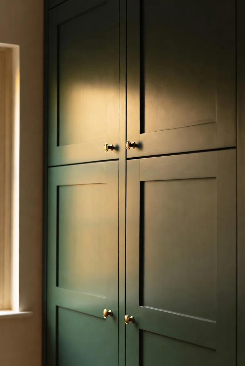
Worried the room will swallow itself? Paint only the lower cabinets dark and keep uppers in cream, warm white, or natural wood. Eye level stays light, the floor level grounds, and small kitchens keep their air.
This is the single most effective anti-cave strategy, and it halves the paint commitment for the nervous.
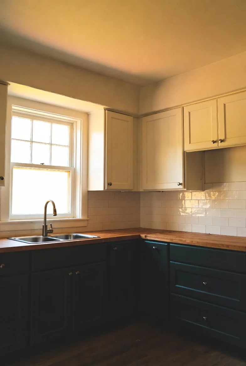
Choose Charcoal With Brown in Its Blood
For walls, the working shade is charcoal that leans brown or green underneath, never blue. On a feature wall or wrapped around the whole room in a matte finish, it becomes the dusk-colored backdrop that makes copper glow and cream pop.
Matte matters as much as the color: high-gloss dark paint throws harsh streaks of reflection, while matte absorbs light gently and keeps the handmade mood.
Counters That Have Seen Things
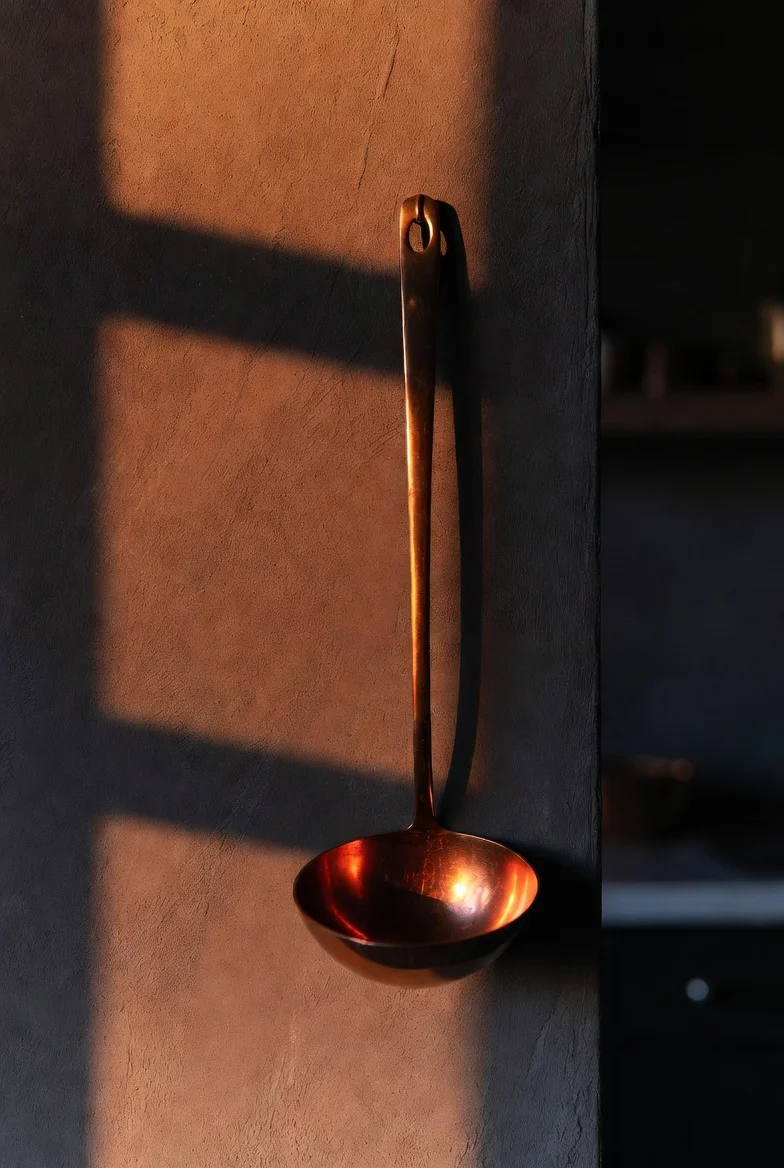
Glossy white quartz breaks the spell instantly. The style wants butcher block gone dark with oil and years, its rings and knife marks left as biography. New butcher block can be dark-stained and will earn its history honestly.
A warped thrifted cutting board leaning against the backsplash does more for the mood than any styled accessory. Imperfection is the material here.
Shelve the Working Clutter
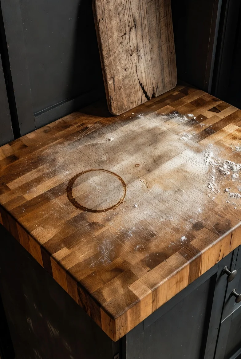
Open shelving here is not a display case; it’s a working pantry that happens to be beautiful. Dark glass jars of dried herbs, a row of apothecary bottles, cookbooks with actual food stains, hand-painted ceramic mugs.
One filter keeps it honest: if it doesn’t get used in this kitchen, it doesn’t live on the shelf. Styled-but-fake is the failure mode; the grandmother would notice.
Hang the Ceiling
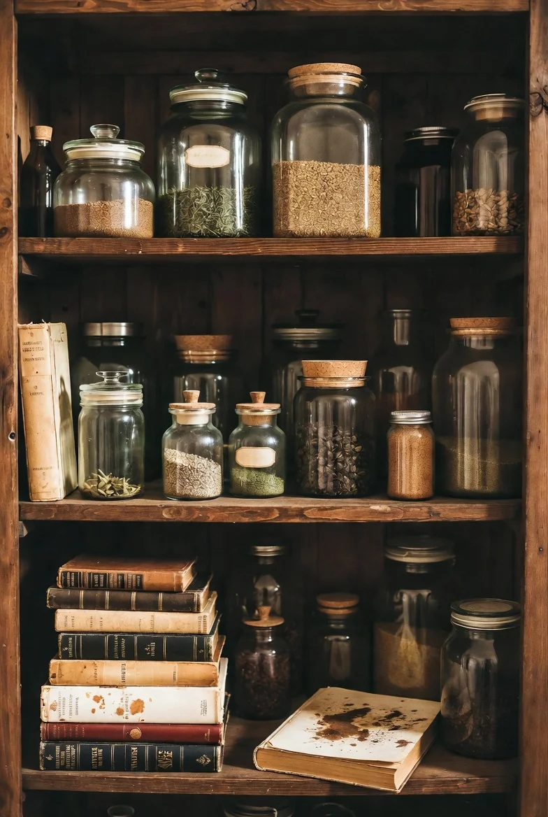
In a dark cottagecore kitchen the ceiling never stays empty. Dried herb bundles tied with twine, flowers going dark at the edges, a string of garlic for the committed. The eye pulls upward and the room starts feeling inherited rather than decorated.
No beams required. A curtain rod mounted high across the window recess or a few ceiling hooks above the counter starts the whole thing for pocket change.
Copper In, Stainless Out
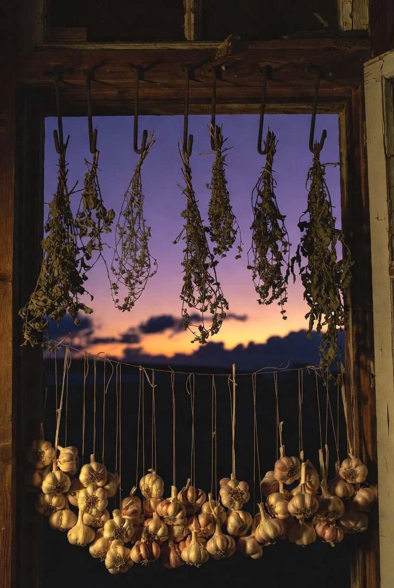
Stainless steel has no place in this story. The metal language is copper pots with age on them, cast iron living permanently on the stovetop, and wooden utensils worn smooth.
Thrift shops and flea markets sell tarnished copper cheap because most buyers want it shiny. You want it exactly as found. Hang three pots where the light can find them and half the aesthetic arrives in one afternoon.

Unlacquered Brass at the Fingertips
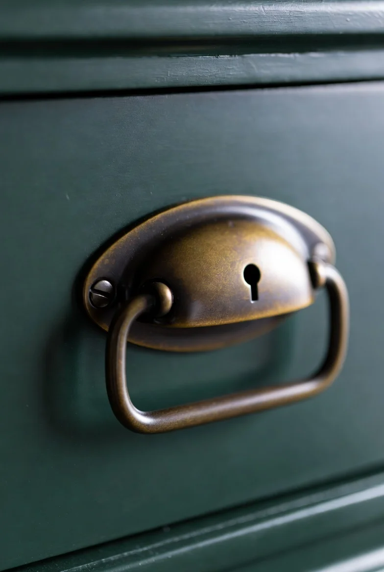
Hardware is the punctuation. Unlacquered brass knobs and pulls, or aged bronze, warm every drawer-pull and darken beautifully where fingers touch most, writing the kitchen’s use into its surfaces.
Swapping hardware is renter-possible and afternoon-sized. Keep the old knobs in a labeled bag for move-out day.
Sink a Black Farmhouse Sink
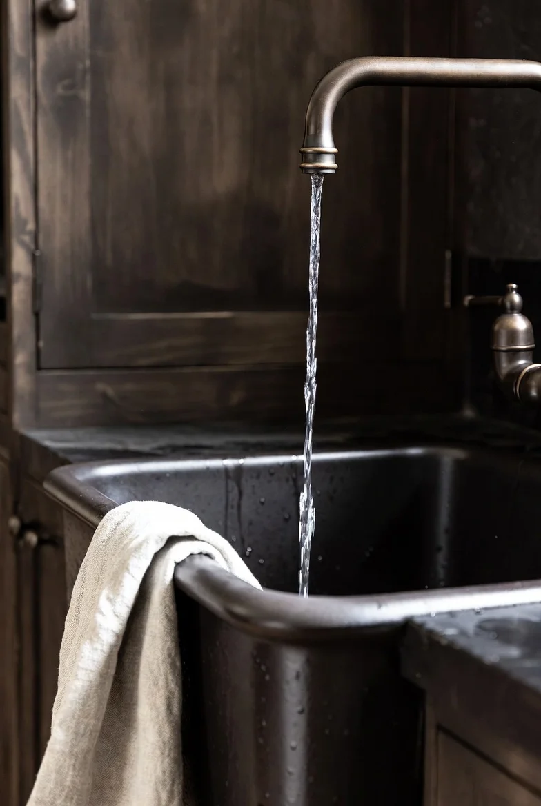
The apron-front farmhouse sink in black fireclay or cast iron is the style’s anchor fixture, rustic in shape, moody in finish. Pair it with an aged brass or oil-rubbed bronze tap and the corner becomes the room’s gravity.
The white farmhouse sink version works too, trading drama for contrast. Either way, farmhouse shape is the non-negotiable part.
The Two-Layer Lighting Truth
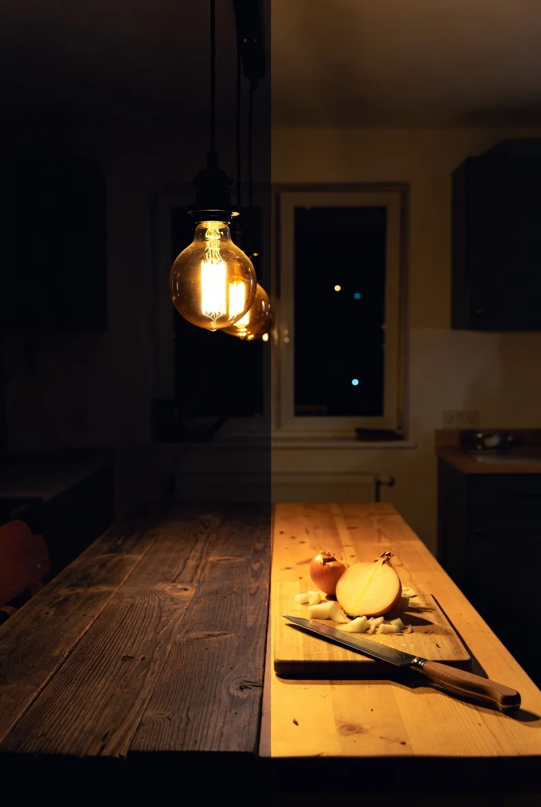
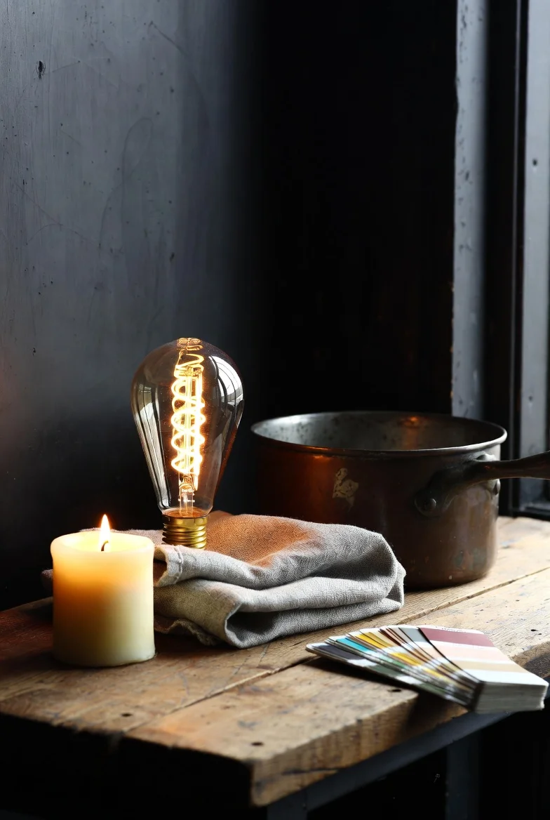
Here’s what the mood boards won’t tell you: you cannot dice an onion by Edison bulb. Every dark kitchen needs two honest layers. Layer one is the atmosphere: amber Edison pendants dimmed low, a small lamp on the counter, candles on the sill, the dusk-glow every photo celebrates. Layer two is the workhorse: proper under-cabinet task lighting over the chopping and cooking zones, switched on when knives come out and off when the wine does.
Warm-toned LED strips (2700K, never cooler) keep even the task layer inside the palette. A dark kitchen with only mood lighting is a beautiful place to order takeaway; the two-layer version actually cooks.
Paper One Wall in Dark Botanicals
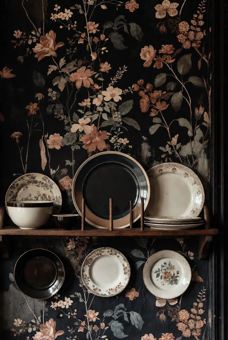
Moody florals, dark meadow prints, the occasional gothic rose: one wallpapered wall injects the storybook pattern the painted surfaces can’t. Vintage-style prints with black or deep green grounds keep it inside the palette.
Peel-and-stick versions hand the idea to renters, and a wallpapered pantry interior is the low-risk gateway version.
Soften It With Ticking and Linen
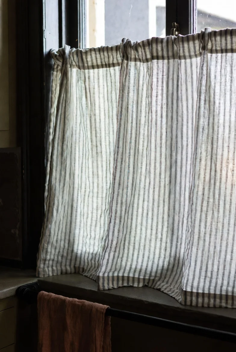
Dark kitchens need fabric or they harden. Linen café curtains in a muted stripe, a ticking-stripe towel on the oven rail, a woven runner underfoot in faded tones, seat cushions on the nook bench.
Muted is the operative word: dusty olive, faded rust, oatmeal, charcoal stripe. Bright white textiles read hotel; storybook fabric looks washed a hundred times.
Grow the Apothecary Corner
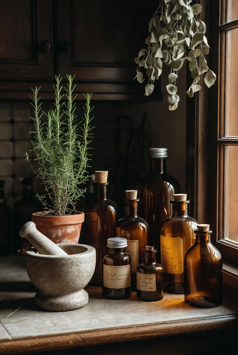
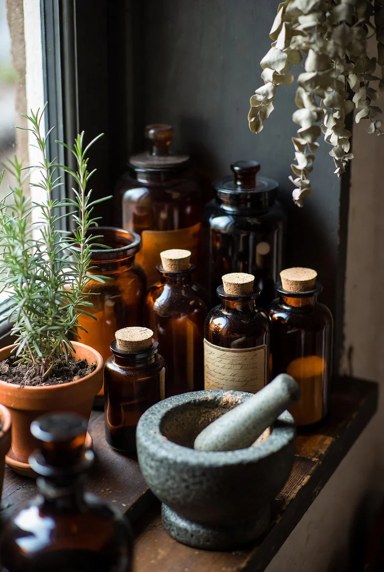
One corner, one shelf, or one windowsill dedicated to the ritual layer: amber glass jars of dried goods, labeled herb bottles, a mortar and pestle that gets used, rosemary or sage growing in a clay pot, eucalyptus drying upside down.
It’s the most photographed square meter of every dark cottagecore kitchen, and it costs almost nothing because half of it is groceries.
The Renter’s No-Demo Version
Locked into white laminate and a lease? The look still builds: peel-and-stick dark botanical wallpaper on one wall, tile stickers over the backsplash, a tension rod across the window for herb bundles, copper and cast iron doing the metal work, warm bulbs in every socket, linen curtains, the apothecary corner.
The bold bonus move: remove a pair of upper cabinet doors (store them under the bed, screws in a labeled bag) for instant open shelving. Everything reverses on move-out day.
Build It in This Order
The style accumulates; here’s the sequence that gets maximum mood per euro. First weekend: warm bulbs and candles, about twenty euros, half the atmosphere. Second: textiles and the apothecary corner. Third: thrifted copper, cast iron, and the ceiling herbs. Fourth: hardware swap and any wallpaper. Only then, if the budget and lease allow: the paint, and last of all the counters and sink.
Most people stop somewhere around step four and discover the kitchen already feels like the mood board. The expensive steps are the least transformative per euro, which is the happiest secret in this entire aesthetic, and the same logic behind expensive-looking kitchens on a budget.
3 Mistakes That Break the Spell
Cool-undertone darks. Blue-black cabinets under white LED is an industrial loft wearing a costume. Warm undertones and warm light are the whole game; get these two wrong and nothing else recovers it.
Darkness with no relief. Dark cabinets, dark walls, dark counters, dark floor: the cave the skeptics warned about. Every dark cottagecore kitchen keeps light valves open, whether cream uppers, a pale counter, or a bright ceiling.
Forgetting it’s a kitchen. Dark surfaces show flour dust and smudges enthusiastically, and mood lighting can’t light a cutting board. Plan the wipe-down routine and the task layer from day one, or the prettiest room in the house will quietly stop being cooked in.
FAQs
What is a dark cottagecore kitchen?
It’s the moody branch of cottagecore: traditional cottage elements like worn wood, copper, dried herbs, and vintage ceramics, wrapped in deep palettes of forest green, warm charcoal, navy, and plum. The feel aims for candlelit storybook rather than gothic or industrial.
What colors work for a dark cottagecore kitchen?
Forest and hunter green, charcoal with brown or green undertones, aged navy, deep plum, and soft black, balanced by cream, warm white, and natural wood. The rule that holds it together: warm undertones only, in both the paint and the lighting.
Will a dark kitchen make my small kitchen feel smaller?
Not if the contrast is planned. Two-tone cabinets with light uppers, a pale counter or backsplash, glass-front cabinets, and layered warm lighting keep the air in the room; done this way, small dark kitchens read intimate rather than cramped.
How do I get the dark cottagecore look on a budget?
Follow the accumulation order: warm bulbs and candles first, then muted textiles, thrifted copper and cast iron, hanging dried herbs, and a hardware swap. Most of the aesthetic arrives before any paint is opened, typically for less than the cost of one new appliance.
What’s the difference between dark cottagecore and gothic kitchens?
Gothic leans ornate, dramatic, and cool-toned: wrought iron, black-on-black, sharp contrast. Dark cottagecore stays rural and warm: worn wood, herbs, copper, and soft imperfection, with darkness as the backdrop rather than the point.
Final Thoughts
A dark cottagecore kitchen isn’t installed; it gathers, one tarnished pot and one bundle of drying sage at a time. Start with the twenty-euro weekend, run everything past the storybook test, and keep one honest light over the chopping board.
Dusk can move in permanently. Dinner still has to get made.
