

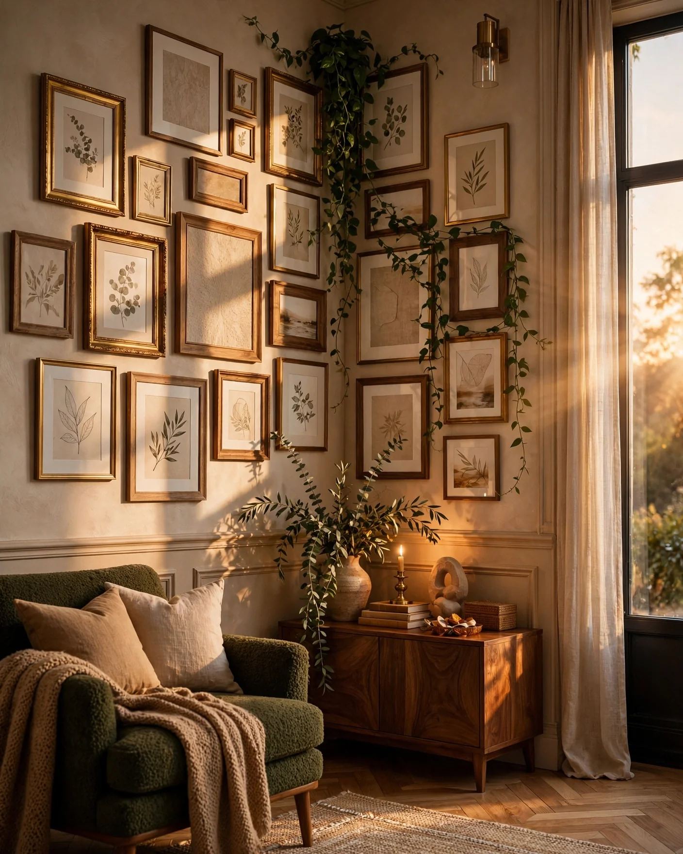
Every home has one: the corner that furniture ignores and the eye slides past. A corner wall gallery is the fix that turns that dead angle into the most intentional spot in the room. The best corner wall gallery ideas do something a flat gallery can’t; they pull the gaze around the turn, connect two walls into one composition, and make a space feel larger by using the volume most people waste.
The one thing to understand before you hammer anything: a corner gallery lives or dies by how it handles the fold. Wrap the frames around the turn with matched spacing, or align them cleanly to the inside edge, but never let the corner become a random gap. Treat the corner like a fold in a book, and two walls read as one.
Fourteen ideas, from choosing the right corner to hanging it without a single nail.
Choose the Corner That Earns It
Not every corner wants a gallery. The ones that do: the corner you see first walking into a room, the dead space behind a sectional, an awkward nook the furniture can’t fill, or the turn of a staircase that greets people twice.
Pick the corner your eye already travels to, then give it a reason to stop there. A gallery in a corner nobody looks at is effort spent in the dark.
Wrap the Whole Thing Around the Turn
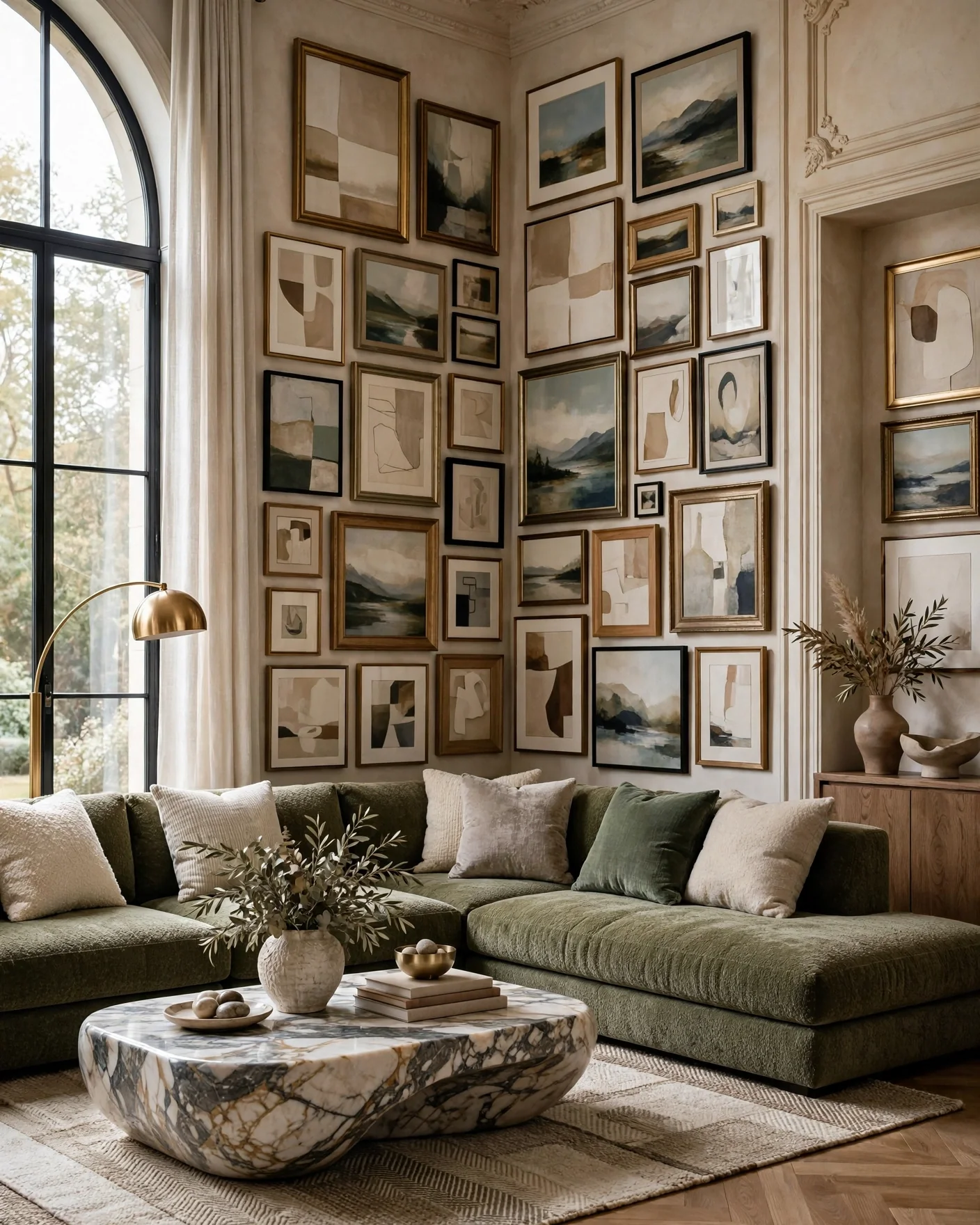
The signature corner move: let the frames continue across both walls as one connected composition. When the arrangement flows around the fold, your brain reads the two surfaces as a single expanded wall, and the room feels bigger for it.
The rule that makes it work: keep the spacing between frames identical on both walls, and treat the corner line itself as just another gap in the grid. Frames can sit close to the inside edge on each side, almost meeting, so the turn feels deliberate rather than accidental.
Stack a Vertical Column
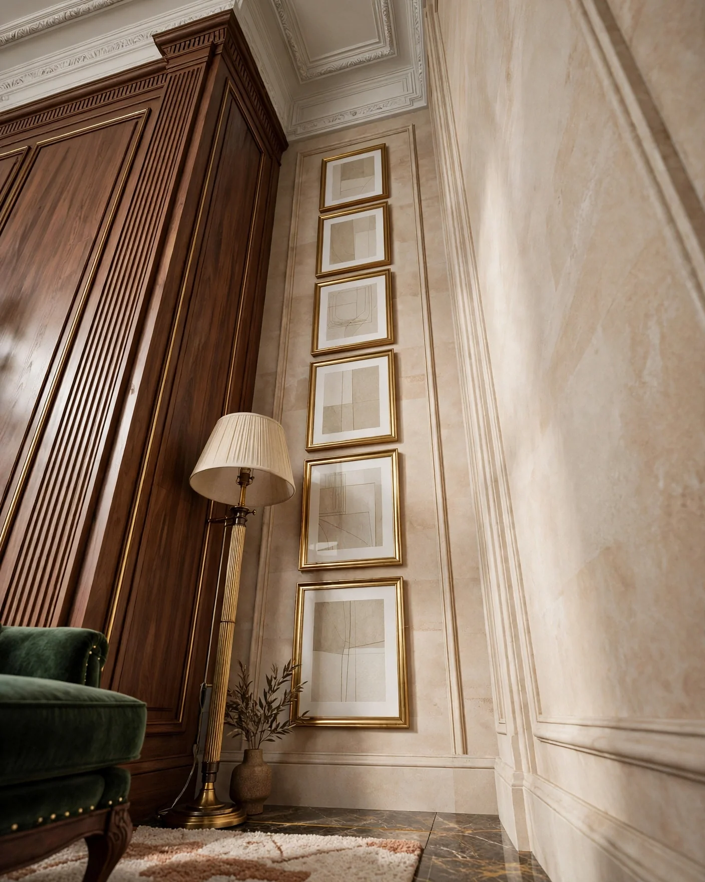
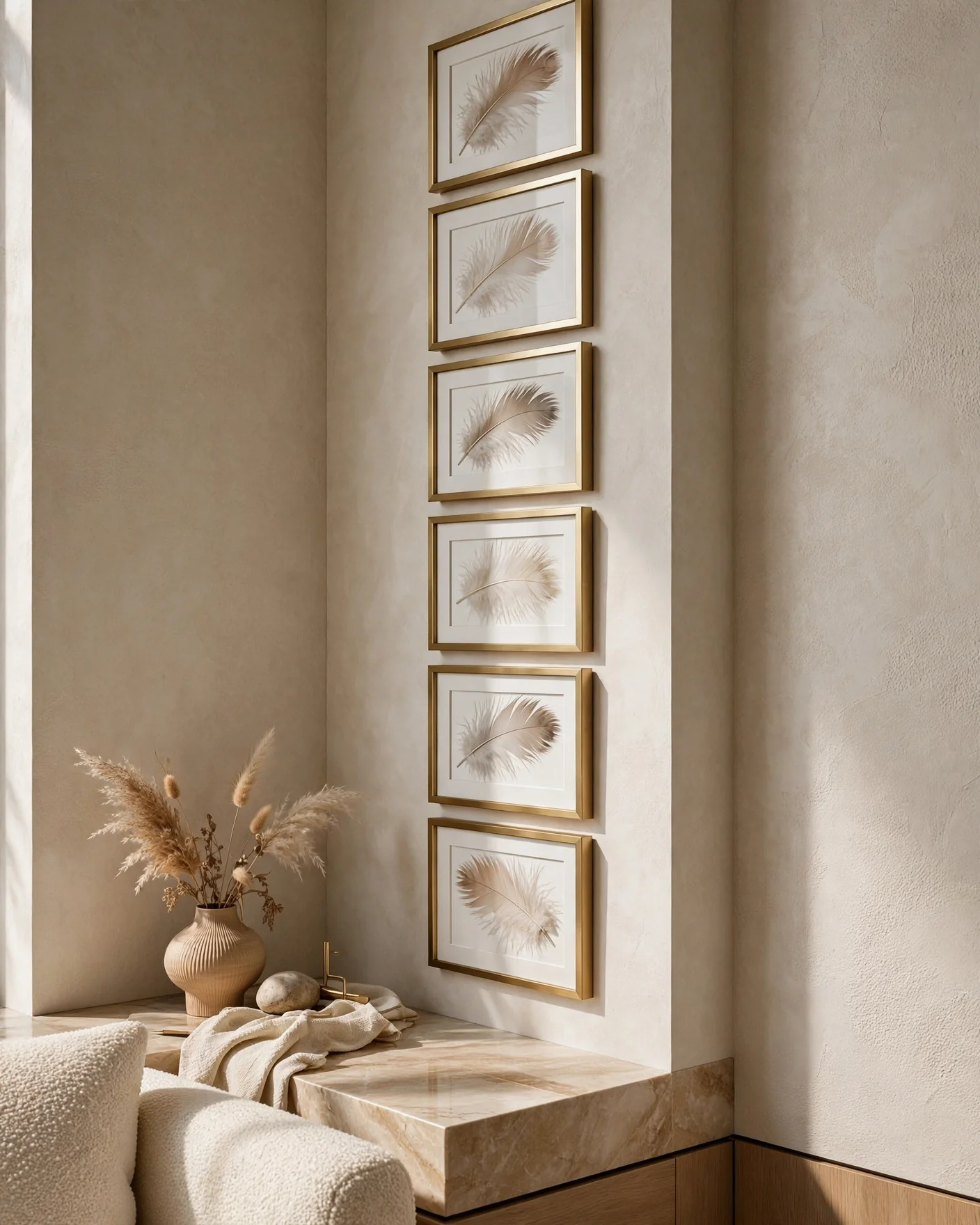
Short on width but tall on wall? Run a slender vertical column of frames up one side of the corner. The stack draws the eye upward, makes ceilings feel higher, and suits narrow corners beside a floor lamp, a plant, or a doorway.
Pick one frame width and repeat it for a clean, graphic rhythm. Three to five frames straight up is often all a tight corner needs.
Flank a TV or Furniture in an L-Shape
An L-shaped gallery hugging the corner around a television dissolves the black rectangle into a composition, the same trick that rescues any TV wall. Frames climb one wall and turn along the other, framing the screen as one element among many rather than the room’s unavoidable focus.
Works equally around a corner console, a plant stand, or a reading chair. The furniture anchors the base; the art turns the corner above it.
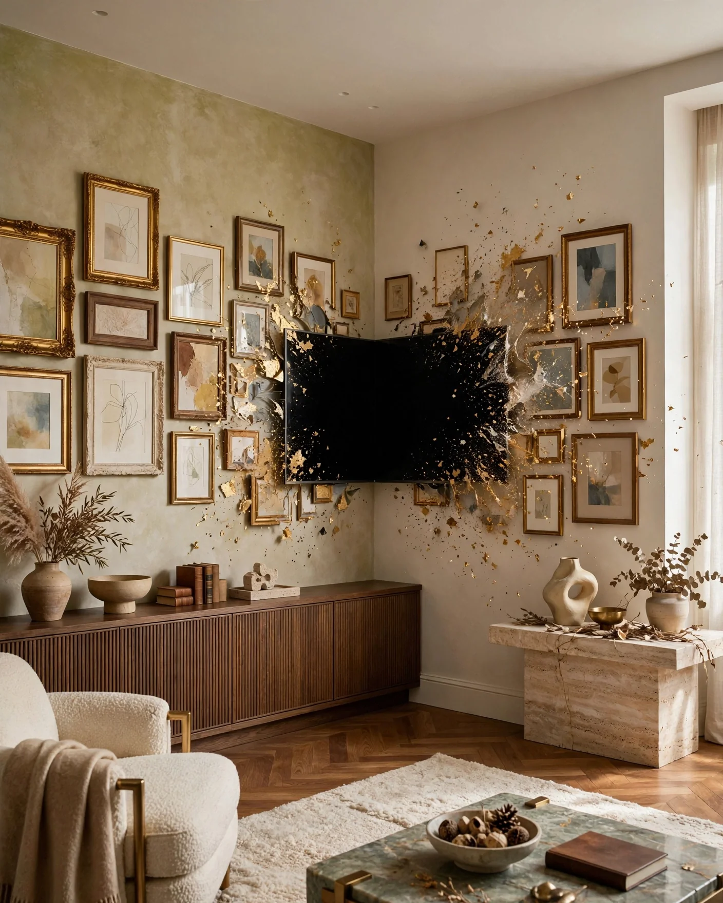
Cluster It Asymmetrically
The relaxed, collected-over-time look: a loose, organic cluster that’s denser near the corner and feathers out onto both walls. Vary the frame sizes freely, let the outer edges stay irregular, and keep only the inner corner arrangement tight. This is the most forgiving formula for beginners because there’s no grid to get wrong. The imperfection is the style.
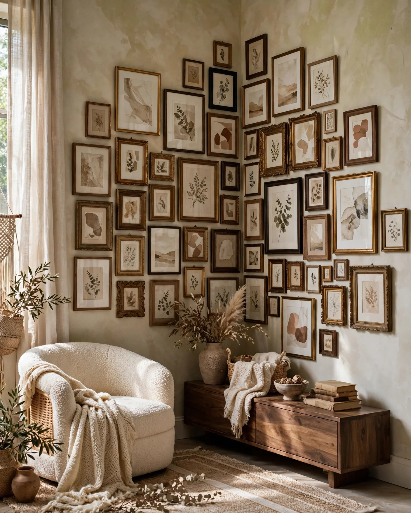
Align Clean to the Inside Edge
The architectural opposite of the cluster: line the inner edges of your frames precisely along the corner’s vertical line, letting the outer edges of the arrangement feather out onto each wall. The crisp inside spine reads tailored and modern.
Designers use this when the room is otherwise minimal and the gallery needs to look composed rather than casual. Sharp inside, soft outside.
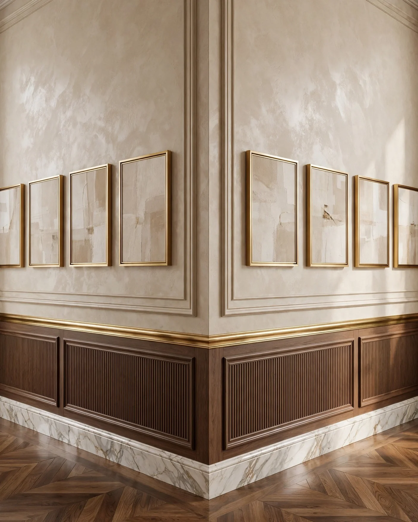
Mix the Frames, Commit to One Thread
Corner galleries handle variety beautifully, but they need one connecting thread or they read as chaos. Choose the constant: all the same frame finish with varied art, or wildly mixed frames unified by black-and-white prints throughout, or one repeated color running through every piece.
Mixed sizes, one gold finish, muted art is the reliable formula. Vary two things, hold one steady.
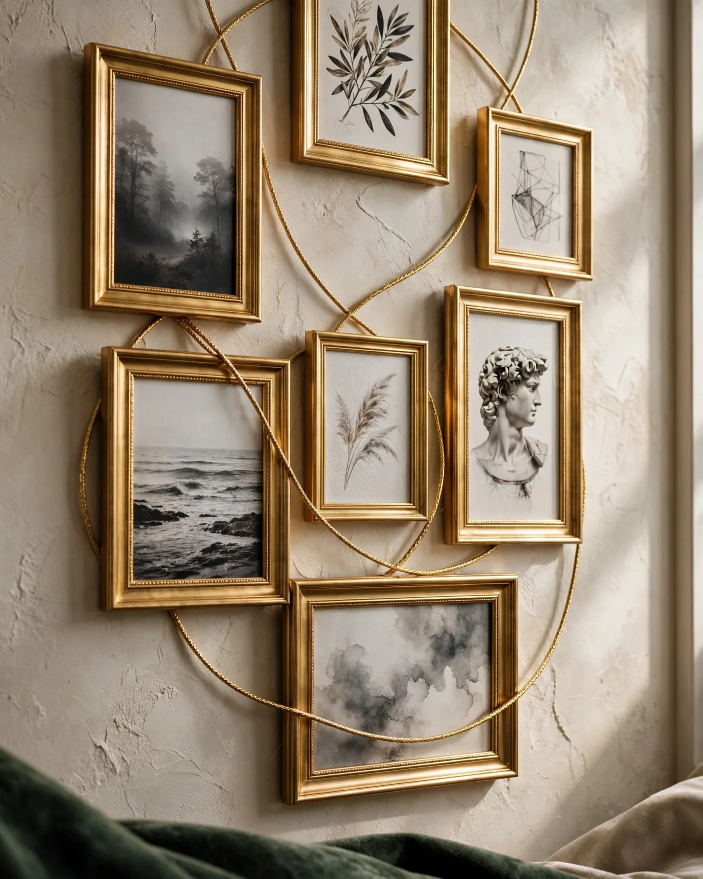
Ditch the Nails, Use Picture Ledges
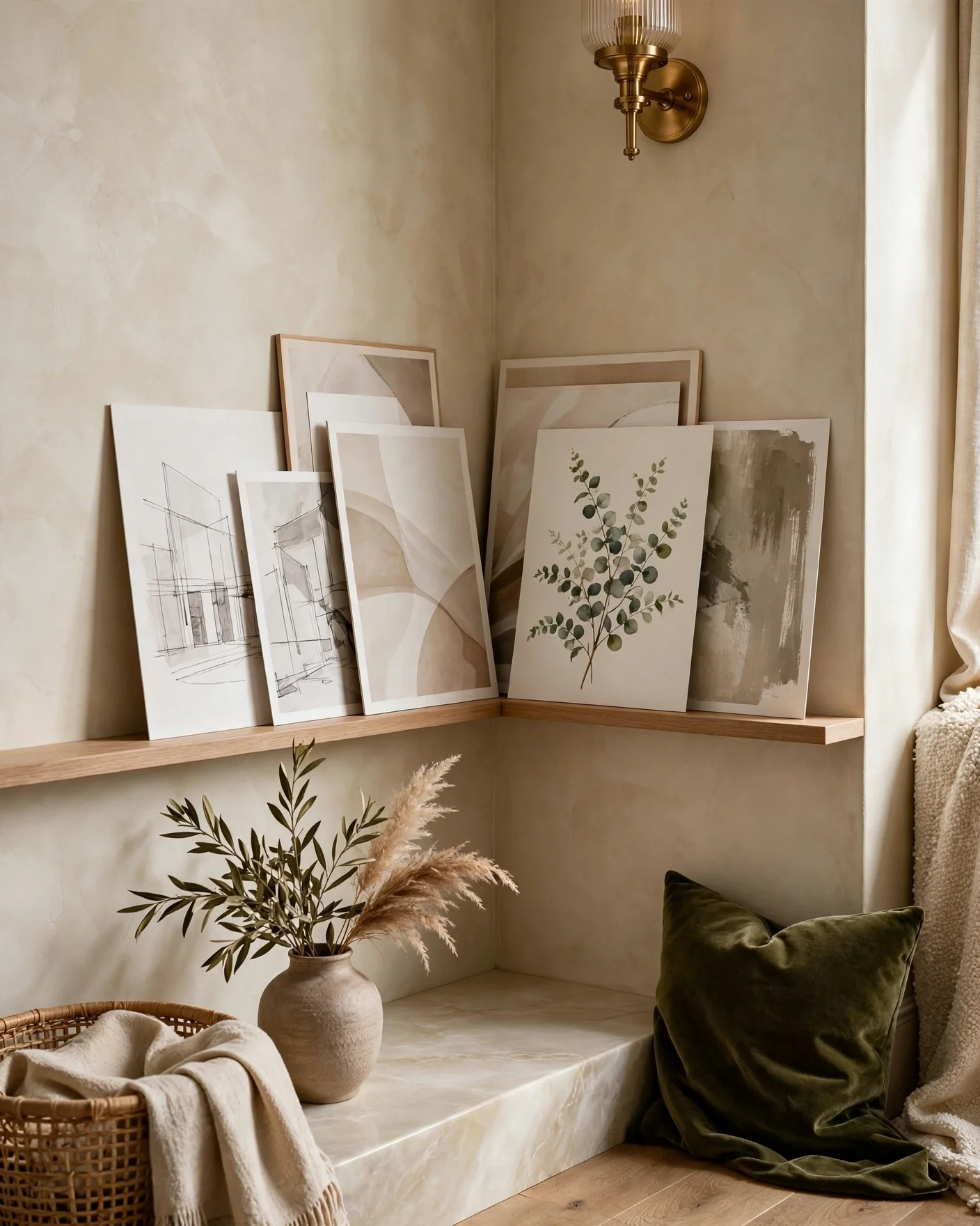
Two slim shelves, one on each wall meeting at the corner, let you lean and overlap prints instead of hanging them. The look is casual and endlessly rearrangeable; swap a print in ten seconds, no fresh holes.
Overlapping frames at the corner where the two ledges meet is what sells the wrap-around effect. Renters and the commitment-shy start here.
Go Beyond Prints
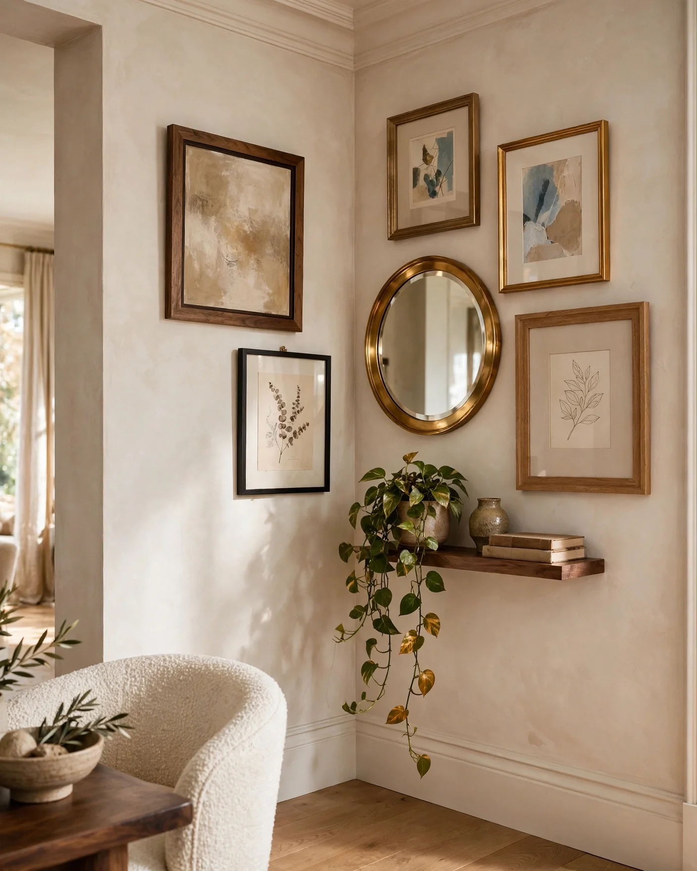
A corner gallery doesn’t have to be flat. Fold in a small wall sculpture, a round mirror catching light, a woven piece, a trailing plant on a corner shelf, an unexpected clock. The depth turns a wall of frames into a three-dimensional moment.
One or two non-print elements per gallery. More than that and the frames lose the argument.
Decide: Moody Black-and-White or Full Color
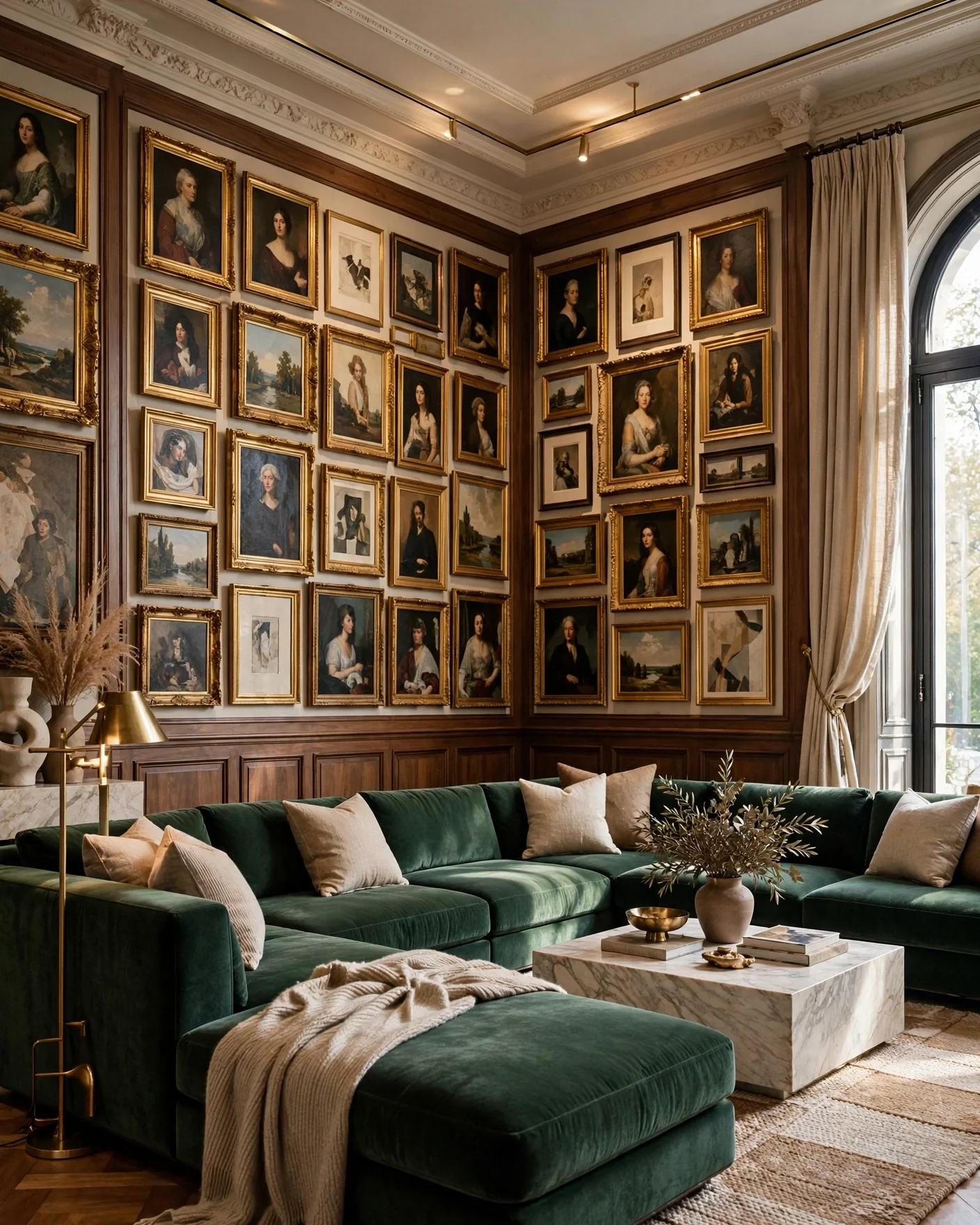
The palette sets the whole mood. Black-and-white prints in matching frames read graphic, calm, and grown-up, ideal for a Scandi corner or a reading nook. A colorful mix with mismatched frames, botanical prints, and a bit of greenery reads boho, warm, and personal.
Neither is wrong. Choose the one that matches the room it turns, and the color scheme already living there.
Fill the Space Behind a Sectional
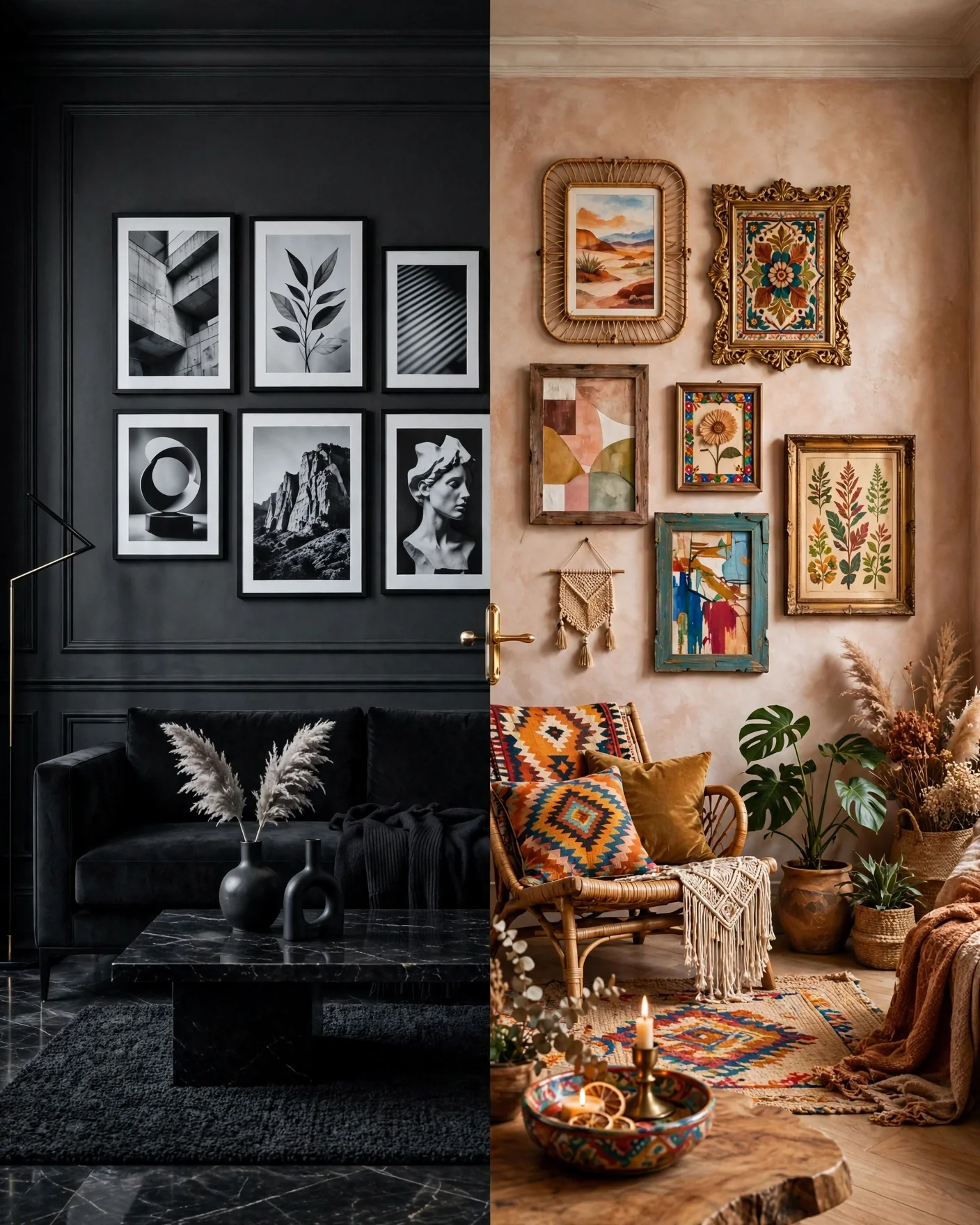
The classic dead zone: the corner a sectional sofa creates behind its back. A gallery wrapping that corner turns wasted volume into the room’s backdrop, visible from the whole living space.
Hang it higher than a standard gallery here, clear of heads and cushions, and let it wrap generously. This corner can take a bigger, bolder arrangement than most.
Rescue the Stairway or Awkward Nook
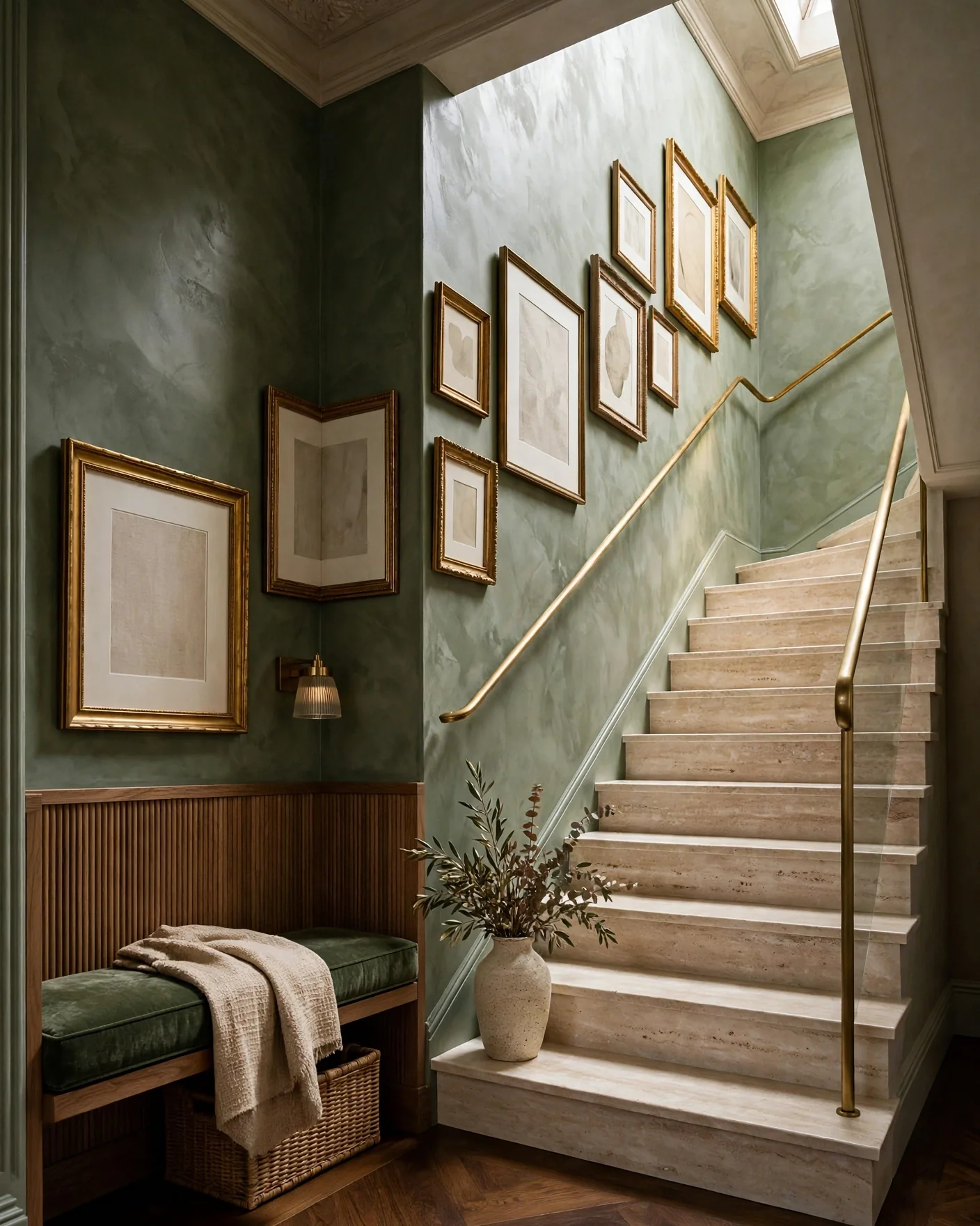
Stairway corners, the turn of an L-shaped hall, the odd triangular nook under a slope; these are the corners begging for a gallery most, because nothing else fits them. Follow the rising line of the stairs with the frame arrangement, or fill the nook’s shape organically.
The awkwardness that made the corner useless is exactly what makes the gallery look custom. Lean into the angle instead of fighting it.
Hang It Right: the Paper Template Method
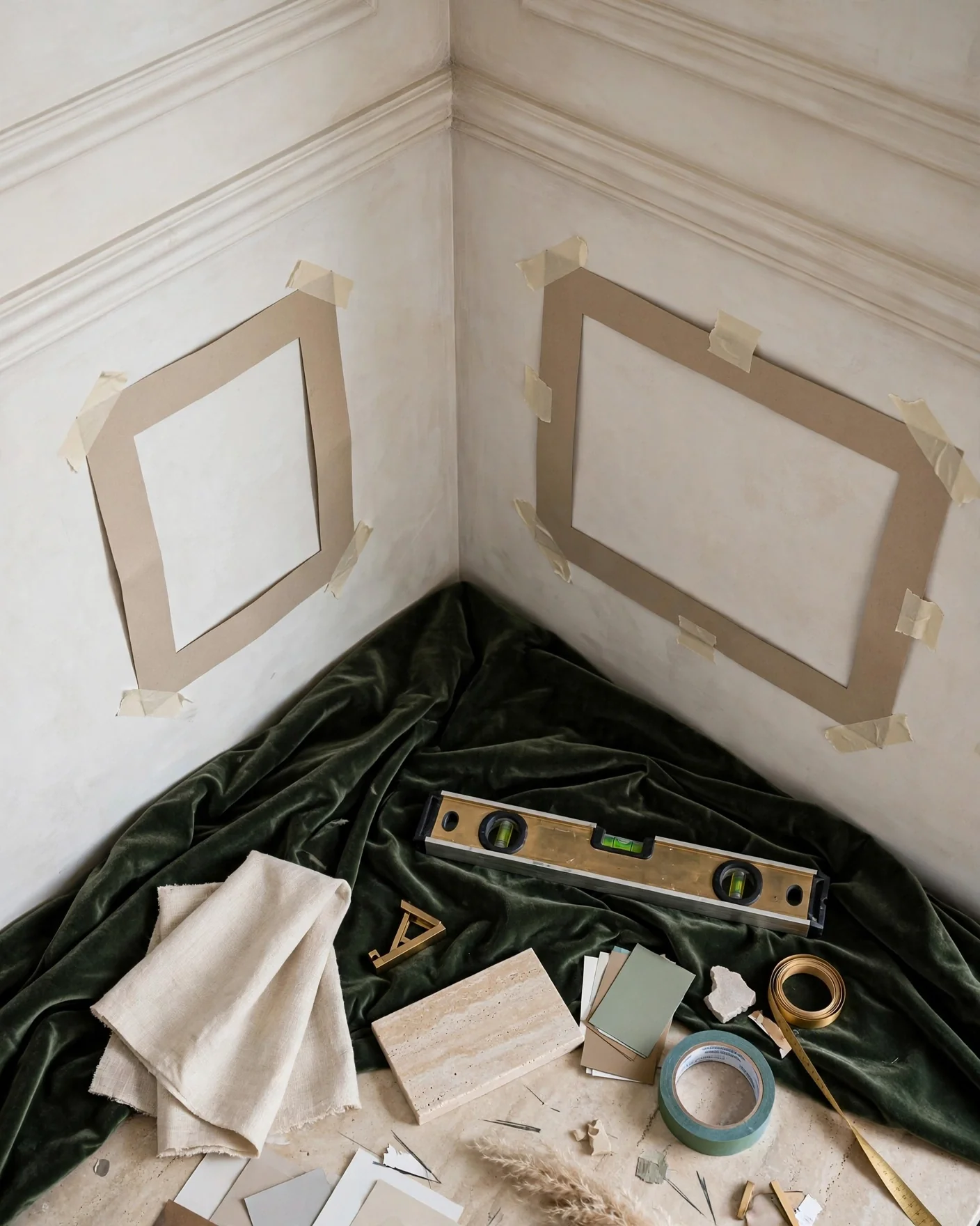
Here’s how the professionals nail a corner without a wall full of test holes. Trace each frame onto paper, cut out the shapes, and tape them to both walls with painter’s tape. Rearrange the paper until the layout and corner spacing look right, then hang each frame where its paper sits, marking the nail spot through the paper before pulling it off.
A small spirit level keeps every frame honest. Measure the corner spacing twice; the fold is the one place a crooked gap shows immediately.
The Renter’s No-Nail Corner Gallery
The complete deposit-safe version: adhesive strips rated for your frame weights, or the twin picture-ledge approach from idea eight, plus lightweight frames and a repositionable layout. Adhesive hooks handle the heavier pieces; strips manage the light ones.
Clean both walls with alcohol first and respect the cure time before loading any weight. Done right, the whole corner comes down at move-out with nothing left behind but a wall you improved for a while, the same renter logic as any rental refresh.
3 Mistakes That Ruin a Corner Gallery
Letting the frames camouflage. Dark frames on a dark wall, white on white; the gallery disappears and the effort with it. Choose frames that contrast the wall color enough to read from across the room.
Mismatched corner spacing. A tidy grid on one wall and a crowded jumble on the other breaks the wrap-around illusion instantly. The gap at the fold and the spacing on both walls have to match, or the eye catches the error every time.
Overcrowding the turn. Cramming the densest cluster right into the corner makes the fold feel heavy and chaotic. Give the corner a little breathing room and let the density build slightly out from it.
FAQs
How do you arrange a gallery wall in a corner? Treat the two walls as one surface folded at the corner: keep frame spacing identical on both sides, and either wrap the arrangement continuously around the turn or align the frames’ inner edges cleanly to the corner line. Plan the layout on paper first so the corner spacing is right before any holes are made.
How much space should be between frames in a corner gallery? Two to three inches (5 to 8cm) is the standard, and the key is consistency, the gap at the corner fold should match the gaps everywhere else. Uneven spacing at the turn is the fastest way to break the composition.
Can I make a corner gallery wall without nails? Yes; use adhesive strips rated for each frame’s weight, or lean prints on twin picture ledges mounted on each wall. Both are renter-friendly, repositionable, and leave the walls intact, ideal for apartments.
What kind of art works best in a corner gallery? Anything with a unifying thread: matching frames with varied art, mixed frames unified by black-and-white prints, or one repeated color throughout. Corner galleries also welcome depth, a small mirror, wall sculpture, or a trailing plant adds dimension the turn shows off well.
Where should I put a corner gallery wall? The best spots are corners the eye already finds: the first corner seen entering a room, the dead space behind a sectional, a stairway turn, or an awkward nook furniture can’t fill. Choosing a corner people actually look at matters more than any layout choice.
Final Thoughts
A corner gallery is the rare decor project that solves a problem and adds beauty at once: it fills the volume rooms waste, connects two walls into one, and turns the angle everyone ignored into the spot everyone notices. Plan it on paper, match the spacing across the fold, and choose a corner worth the attention.
Start by standing in your doorway and noticing where your eye lands. That corner is asking for it.
