

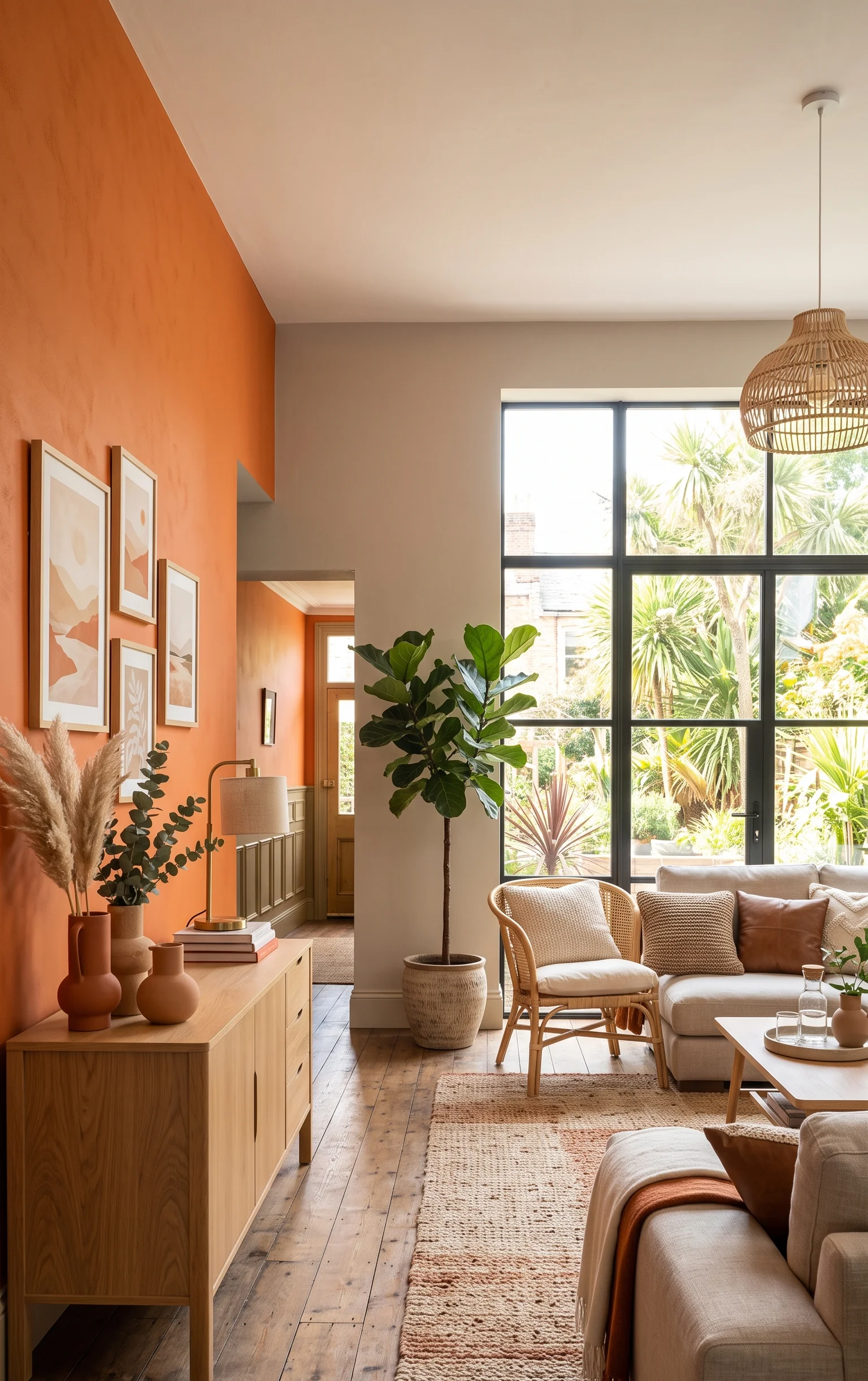
Persimmon is not your usual orange. It is warmer, dustier and somewhere between a sunset and a piece of ripened fruit. This softness is what makes Persimmon still relevant even long after it became color of the year. Persimmon looks daring but does not resemble at all that brash red-orange that your parents used to paint kitchens in the early 2000s.
The trick with persimmon isn’t choosing whether to use it. It’s choosing where, and what to put next to it. Below are 17 persimmon accent wall ideas for 2026 that show off this shade at its best, from quiet pairings to genuinely daring ones.
Classics That Never Go Out Of Style
Persimmon With Clean White Accents
In its most basic form, the idea involves a persimmon-colored wall accompanied by white trim and baseboard. This helps avoid making the wall look too heavy, adding an architectural element to the wall color. This is especially true in entryways where making a strong first impression is essential.

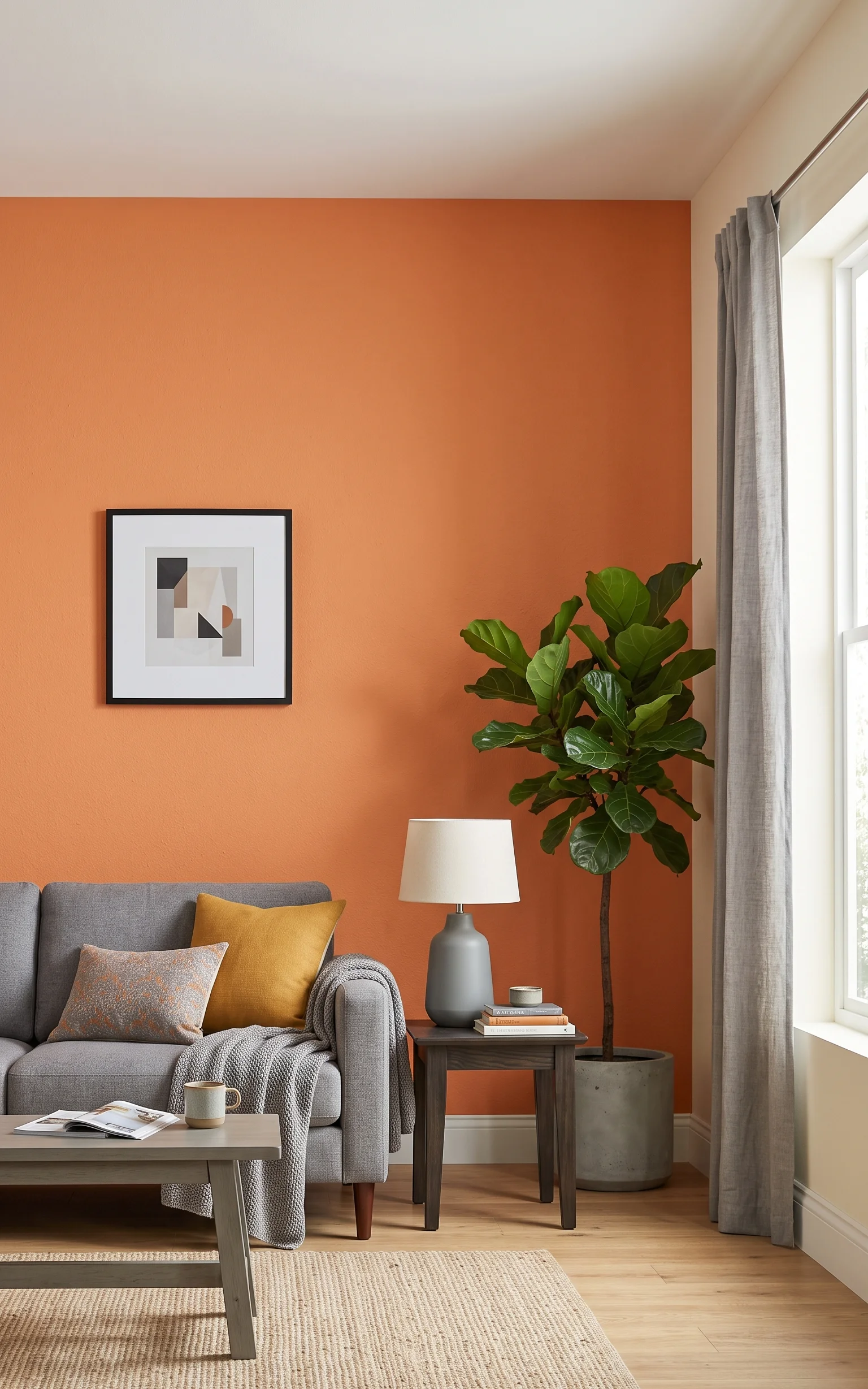
Persimmon and Soft Gray
While persimmon’s vibrancy would be muted by the gray tone without losing any of its warmth, the pairing comes across as more refined than using white. It is well suited for living spaces where color but not showiness is desired. The gray furniture against the wall allows the persimmon to remain the focus of the space.
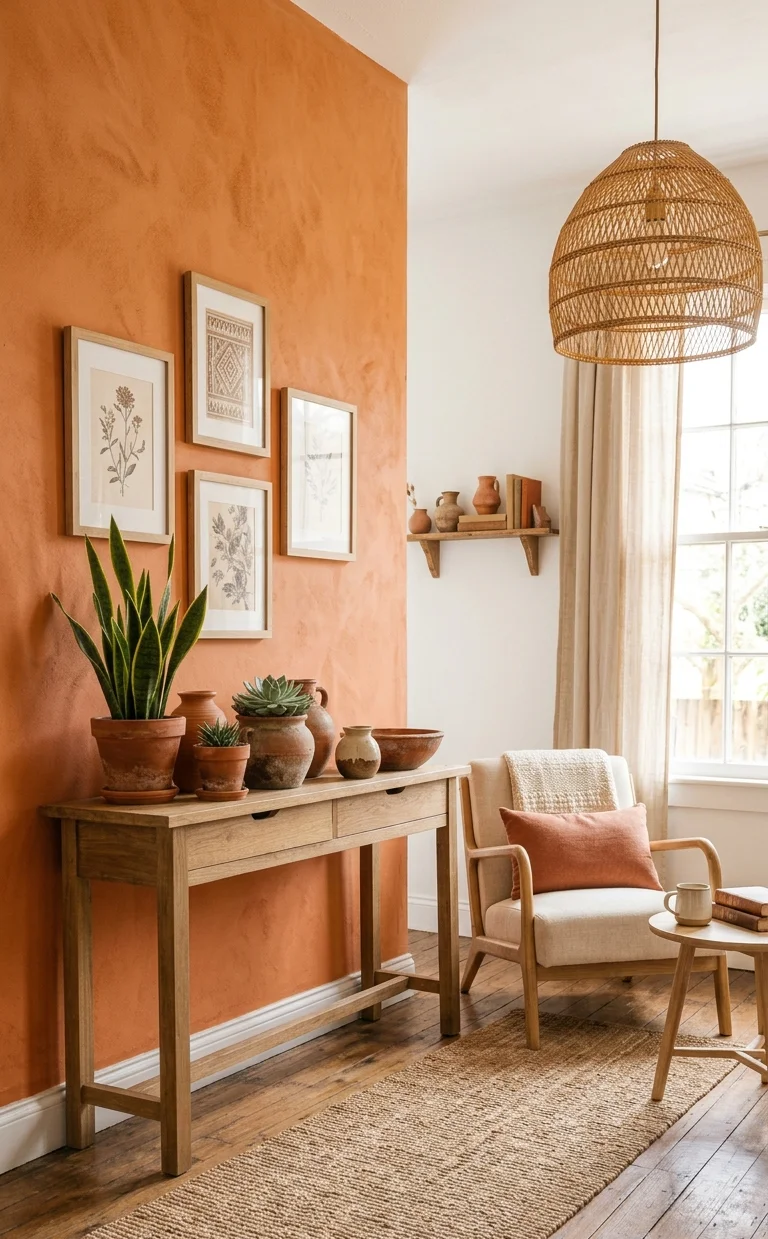
Persimmon and Warm Cream
The combination of persimmon with an off-white cream color as opposed to a pure white color maintains consistency within the whole palette, since both colors belong to the warm range.
This is probably one of the easiest methods to incorporate persimmon into a neutrally colored interior space.
Persimmon Behind a White Leather Sofa
A simple white leather couch set against the backdrop of a persimmon colored wall gives the space a sort of tropical, or resort vibe. The simplicity of the leather offsets the warmth of the wall without making the entire room look too chaotic. Two large potted plants help to reinforce that vibe.
Bold Contrast Combinations
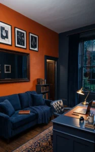
Persimmon and Deep Navy
Pairing persimmon with a deep navy creates real visual tension, the kind that makes a room memorable. The cool depth of the navy balances persimmon’s heat almost perfectly, since the two sit roughly opposite each other on the color wheel.
This combination works well in a den or home office where you want energy without losing focus.
Persimmon and Sky Blue Accents
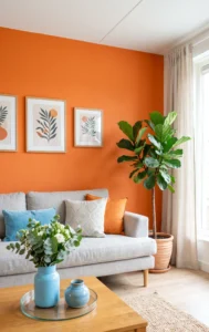
Instead of committing to a navy blue wall, one can use elements of sky blue from pillows, paintings, or even a vase to provide contrast against persimmon. Since the two colors contrast each other very well, their combination will come out as naturally beautiful. This is an easy way of testing the effect of the two colors before getting carried away.
Persimmon and Charcoal Gray
A darker, more dramatic gray pulls persimmon toward a moodier, richer feeling than its usual cheerful reputation suggests. This pairing suits a media room or a space meant for evening use, where the lighting will already be warm and low.

Earthy and Natural Pairings
Persimmon and Terracotta
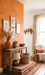
Keeping persimmon in its own warm color family, paired with terracotta accents through pottery, rugs, or pillows, creates a layered, sun-baked look that feels intentional rather than matchy.
This tonal approach is forgiving, since nothing has to match exactly, just stay in the same warm range.
Persimmon and Natural Wood Tones
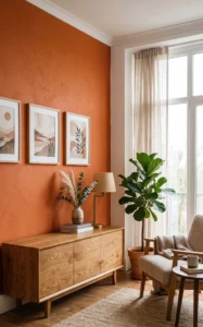
Wood furniture, particularly those made from oak and walnut, will tone down persimmon so that it doesn’t appear overly intense or unnatural. This is probably the easiest color combination to live with, due to the fact that wood furniture works well in any home.
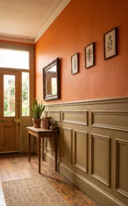
Persimmon and Khaki Wainscoting
A khaki-toned wainscoting panel below a persimmon wall splits the color story into two complementary warm layers, adding architectural structure to the room at the same time.
This combination has a slightly vintage, collected feel that suits older homes with existing trim details.
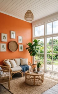
Persimmon With Wicker and Jute Textures
Wicker chairs and a jute rug on a persimmon-colored wall contribute to textures that help ease the aggressiveness of the color. Natural and woven elements will feel very grounded alongside such an aggressive color like persimmon. This combination gives a very sunroom-y, relaxed atmosphere to the room, despite its lack of natural light.
Where to Use It in Your Home
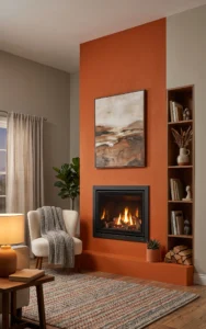
As a Fireplace Focal Wall
Painting the wall behind a fireplace in persimmon turns it into the obvious anchor of the room, especially when the rest of the walls stay neutral. The warmth of the color echoes the warmth of the fire itself, which is part of why this pairing feels so natural.
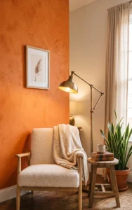
Behind a Reading Nook
A small persimmon wall behind a single armchair and reading lamp creates a cozy, defined nook within a larger room, without needing to commit to painting the whole space. This works particularly well in a corner that’s felt a little undefined or purposeless before.
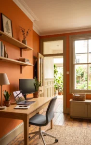
In a Home Office for Energy
Persimmon’s energizing quality makes it a strong choice for a home office wall, especially one facing the desk rather than behind it, so you actually get to look at it during the day. Pair it with simple, uncluttered shelving so the wall stays the visual focus rather than competing with paperwork and decor.
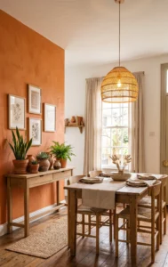
As a Dining Room Statement Wall
Warm colors are known for making food and conversation feel more inviting, which makes persimmon a natural fit for a dining room wall. Paired with a simple wood table, the color does most of the personality work in the room.
Textured and Modern Takes
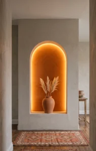
Persimmon on a Single Architectural Niche
Rather than a full wall, applying persimmon inside a single recessed niche or arch adds a pop of color in a controlled, contained way. The surrounding neutral wall keeps the rest of the room calm while the niche becomes a small, glowing focal point.
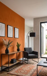
Persimmon Paired With Matte Black Fixtures
Matte black light fixtures, hardware, or furniture legs against a persimmon wall add a modern, slightly industrial edge that keeps the warmth from feeling too soft or whimsical. This combination works well in a space that wants color but still leans toward a more contemporary, structured aesthetic.
Things to Keep in Mind Before Applying Persimmon Paint
Here are some of the things you should know about persimmon paint before applying it:
It is highly sensitive to lighting conditions. It appears more orange during daylight and the red tone starts to appear under artificial warm lighting. You should see how it looks like at different times of the day.
Choosing the right trim color is essential.
The problem with white color paint is that the base is always blue toned, which might clash with persimmon. Therefore, choose a warm white paint.
Only one wall should be enough. Since persimmon is quite an expressive color, one wall is sufficient to produce the desired effect.
A Few Final Thoughts
Persimmon needs a bit of restraint. Those spaces that get it just right are the ones that complement persimmon with one or two other mellow colors like wood or white. If you are not sure yet, go smaller than wall color. A persimmon pillow, vase, or artwork will give you pretty much the same information about how much you’ll love persimmon as a can of paint would.
FAQs
What colors go best with a persimmon accent wall?
Crisp white, soft gray, warm cream, and natural wood tones all pair easily with persimmon. For bolder contrast, deep navy or sky blue work well since they sit opposite persimmon on the color wheel.
Is persimmon too bold for a small room?
It might not necessarily be true since persimmon has medium light reflectance and hence won’t darken the room the way most people expect it. Besides, using persimmon on just one accent wall, rather than four walls, is another way to prevent overwhelming the room.
Does persimmon appear differently depending on the lighting?
Yes, in daylight, the orangish tones in persimmon are prominent while under warm artificial light at night, the red tones of persimmon come into play.
Which room should I choose for my persimmon accent wall?
All living, dining, entry, and home office rooms would do nicely because of the warm nature of the persimmon that is usually associated with creating an energetic space.
Is persimmon an in-trend color in 2026?
Yes. Persimmon color still retains its popularity despite having been chosen as a color-of-the-year previously.
Which white is best used for my persimmon accent wall?
Warm white would blend much better with the persimmon color because it has the same base as it.
