

Most colour guides recycle the same five shades with different names. Sage, terracotta, and navy show up everywhere, and they’re lovely, but they’re not the only directions worth considering this year. There’s a whole second tier of colours quietly gaining ground in 2026, ones that feel just as current but haven’t been talked about quite as much.
Below are 21 living room colour schemes built around those less-expected shades, each one with a clear, livable pairing so you’re not left guessing what to put it with.
Rust and Spice-Toned Schemes
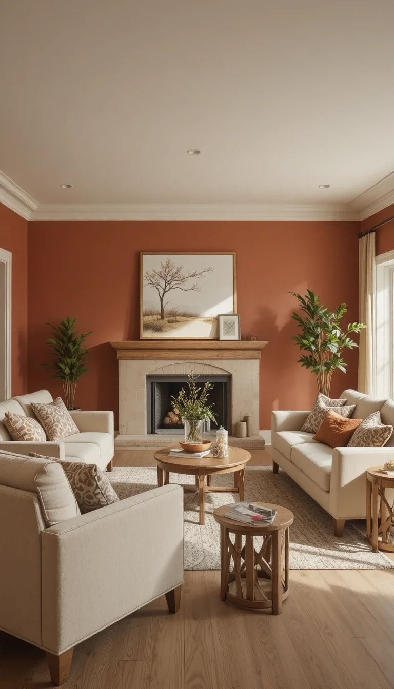
Rust and Soft Oatmeal
Rust has more depth than a typical orange, with a slightly faded, vintage quality that feels grounded rather than loud. Paired with oatmeal-toned furniture, it stays warm without tipping into overwhelming.
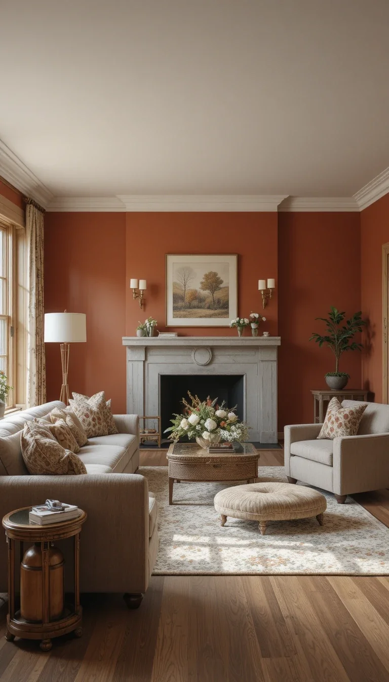
Cinnamon and Warm Gray
Cinnamon brings a spiced, reddish-brown warmth that pairs surprisingly well with a cooler warm gray, balancing heat with calm.
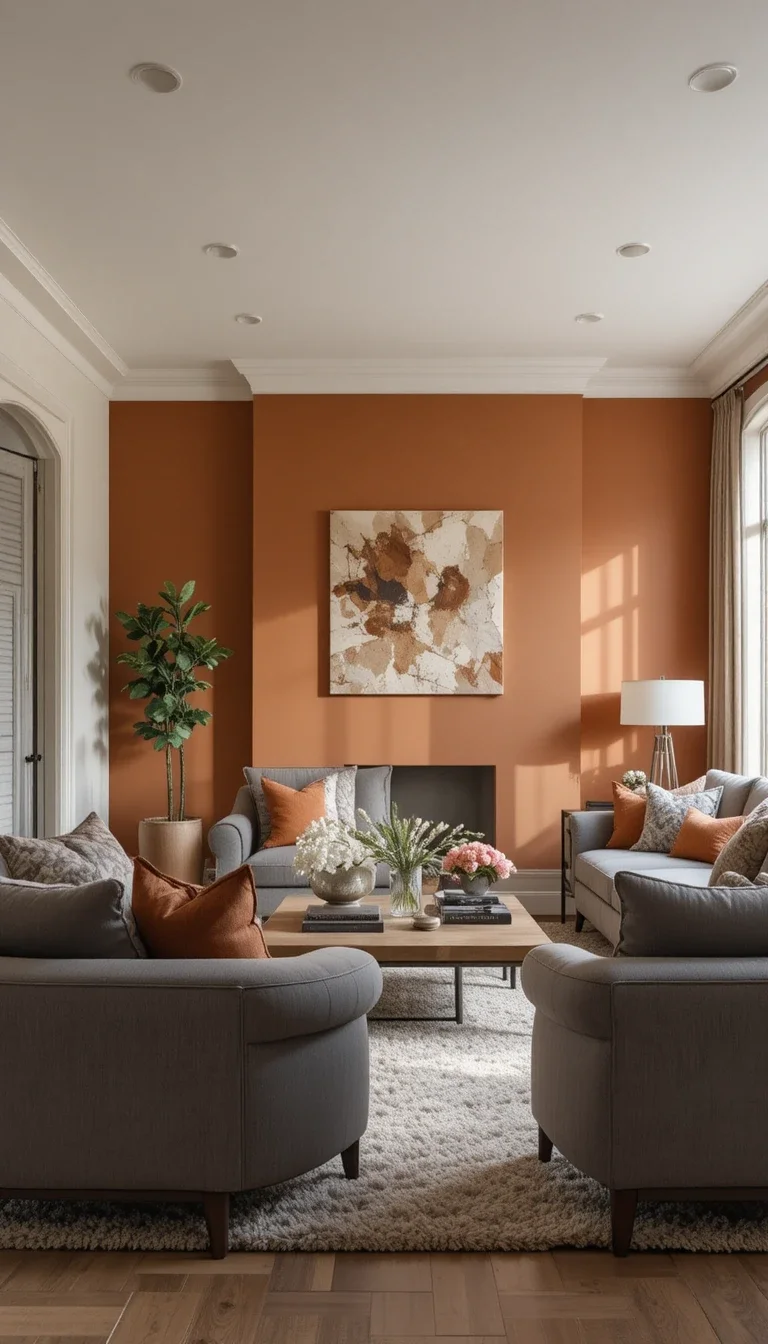
Paprika and Cream
A bold paprika red-orange works best in small doses, like an accent wall or a single statement chair, balanced against a soft cream backdrop.
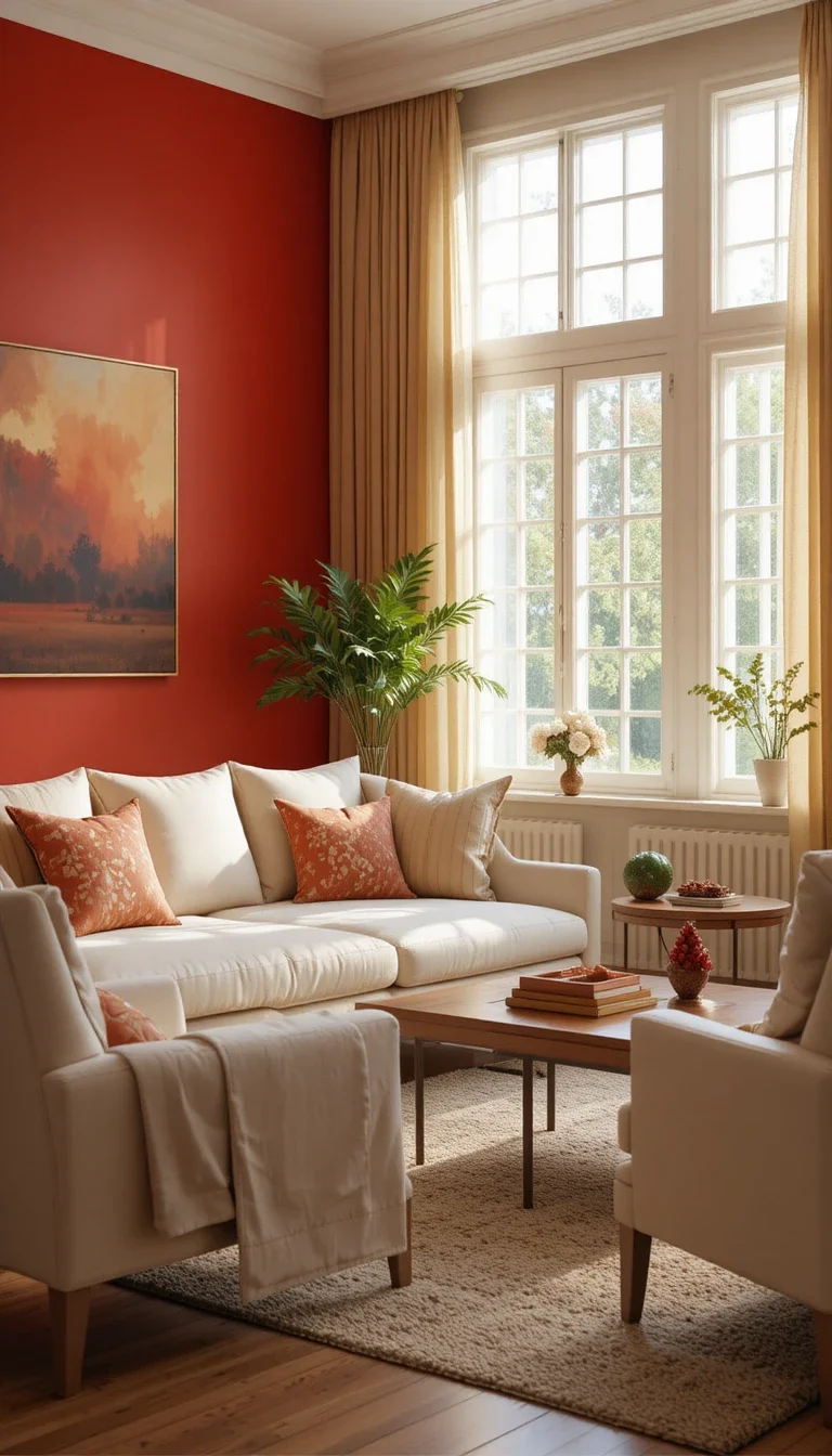
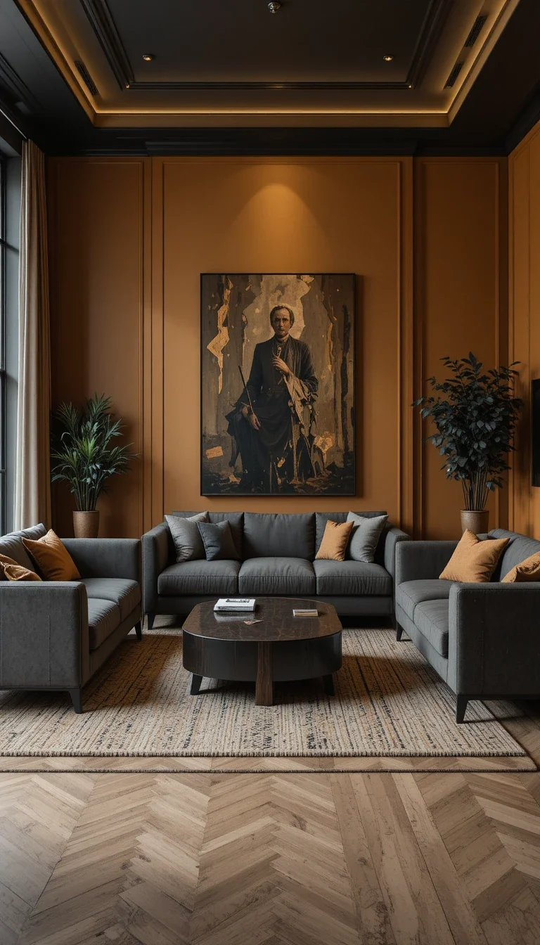
Ochre and Charcoal
Ochre’s golden-yellow undertone feels rich and a little unexpected, especially when grounded by charcoal furniture or trim to keep it from feeling too sweet.
Muted Pink and Mauve Schemes
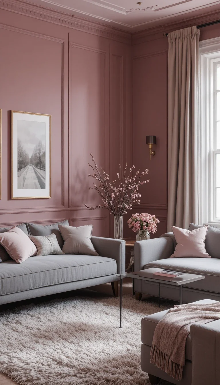
Mauve and Soft Gray
Mauve sits between pink and purple, giving it a quiet sophistication that a true pink doesn’t always have. Paired with soft gray, it feels calm and a little moody.
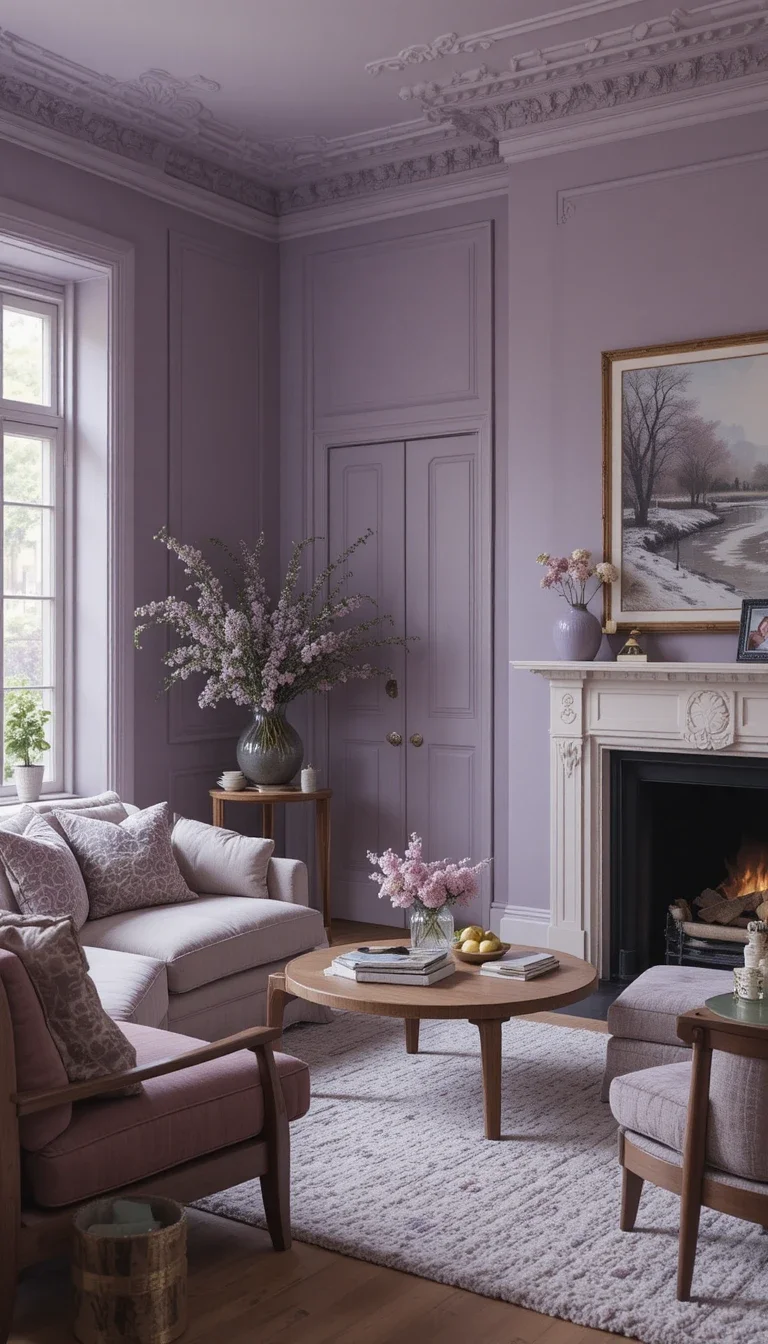
Dusty Lavender and Walnut
A faded, dusty lavender feels grown-up rather than girlish, especially when paired with rich walnut wood tones that ground the softness.
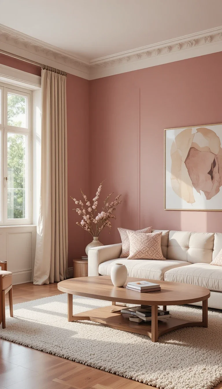
Rosewood and Cream
Rosewood carries a deep, brownish-pink quality that reads more like a neutral than a true color, making it an easy base for almost any accent.
Slate and Cool Stone Schemes
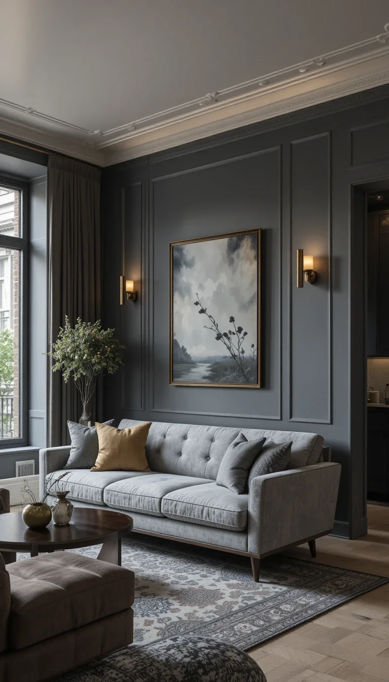
Slate Gray and Warm Brass
Slate gray has a cooler, almost blue-leaning depth that feels modern and a little architectural, especially when warmed up with brass lighting and hardware.
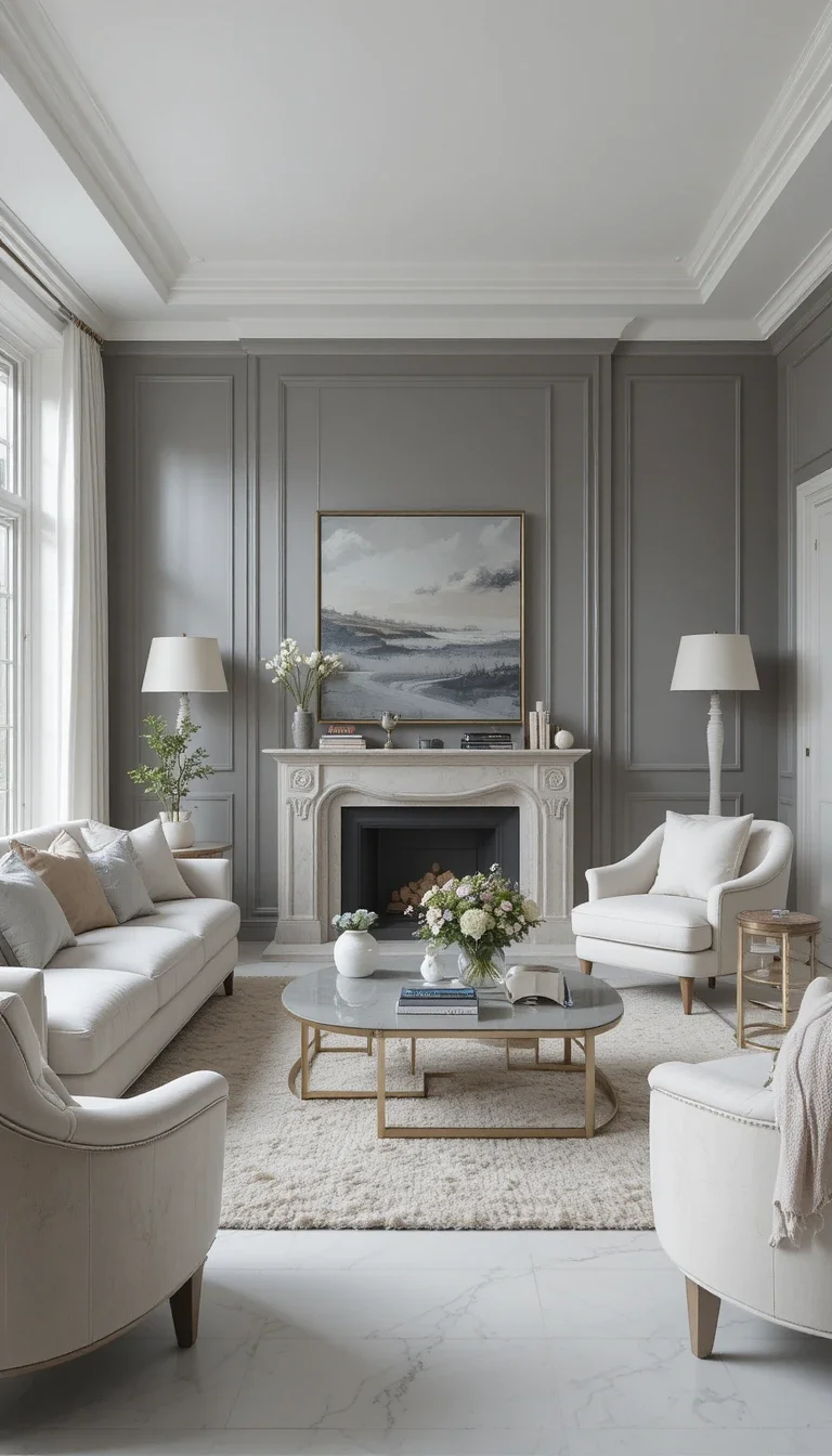
Pewter and Soft White
Pewter sits between gray and silver, offering a slightly metallic, cool sophistication that pairs cleanly with soft white furniture.
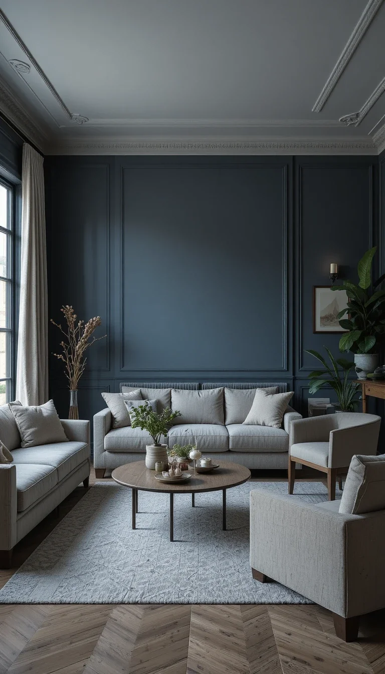
Storm Blue and Natural Linen
A deep, stormy blue-gray feels moody without being dark, especially balanced against natural linen textures that soften the overall tone.
Bottle Green and Deep Botanical Schemes
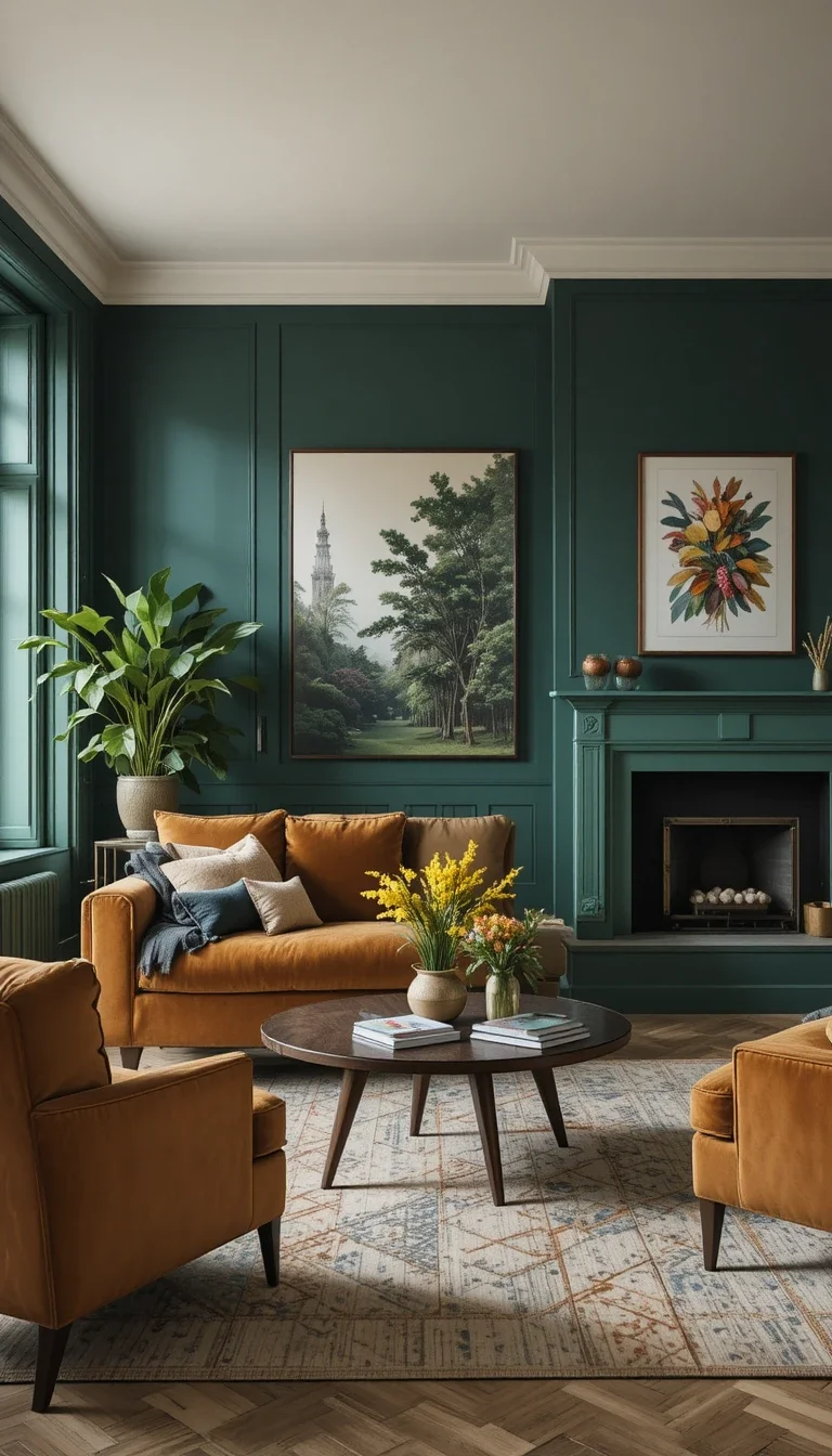
Bottle Green and Camel
A darker, more saturated bottle green than the usual sage or olive, paired with camel furniture for warmth and balance.
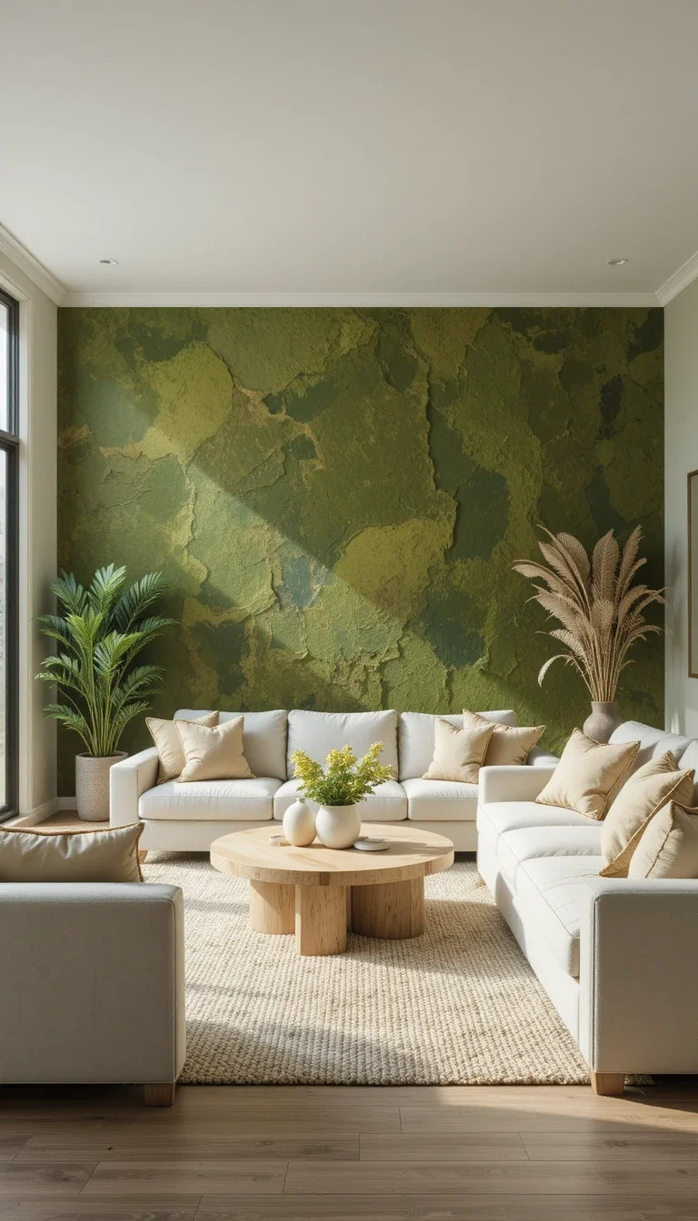
Moss and Warm White
Moss green leans more brown than typical greens, giving it an earthy, almost neutral quality that works as a calm backdrop for brighter accents.
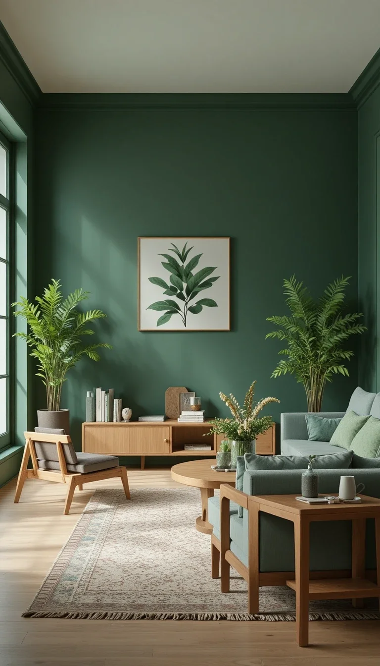
Juniper and Natural Wood
Juniper green has a slightly blue undertone that feels fresh and a little unexpected, especially paired with natural, unfinished wood tones.
Warm Sand and Desert-Inspired Schemes
Desert Sand and Rust
A warm, sun-bleached sand tone paired with a rust accent creates a sense of warmth that feels pulled from a desert landscape rather than a typical neutral palette.
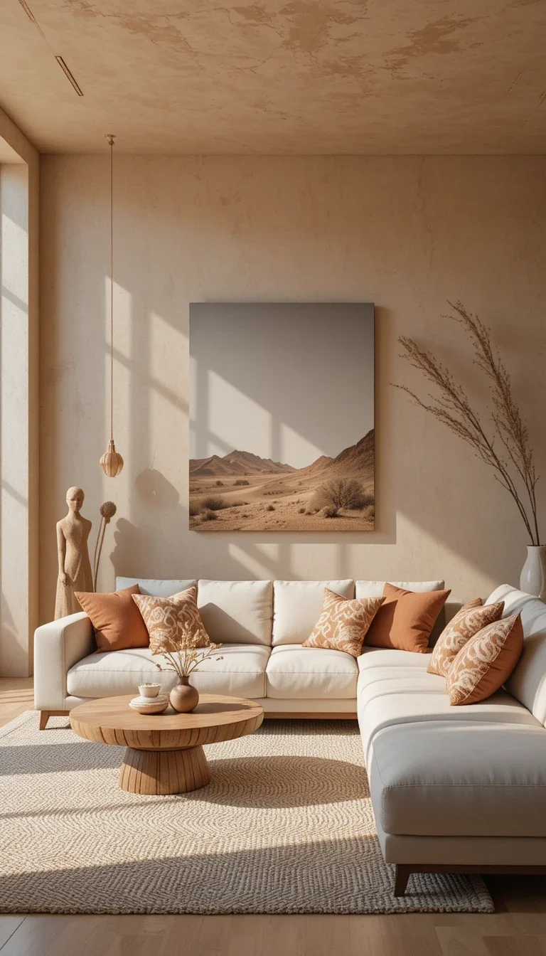
Adobe and Soft Cream
Adobe, a warm, slightly pink-toned clay colour, pairs naturally with soft cream furniture for a sun-warmed, southwestern-inspired feel.
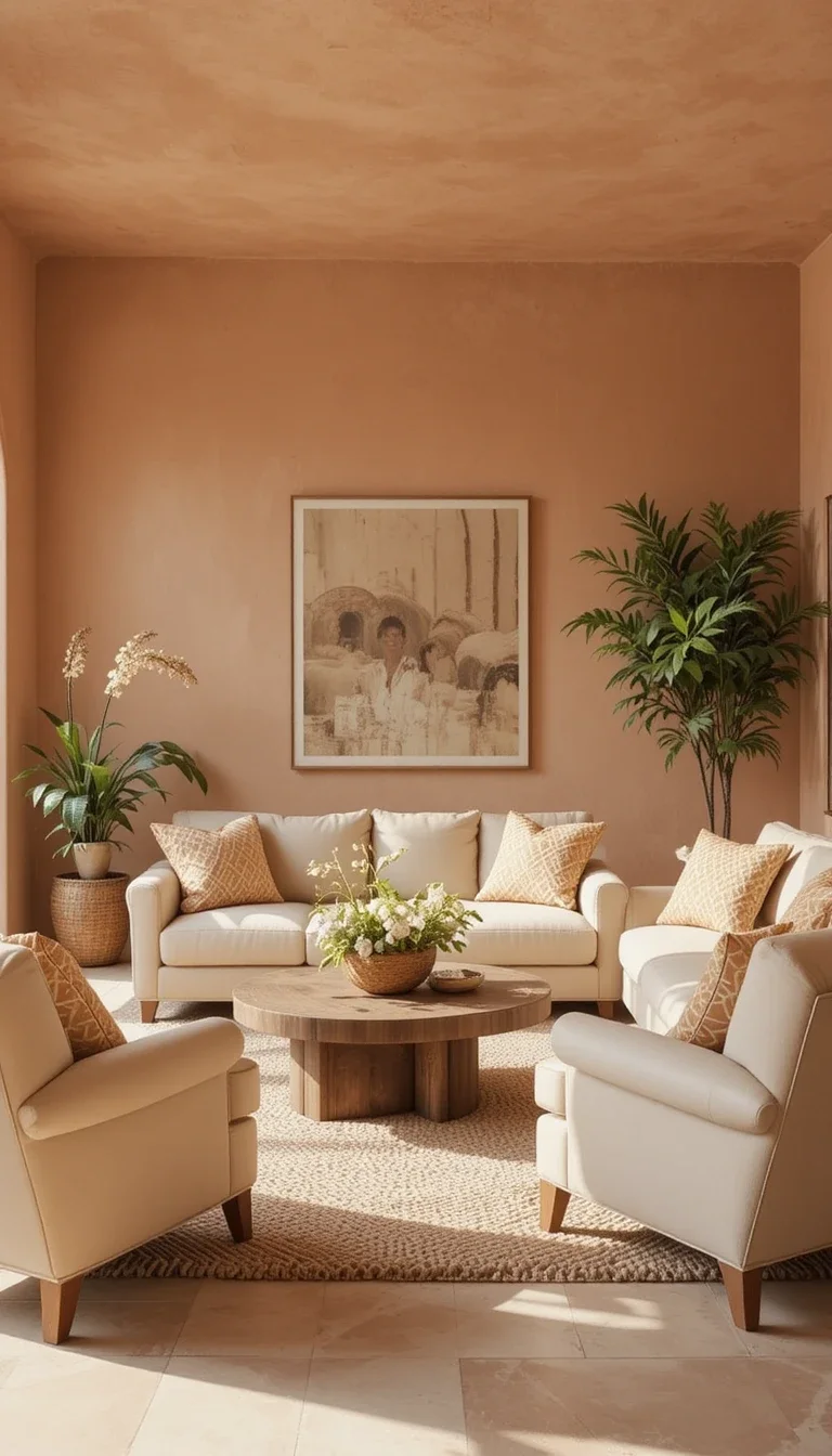
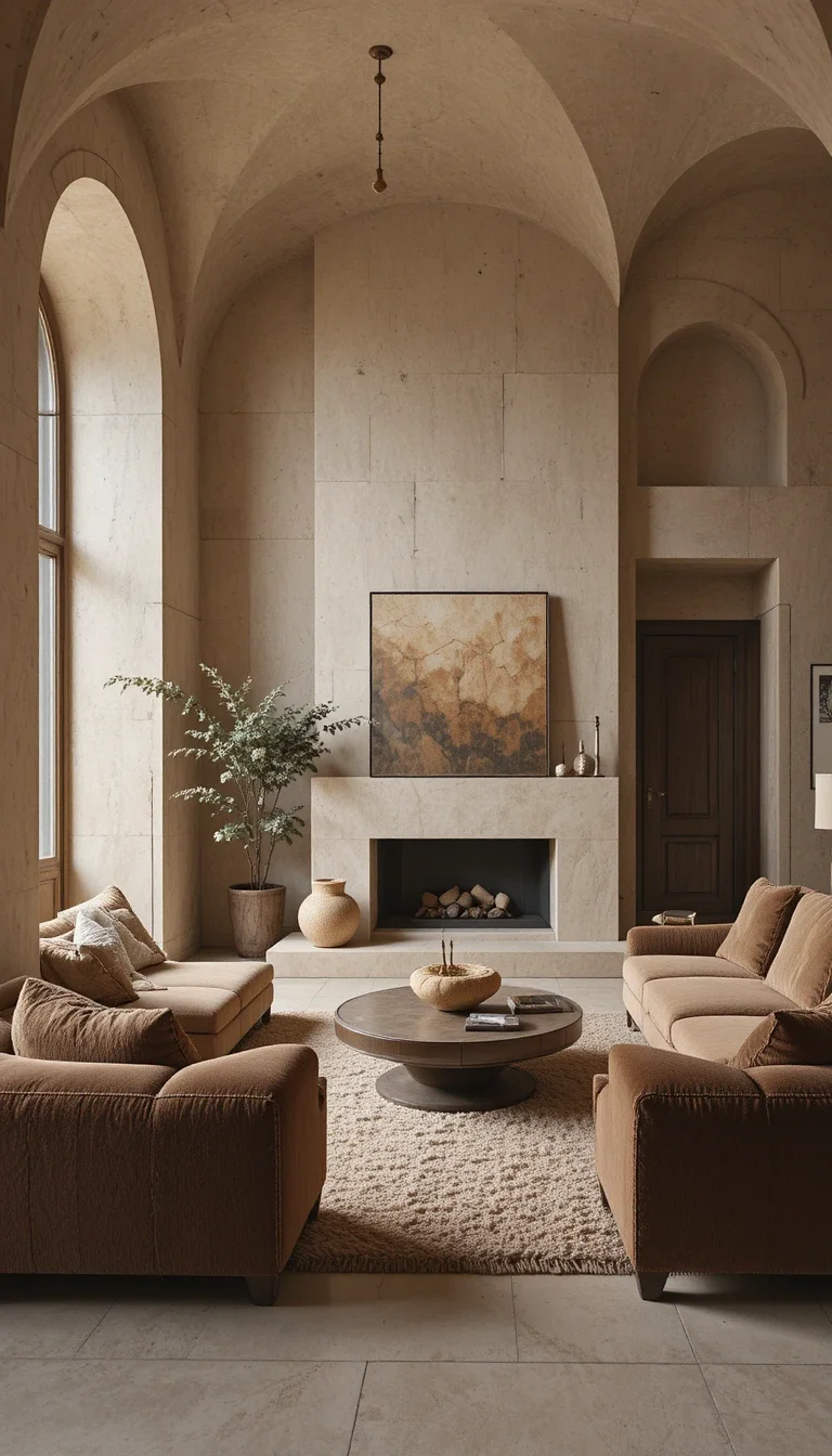
Sandstone and Deep Brown
Sandstone’s pale, warm neutral tone pairs well with deep brown furniture, creating contrast without needing any bold accent colour at all.
Unexpected Bold Schemes
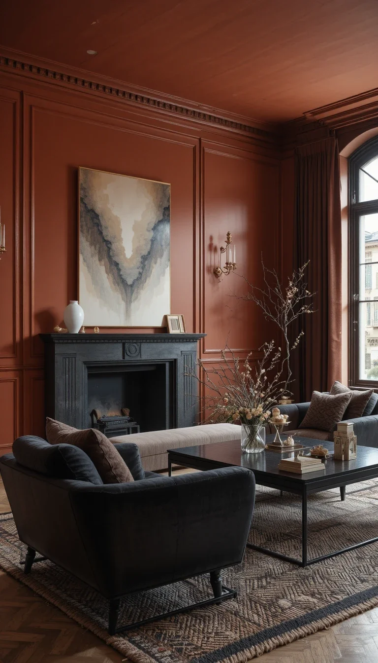
Burnt Sienna and Soft Black
Burnt sienna, a deep reddish-brown, feels rich and grounded when paired with soft black accents through furniture legs or frames.
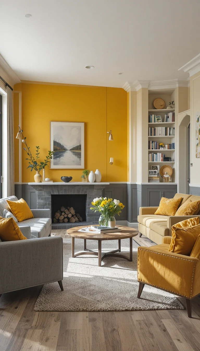
Marigold and Warm Gray
A true marigold yellow is bold but works in small, intentional doses, like an accent wall, balanced against a calmer warm gray base.
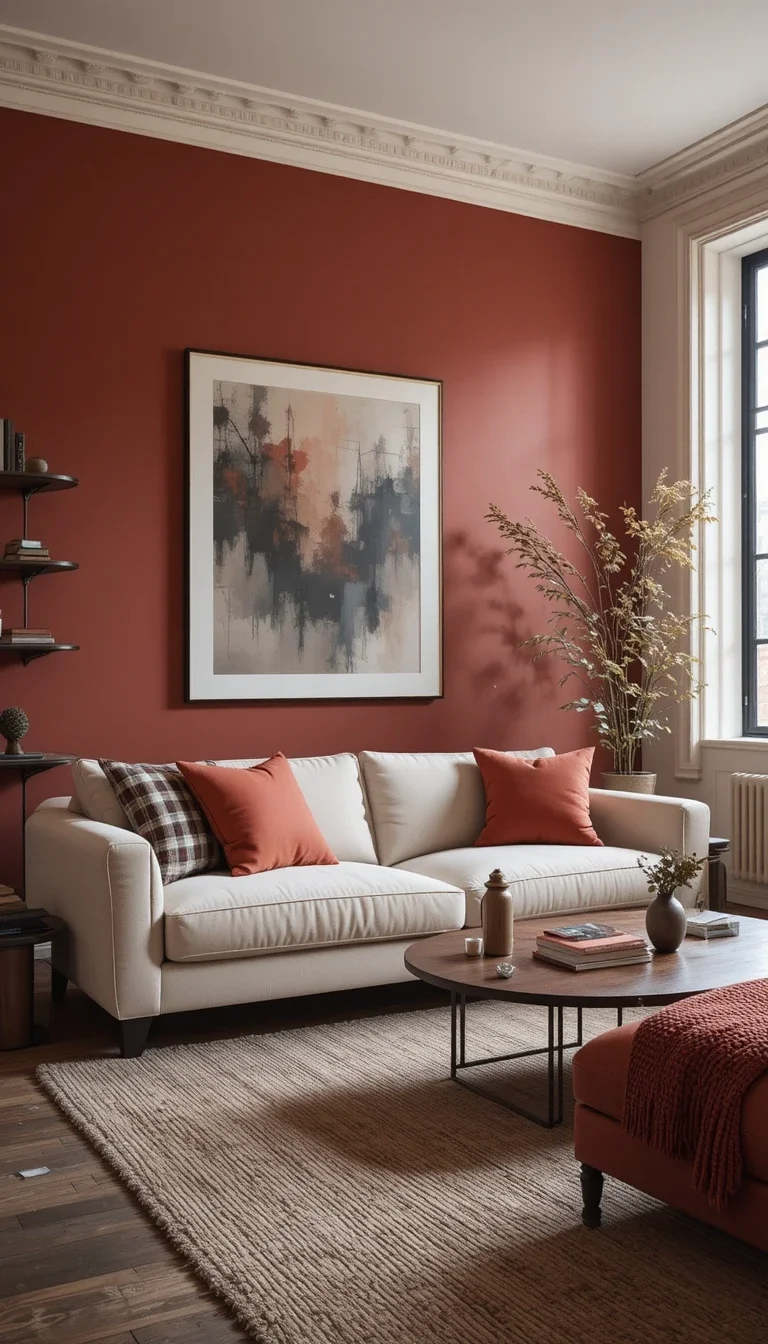
Brick Red and Cream
A muted, slightly dusty brick red feels less intense than a true red, especially when paired with cream furniture to soften the overall look.
Layered Neutral Schemes With a Twist
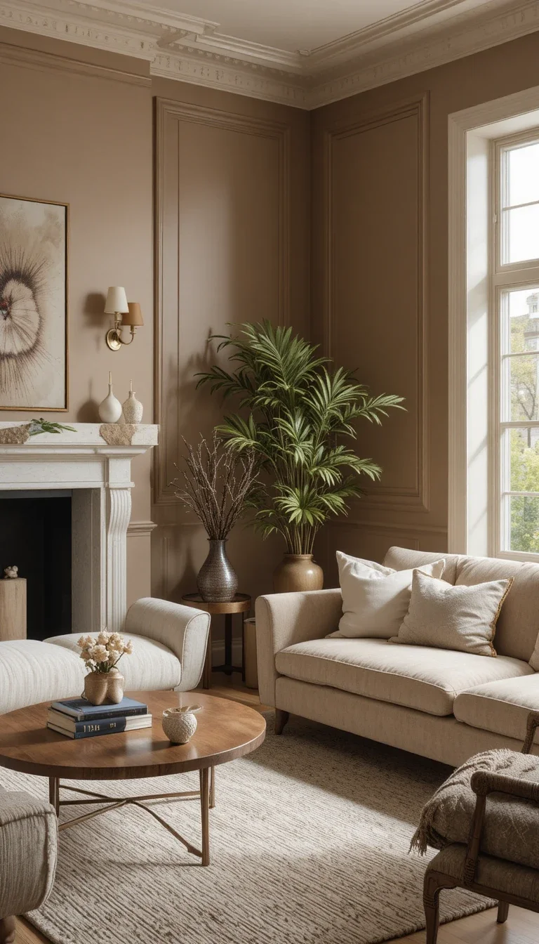
Putty and Warm Brass
Putty, a soft, slightly grayish beige, feels current and understated, especially when paired with warm brass accents for a touch of shine.
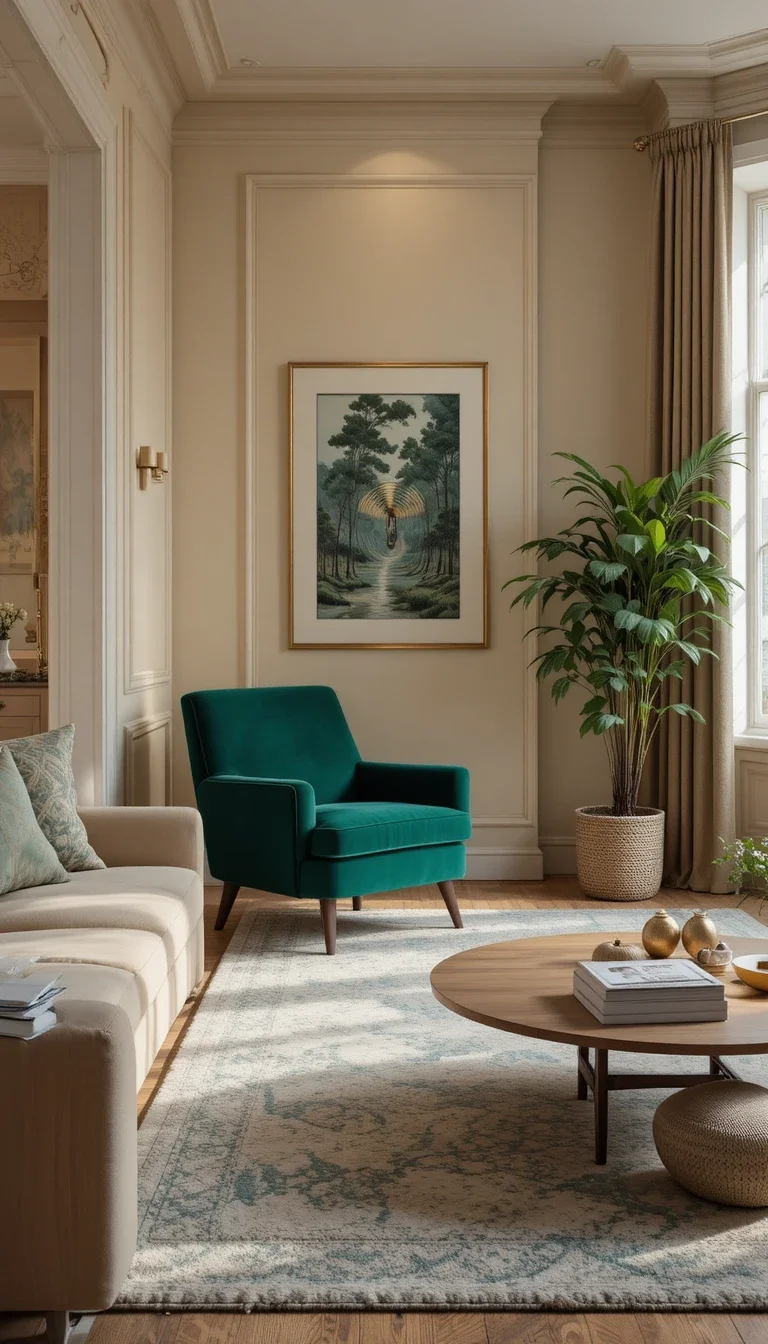
Biscuit and Deep Forest
A warm, biscuit-toned neutral base paired with a single deep forest green accent, through a chair or large plant, adds depth without committing to a fully colourful room.
A Few Final Thoughts
The most interesting living rooms usually aren’t built around the colour everyone’s already talking about. They’re built around a shade that feels like it belongs to the room, not the trend report.
If one of these combinations catches your eye but feels like a bigger leap than you’re ready for, start small. A single throw pillow in rust or a vase in dusty lavender will tell you more about whether you’ll actually love it than staring at a paint chip ever will.
Frequently Asked Questions
What are some unique living room colour schemes besides sage and terracotta?
Rust, mauve, slate gray, bottle green, and dusty lavender are all gaining attention in 2026 as alternatives to the more commonly discussed neutrals and earth tones.
Is mauve a good colour for a living room?
Yes. Mauve sits between pink and purple, giving it a muted, sophisticated quality that pairs well with grays, walnut wood, and soft neutrals.
What colour pairs well with rust in a living room?
Soft oatmeal, warm gray, and cream all pair well with rust, since they balance its warmth without competing for attention.
Is bottle green different from sage or olive green?
Yes. Bottle green is darker and more saturated than sage or olive, giving it a richer, more dramatic presence in a room.
What is a good colour scheme for someone who wants something different from typical neutrals?
Consider warmer, less common tones like cinnamon, adobe, or burnt sienna paired with a simple neutral base, which offers personality without feeling overly trendy.
Do these colour schemes work in small living rooms?
Many of them do, especially when the bolder tone is used as an accent rather than across all four walls. Lighter pairings like putty and brass or sandstone and brown also work well in smaller spaces.
