

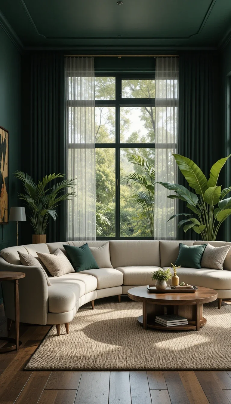
Most living rooms don’t need a renovation. They need editing. The difference between a space that feels “almost right” and one that feels finished usually comes down to a handful of decisions about texture, light, and restraint, not a bigger budget or a full teardown.
Below are 19 ways to bring a living room into 2026, each one something you can do this weekend without moving a wall. Start with the ones that fix whatever bothers you most when you walk in.
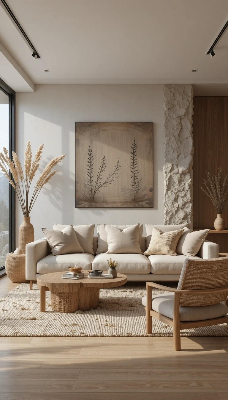
Mix at Least Three Natural Textures
Rooms that feel warm almost always have texture doing the work, not colour. The reason a flat, all-matching room feels lifeless is that every surface reflects light the same way.
Aim for three contrasting materials in every seating area: something woven (a rattan chair, a jute rug), something soft (linen, boucle, wool), and something hard (wood, stone, ceramic). A linen sofa on a jute rug beside an oak table already hits all three. The eye reads that variety as “considered” long before it can explain why.
Build a Warm Neutral Base in Layers
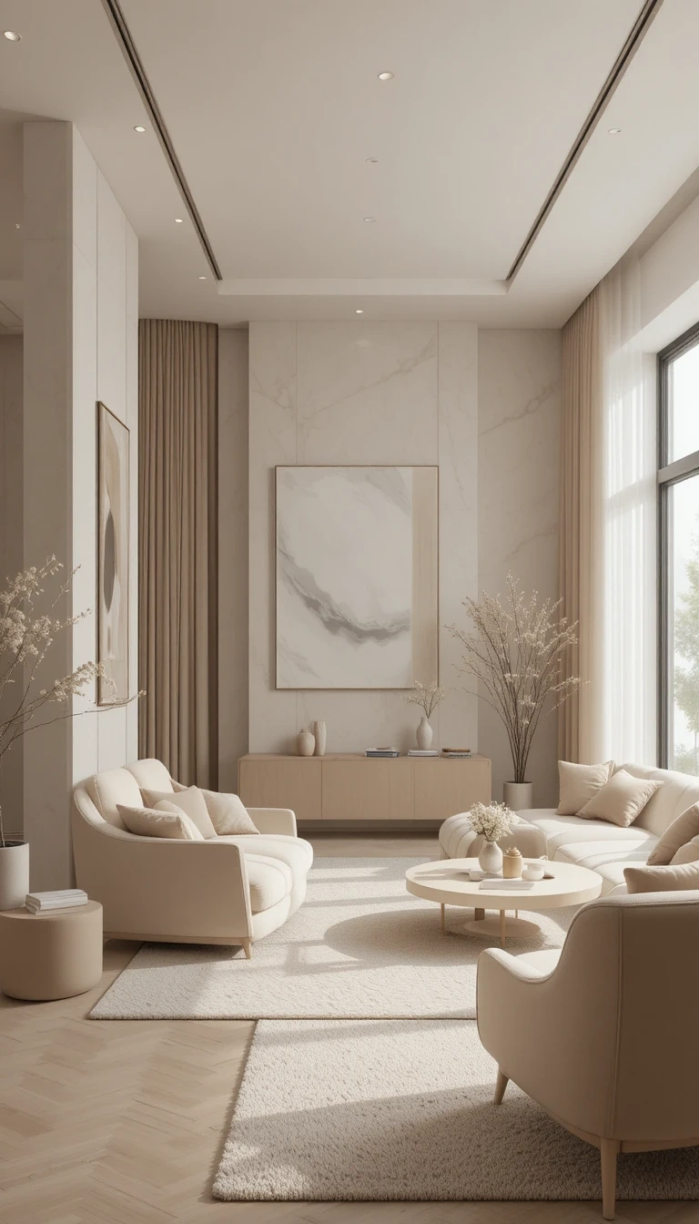
The 2026 neutral is warm, not the cool greige of the last decade. Cream, warm taupe, oatmeal, and sand read as calm; blue-grey beige reads as a rental.
The trick is layering two or three neutrals rather than painting everything one shade. Walls in warm white, a taupe sofa, sand-toned cushions, and the room gains depth without a single bold colour. Test any neutral against warm 2700K light before committing, since cool bulbs pull warm neutrals grey.
Commit to One Accent Wall, Not Four
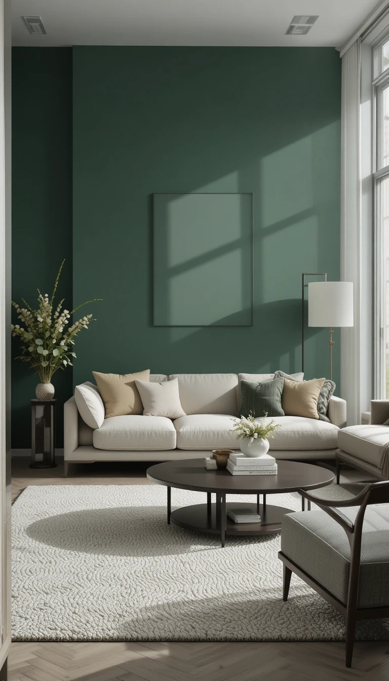
A single painted wall gives a room a focal point without closing it in. Deep green, terracotta, and charcoal are the strongest 2026 choices because each reads rich rather than trendy.
Put the accent wall behind the largest object in the room, usually the sofa or the media unit, so it frames something rather than floating on its own. Keep the other three walls in the warm neutral base, and let the bold colour carry the drama alone.
Hang One Oversized Piece Instead of a Gallery
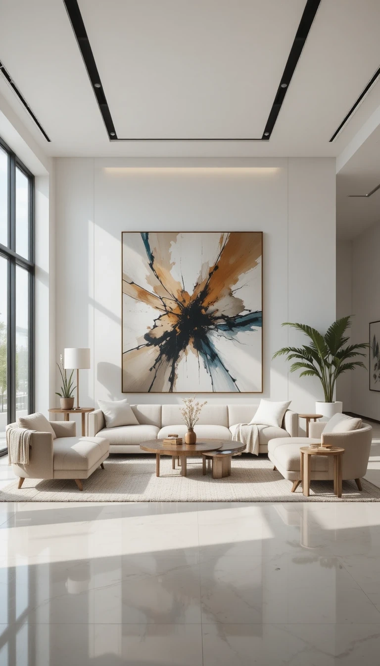
A cluster of small frames scattered across a wall reads as busy. One large canvas or an oversized abstract print anchors the room and makes the ceiling feel higher.
The sizing rule most people miss: the art should span roughly two-thirds the width of the sofa or console beneath it. Anything smaller looks stranded. Hang the centre at eye level, around 145cm from the floor, not tucked up near the ceiling where instinct often puts it.
Layer a Patterned Rug Over a Natural Base
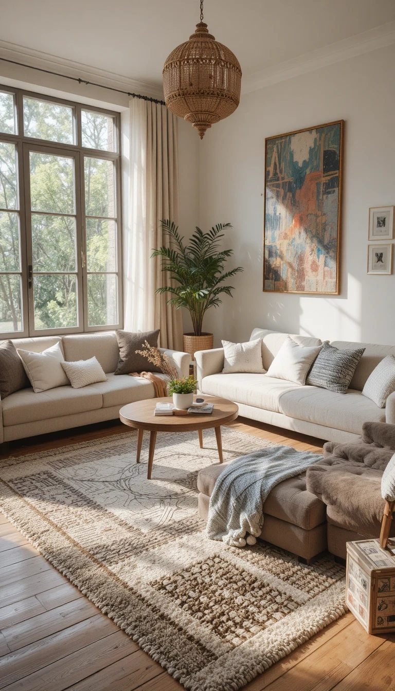
Rug layering still works because it solves two problems at once: a large natural-fiber base rug (jute, sisal) sets the scale of the seating area, and a smaller patterned or vintage rug on top adds personality.
The base rug should be large enough that the front legs of every seat sit on it. The top rug can be smaller and off-centre. Keep the top rug’s pattern in the room’s existing palette so it grounds the space rather than fighting it.
Treat Lighting as Three Separate Layers
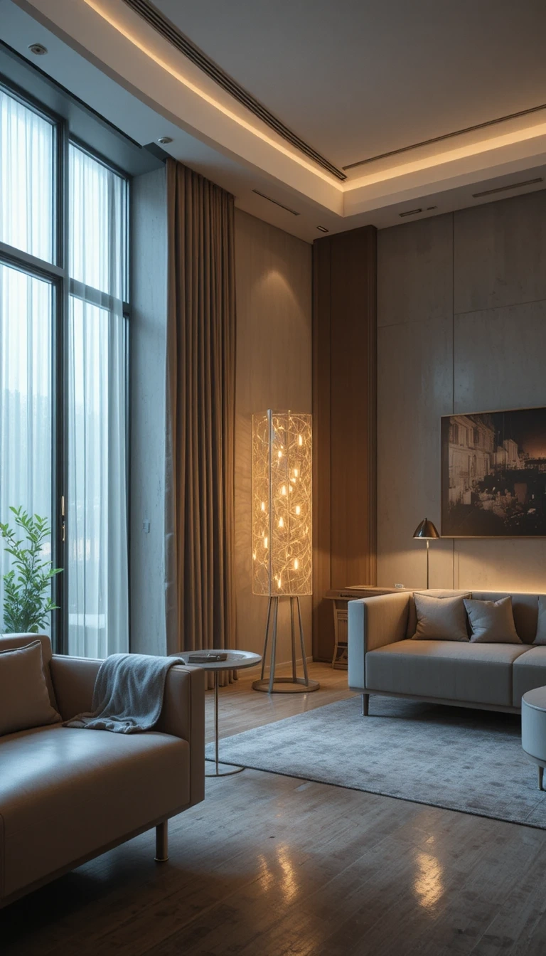
One ceiling light flattens a room. A living room needs three layers working together: ambient (overhead or wall), task (a reading lamp beside a chair), and accent (a table lamp or picture light for glow).
Sculptural pieces earn their place here, a curved floor lamp arcing over the sofa, a soft-glow table lamp on the console. Put lamps on a smart plug or dimmer so the room can shift from bright afternoon to low evening without touching the harsh overhead at all.
Choose One Sculptural Plant Over a Jungle
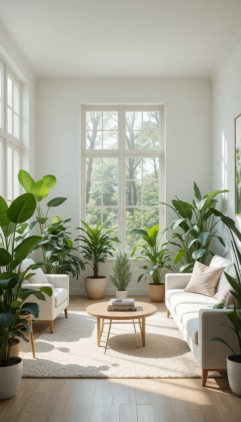
Greenery makes neutral rooms make sense, but scattered small pots read as clutter. One large sculptural plant does more than ten little ones.
A fiddle-leaf fig, an olive tree, or a bird of paradise brings height and an organic silhouette that softens all the straight furniture lines around it. Set it in a woven basket or a terracotta pot so the planter stays inside the room’s material story rather than breaking it with shiny plastic.
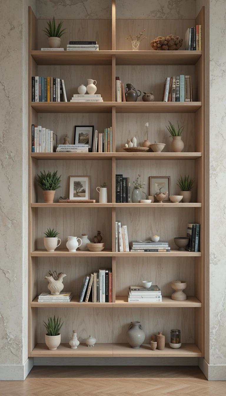
Style Open Shelves With Breathing Room
Open shelving looks intentional only when it isn’t full. The mistake is treating every shelf as storage; the fix is treating it as display.
Fill roughly two-thirds of each shelf and leave the rest empty. Group objects in odd numbers, mix heights, and stand a few books vertically and a few in short horizontal stacks. Keep the palette tight, ceramics, books, one small plant, and the shelves read as styled instead of stuffed.
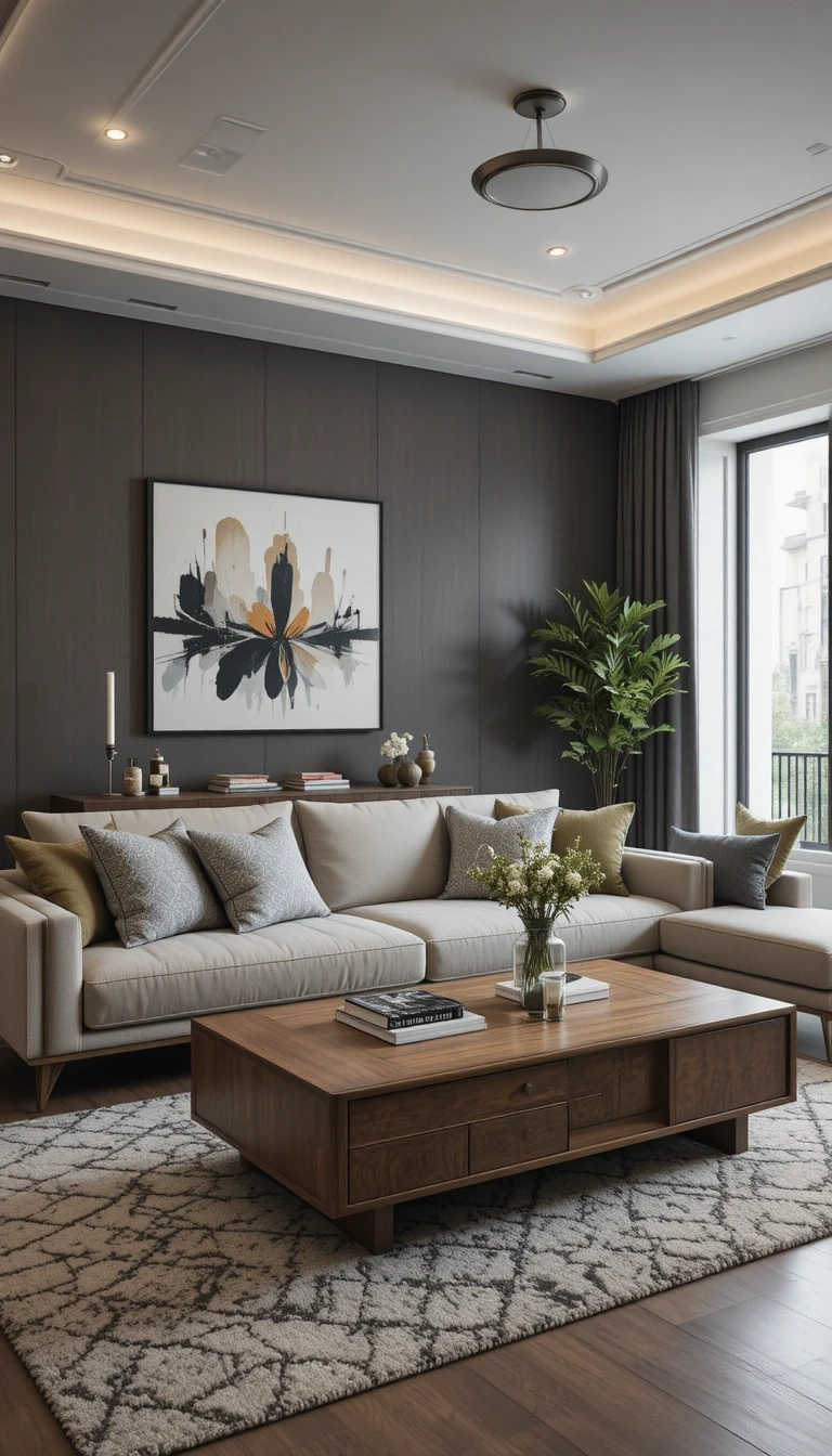
Pair One Vintage Piece With Modern Furniture
A room where everything is new and matching feels like a showroom. Contrast makes it feel collected. Set a vintage wooden coffee table against a clean modern sofa, or an antique mirror above a minimalist console. The age gap is the point: the old piece adds warmth and story, the new piece keeps the room from tipping into fussy. One strong vintage element per room is usually enough.
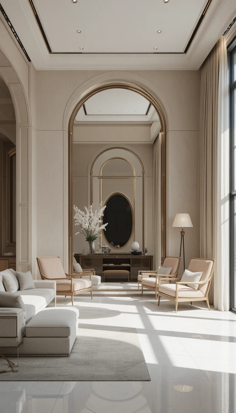
Expand the Space With a Statement Mirror
A large mirror does real work in a living room: it bounces daylight deeper into the room and doubles the sense of space. Placed opposite a window, it can noticeably brighten a dim room.
Arched and oversized round mirrors are the current shapes, in warm wood or aged brass frames rather than cool chrome. Lean a very large one against the wall instead of hanging it, both for a relaxed look and because it skips the landlord conversation in a rental.
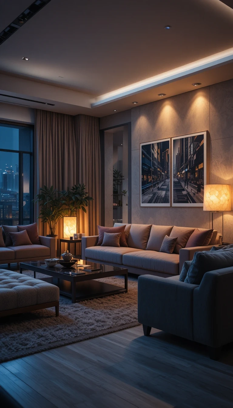
Switch Every Bulb to Warm White
This is the cheapest upgrade with the biggest payoff, and it costs the price of a few bulbs. Cool white light (4000K and up) makes a living room feel like an office and turns warm neutrals grey.
Warm 2700K to 3000K bulbs shift the entire room toward cozy instantly, no other change required. If you do only one thing on this list tonight, change the bulbs and see how different the same room feels after dark.
Keep Surfaces Clear and Intentional
Clutter undoes good styling faster than anything else. A room can have beautiful furniture and still feel “off” purely because every surface is covered.
Apply a simple rule to coffee tables and consoles: a small tray to corral remotes, one stack of books, one object, one bit of greenery. Everything else finds a drawer. The empty space around a few chosen objects is what makes them read as deliberate.
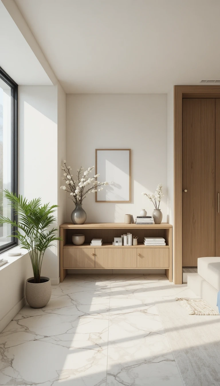
Add Built-In or Concealed Storage
Visible storage that hides its contents is what keeps a styled room styled. Floating cabinets, wall niches, and lidded storage let you clear the clutter without losing the things.
A media wall with closed lower cabinets and open upper niches is the 2026 version: hide the cables, wires, and clutter below, display a curated few objects above. In small rooms, a storage ottoman or a bench with a lift-top lid does the same job in a single piece of furniture.
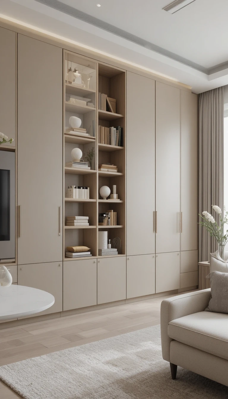
Layer Sheer and Heavy Curtains
A single curtain panel reads as basic. A double layer, sheers for daytime diffusion plus a heavier drape for evening and warmth, lets you tune the light through the day.
Hang the rail close to the ceiling and let the drops run to the floor, even if the window is short. Floor-to-ceiling curtains make walls read taller and windows read grander than they are. Puddle them slightly or hang just kissing the floor, never floating awkwardly above it.
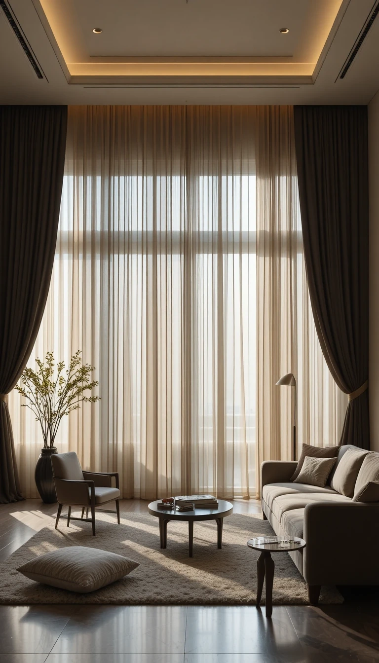
Favour Matte Finishes Over Gloss
High-gloss surfaces have quietly dated. Matte walls, matte furniture, and soft-touch finishes read as more expensive and more current, and they hide fingerprints and light glare that gloss amplifies.
Choose eggshell or flat-finish paint on walls, and look for matte or lightly textured finishes on cabinetry and tables. The one exception worth keeping glossy is a single reflective accent, a ceramic lamp or a glazed vase, so the whole room isn’t uniformly flat.
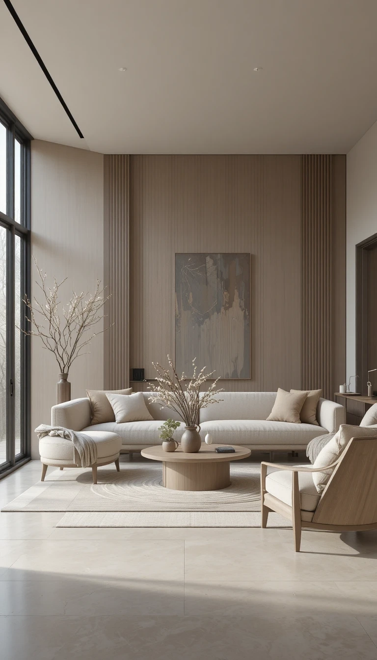
Keep Furniture Low and Grounded
Lower furniture makes ceilings feel higher and rooms feel calmer. Tall, bulky pieces crowd a space visually even when there’s floor to spare.
Low-profile sofas, slim-legged coffee tables, and wide, horizontal seating layouts open up the vertical space above them. This works especially well in rooms with lower ceilings, where a tall-backed sofa would eat the sense of height a low one preserves.
Let a Few Personal Objects Show
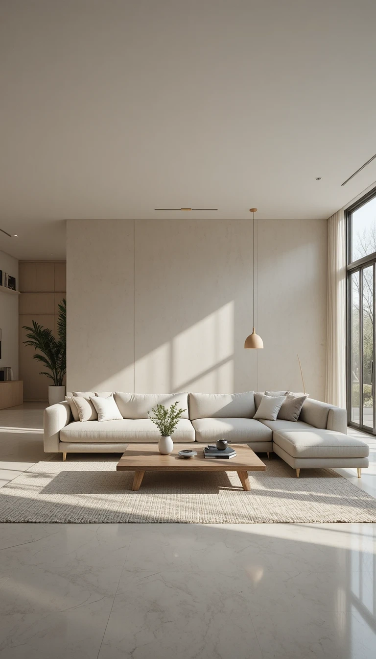
A room should read as belonging to someone. The line between “designed” and “sterile” is usually a handful of genuinely personal objects.
Travel finds, a handmade ceramic, framed photography that means something, worked in among the styled pieces, give a room a story a catalog can’t. The trick is restraint: a few meaningful objects placed with room to breathe, not every shelf turned into a memory box.
Build One Cozy Corner
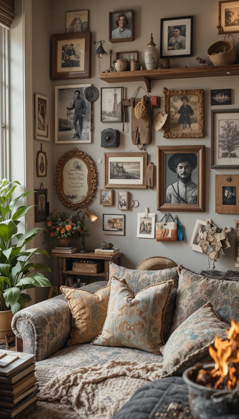
Almost every good living room has one spot designed purely for sitting still. It doesn’t need much: a comfortable armchair angled slightly away from the room, a throw blanket, a small side table, and a warm lamp at shoulder height.
Angling the chair toward a window or a corner rather than square to the TV signals “retreat” instead of “seating.” That single gesture turns dead floor space into the spot everyone quietly competes for.
Leave Deliberate Empty Space
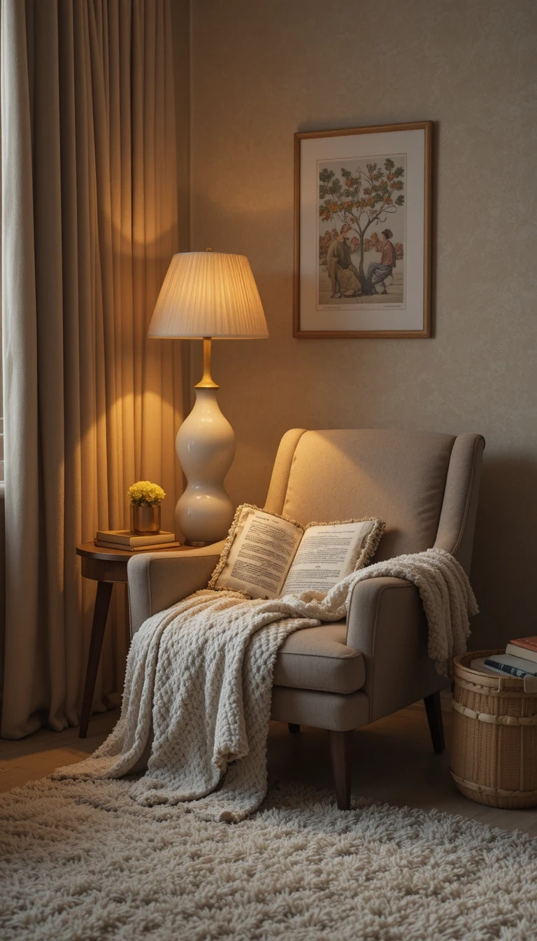
Negative space is what makes expensive rooms feel calm, and it’s the most underused tool here. The instinct to fill every corner is exactly what makes a room feel busy.
Leave a stretch of wall bare. Keep one surface empty. Resist adding a plant to every gap. The eye needs somewhere to rest, and the objects you do keep read as more intentional when they aren’t competing with everything around them.
Final Thoughts
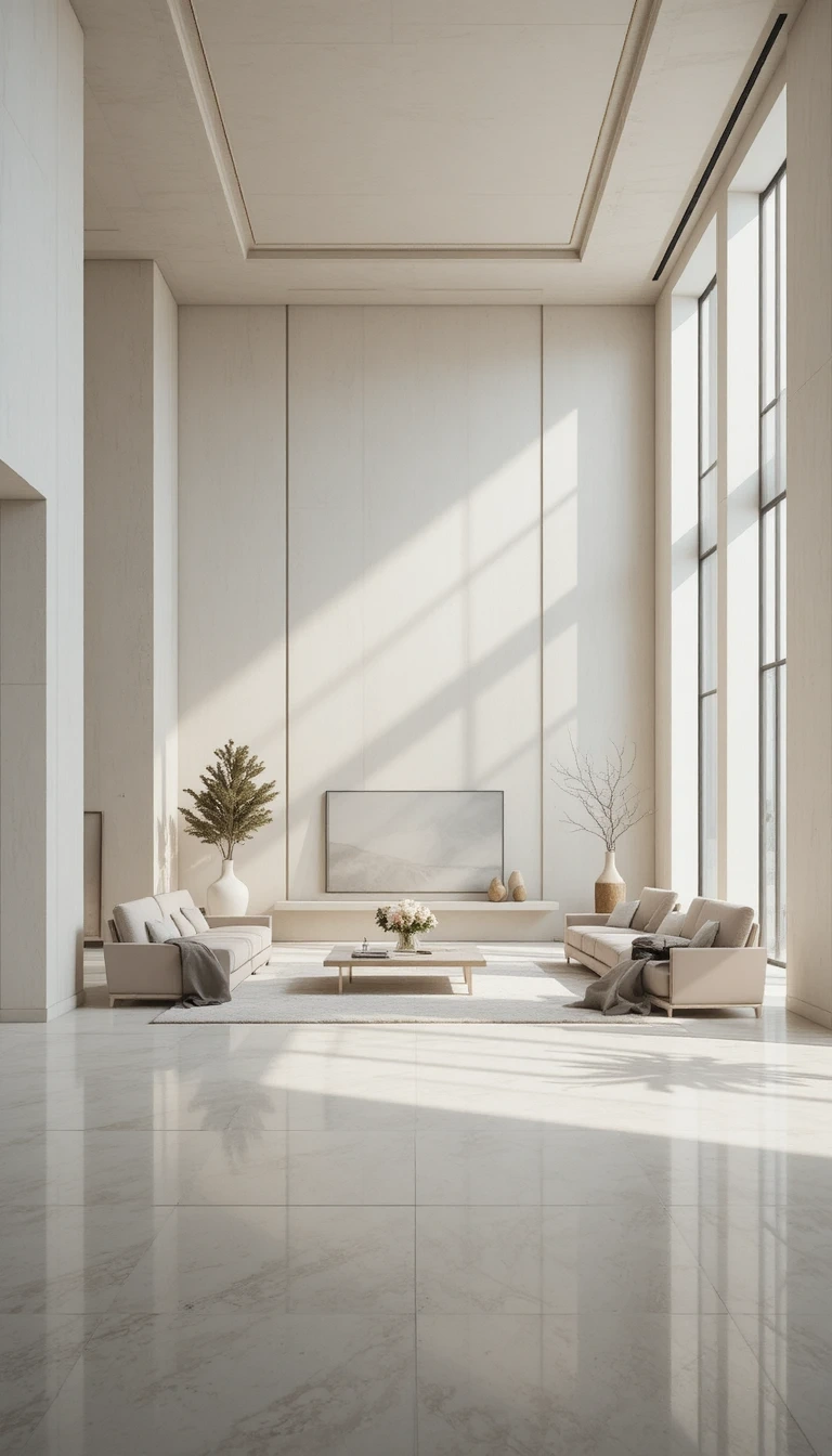
None of these ideas require tearing a room apart. The through-line for 2026 is warmth, texture, and restraint: layer natural materials, fix the lighting, commit to one bold move, and leave space for the room to breathe.
Start with whatever bothers you most when you walk in, the harsh overhead light, the cluttered coffee table, the bare walls, and fix that one thing first. A living room comes together in small, deliberate steps far more often than in a single expensive weekend.
